10 InDesign Preferences You Must Change Today

49

InDesign makes some assumptions about you. It’s pretty sure that your worldview is pretty Dark. It thinks you measure things in picas and points. If you’re using older versions, it’s pretty sure that you don’t want to take advantage of that gorgeous monitor you’re using. And in recent years, it wants to act like it’s your best friend with chummy greetings when you fire it up to get some work done.

If you find any of these quirks annoying or distracting, InDesign also lets you customize your work environment. So if you’ve never thought to change your preferences, press Command+K (Mac) or Ctrl+K (Windows) to open the dialog box and follow along.

[Editor’s note: Some of your options have changed from version to version. This article, originally posted in 2014, has been updated and is current with InDesign 2021, version 16.4.]

1. Lighten up

Do you really like that Dark interface? You have a choice! Select Interface > Color Theme in the Preferences dialog box. You can choose from a range of four gray swatches in the Appearance area—and, yes, you can make the default interface even darker if you really like that. As for me, I like the retro soft gray, so I go with the lightest swatch. (Whew! So much easier on my aging eyes.)

Preferences pane for changing dark theme

2. Keep those curly quotes comin’

Now, this one is a little tricky because Use Typographer’s Quotes (Preferences >  Type … ) is actually checked by default (and for good reason). But you might suddenly find that your quotes are no longer converting to curly. What happened?

InDesign offers a default keyboard shortcut that will change this single setting. Chances are you went to use straight single or double quotes—as you would for indicating feet or inches—with the usual respective keyboard shortcuts: Command+’/Command+Shift+” (Mac) or Ctrl+’/Ctrl+Shift+” (Windows).

If Use Typographer’s Quotes in the Type area of the Preferences dialog box is mysteriously unchecked, you almost certainly added Option (Mac) or Alt (Windows) to those commands and accidentally changed the way InDesign works for you.

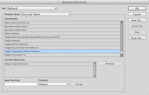
Select Use Typographer’s Quotes again. And if it keeps happening, consider changing that keyboard shortcut. Choose Edit > Keyboard Shortcuts, then select Text and Tables from the Product Area menu and scroll to Toggle Typographer’s Quotes Preference. Click on the current shortcut and click Remove. (If you’re using the [Default] Keyboard Shortcuts set, InDesign will prompt you to create a custom set.) You can select a more obscure keyboard shortcut or eliminate the shortcut altogether.

3. Keep line spacing consistent

When do you not want the leading to be the same within a paragraph? There might be a case here and there, but chances are, you want the same spacing between lines no matter the text sizes. Check Apply Leading to Entire Paragraphs in the Type panel. (If you need more details on this topic, read Rein in Rogue Leading.)

4. Rulers that rock

Apparently, Adobe thinks all designers not only understand picas but are most comfortable using them. As a writer and page layout person with no design training, I never learned picas. I never changed the default rulers because I thought that’s what the pros use.

At one point, though, a brilliant production artist mentioned to me that nobody really knows picas except for people with newspaper training. Whether this is true or not, that observation freed me up to work in inches. Let go of your guilt—work in the measurement system you prefer.

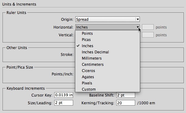
To change your units of measurement for your rulers, choose from different options from the Horizontal and Vertical menus in the Units & Increments panel of the Preferences dialog.

And if you are curious about those other units of measurement, check out “The Measure of Type.” (No pressure—now you know that nobody will make you use ciceros if you don’t want to.)

5. More careful kerning

Keyboard shortcuts for kerning and tracking are awesome for quickly experimenting with type and for copyfitting. But I find InDesign’s default increment of 20/1000ths of an em to be huge. I knocked it down to 5 in the Kerning/Tracking field (Preferences > Units & Increments > Keyboard Increments). You can adjust this setting to make it work for you.

Change kerning default.

6. Spot those spelling errors

Do you like how Microsoft Word underlines potentially misspelled words, repeated words? You can enable similar behavior in InDesign with by selecting Enable Dynamic Spelling in the Spelling panel of the Preferences dialog. (You can quickly toggle this preference from the Edit > Spelling menu as well.)

7. Quick corrections

Another preference that mimics Microsoft Word is Autocorrect. If you type in InDesign a lot, turning it on is worth a try. Check Enable Autocorrect in the Autocorrect panel of the Preferences dialog box.

Tip: You can use Autocorrect as a poor person’s keyboard macro as well. For example, in one project, I repeatedly had to use the tedious phrase “financial capabilities program.”  To speed up the typing, I added a new Autocorrect entry that automatically changed “fcp” to expand the text.

8. Set up your Display Performance to work for you

For many years InDesign would, by default, protect your computer’s resources and display graphics with mediocre quality. Now, by default, graphics come in looking their best.

But if you’re using an older computer or a machine that otherwise isn’t maxed out, you might find that the computing power needed to display your graphics beautifully isn’t worth the tradeoff. Conversely, if you’re using an older version of InDesign, you might wonder why your stunning 27-inch iMac Retina 5K monitor is displaying jagged graphics.

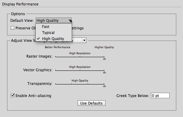
To change the default, select the Default View from the menu in the Display Performance panel of Preferences. You can then set the way that those views behave whenever you override them, which you can always do individually via Object > Display Performance.

While you’re in that panel, you can select Preserve Object Level Settings so that even graphics that are set to Fast or Typical always display at High Quality—or vice versa.

Tip: If you’re adjusting your preferences because InDesign is behaving sluggishly, check out “Six Tips to Speed Up InDesign.” One more idea: Don’t forget that you can put any or all of your graphics on a separate layer and simply turn off visibility from the Layers panel.

This little hockey player’s shot is super crisp, but you can’t see it onscreen with Typical display. Bump it up to High Quality for a clean look.

9. Greek be gone

I’ve often been irritated by seeing lines of type on my page displayed as little gray bars instead of text. Another setting you can change! It’s the Greek Type Below setting in the Display Performance panel of the Preferences dialog box.

Essentially, text will display this way when its size on your monitor (not on your page) dips below this value (default: 7 point). If you want to see all your characters, no matter how long it might take to draw the itty-bitty ones, change this value to 0.

Again, it’s a matter of performance. It takes a similar amount of computing power to draw each letter, and if those letters are too tiny to be legible, it might be worth keeping the text Greeked. If your computer is lagging, you might even increase the value.

(Thank you to John Cruise for this tip.)

10. Spend less time on links

By default, every time you open an InDesign document, it scours your computer to look for the links to graphics and text files. If they’re missing, you will have to respond to an alert before the document opens.

I often open documents only to edit them and, in many cases, I don’t even have the graphic files, so of course they are missing! InDesign is spending time checking something I already know about. It made sense for me to turn off Check Links Before Opening Document in the File Handling pane of the Preference dialog.

Now, are you thinking to yourself, “I did change that once, but it didn’t stick?” Even experienced users can get confused by which preferences are document-specific and which ones are application-specific. For help, read A Visual Guide to InDesign Preferences.

And remember: Anytime you find yourself irritated by how InDesign is working, take a trip to the Preferences dialog and see if you can change a setting to better suit you, your computer, and your work environment.

And a bonus tip from 2021…

For the past few years, InDesign has tried to become increasingly friendly to new users with a Home Screen (“Welcome to InDesign, <Your Name>”) and a snazzy New Document dialog box.
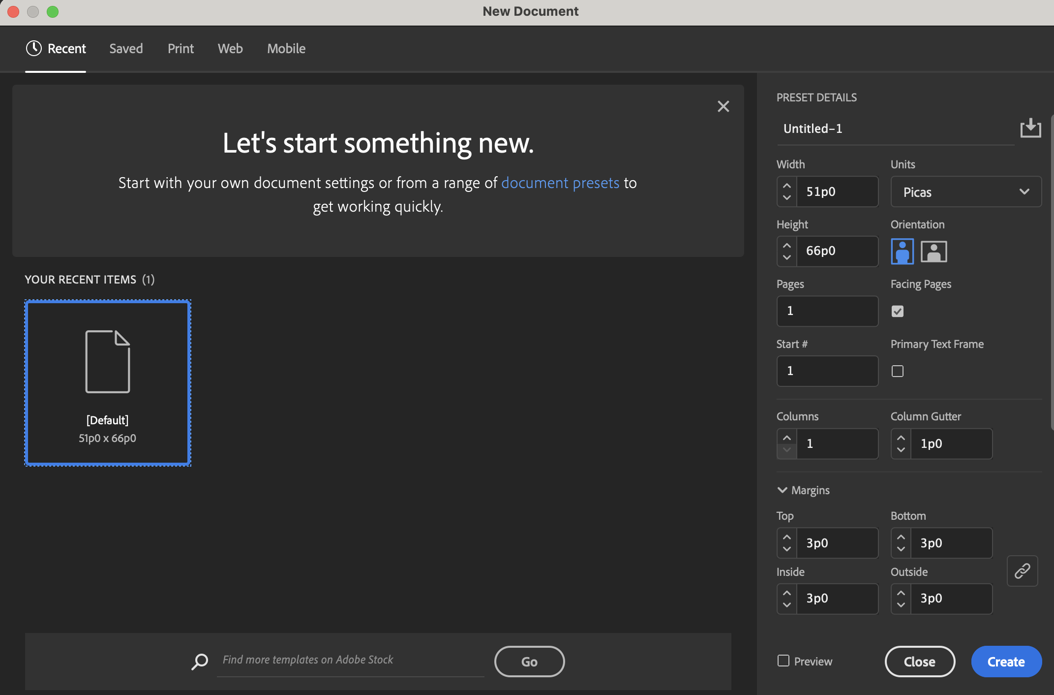
New users might appreciate these new ways of approaching serious software. But if you find them getting in your way or you pine for the simpler, less communicative InDesign, you can go to the General panel of the Preferences dialog box and:

  • Disable “Show Home Screen When No Documents Are Open”
  • Use Legacy “New Document” Dialog

Doing so will restore the boring but far smaller (and seemingly speedier) New Document dialog box.

Kelly Kordes Anton has written and edited dozens of books and training resources on InDesign, including multiple editions of the Adobe InDesign Classroom in a Book.
  • David Creamer says:

    A couple of other settings I like to change (some I consider critical, some are just settingsI like)…

    Interface:
    Turn off the Match Pasteboard to Theme Color (especially if keeping a Dark-ish panel theme)
    Turn Live Screen Drawing to Immediate

    Type:
    Font Preview Size to Large
    Delete Empty Pages for Primary Text Frames
    I don’t change leading settings since I always use paragraph styles with absolute leading (or, for the rare time I don’t use styles, select the entire paragraph before changing leading)

    Dictionary:
    Merge User Dictionary into Document (if sending to another person to work on)

    Display Performance:
    I keep it on Typical, but increase Vector to High Resolution
    Of course, I always sett Greek Type to 0

    Appearance of Black:
    Change both settings to Display All Black Accurately for print work
    (I do the same in Illustrator)

    File Handling:
    Save 5 pages of preview

  • David Creamer says:

    Sorry–all my returns and line breaks were wiped out when I posed. 

  • Mark! Mark! says:

    Love these. Re: #8, if you’ve ever worked off a slow server (thanks corporate beaurocracy!), you know the value of typical display. Every time you scroll or zoom, ID goes back to those files to re-preview. It can be pure agony.  I also change the default settings for superscript and subscript text.

    • SherryO says:

      Yes! As a professionally trained typographer of more than 25 years, picas and points are THE standard for good typography. By their lack of recent use, it’s indicative that instructors are glossing over this very easy and important way of understanding layout measurements (type is not done in inches, period – inches are for the document size). Doing math with picas is so much easier than in inches. Want to divide that 11″ tall (66 picas) page into thirds easily? That would be 22 picas … and in inches it’s a messy 3.66666666. That last measurement is especially fun to find when you’re placing guides in a document – but 22 picas is easy. Buy a pica gauge, which will show both picas and inches, to educate yourself on how to create exceptional type (the beauty of the words and their layout should carry a piece, not the images alone).

      Being taught picas and points makes it easy to understand why a 72-pt. capital letter isn’t 72 points tall. Also leading/linespacing is measured in points as well and not inches or milli/centimeters. Type needs the specifics that come with points – and yes, one point IS noticeable to the trained eye.

      Lastly, please do not use the keyboard shortcuts in this article to achieve foot and inch marks. The true marks are in the Symbol font – or can be found in the “glyphs” palette. The other marks are prime and double prime; seasoned designers and typographers know the difference, just as they know the differences and uses between hyphens, en-dashes and em-dashes.

      Think nobody notices those slight nuances? They do and they judge accordingly, as they should; that’s what quality and good design is all about. Anyone nowadays can proclaim themselves to be a design professional – but your own work will call you out if you’re merely a poser.

  • Matt Mayerchak says:

    Re: Number 4, you state “ a brilliant production artist mentioned to me that nobody really knows picas except for people with newspaper training.” This is FALSE. None of the professionall designers I know worked in newspapers, and we all use picas because the units of measure make a lot more sense when used in conjunction with type sizes. 14 points of space after a paragraph is 0.1944 inches, and 15 points is 0.2083 inches. Picas and points are the measurement system of typography. Sure, you can measure in hectares if you’re the only one working on your files, but if you want to be taken seriously as a professional designer, you should learn the craft of your chosen profession. 

  • Guest says:

    It would be super nice if there were a feature that enabled different units of measurement for typographic controls (like paragraph spacing) and object controls where inches definitely do seem more useful than picas. 

  • chacokid says:

    Thanks. I found this to be extremely helpful for some of those nagging annoyances in iD.  Unfortunately I have to use iD v3 at work.  All but #10 (& the part about changing the bg color in #1) were available as described.  Apparently #10 wasn’t an option until a later version – that would have been nice… but hey – I got a bunch of other awesome workable tips! :D

    • Nina Messina says:

      You can enter the value you want in points (6 pt) and the program will convert that to inches. So it doesn’t really matter if you are working in inches or points. I hope this is what you meant : )

  • Kginch says:

    I’m just recently working in InDesign again (have been all web the last several years)…
    can anyone tell me how to change the paragraph increment setting from inches to points?
    I found the hold-shift key down work-around, but simply prefer to tab though the fields when I’m setting up space before/after, etc. Thanks.

  • Eugene says:

    I agree with most of these – especially dynamic spelling, and typographers quotes, line spacing etc.! Why they aren’t turned on is beyond me.

    I’d say that the “Typical Display” is a user choice, 9/10 times I have it set to typical. Preflight informs of images not high quality.

  • Guest says:

    Two more I always change are Appearance of Black and File Handling. I set my global default to Display and Print Blacks Accurately (I still don’t know who would not want this changed), and I constantly change my File Handling Default Relink Folder from Original Link Folder to Most Recent Relink Folder depending on what I’m doing in the file. I also ditch all of the colors from the swatches palette and set my default paragraph style to reflect my most-used font, hyphenation, h&j, etc.

    • Mike Zielinski says:

      Been in the business 30 years. I use both picas and inches all the time and have done so since the very beginning of my career, along with my colleague. However, admittedly, within the past 15 years or so, design/production graduates don’t seem to use picas as a unit of measurement in their work. Why? I do not know.

  • Steve Jenks says:

    NONE of the professional designers I know use picas because they don’t make sense in their market.

    If you want to be taken seriously as a professional designer then you should work in whatever measurement system is understood by all the people you work with – that’s clients and suppliers, as well as other people in your organisation. For us in New Zealand the measurement system that’s used is millimetres.

    If wherever you are working everyone uses picas and understands them, then great, but don’t use a system that only the designer understands… you won’t be taken seriously just because you use an arcane measurement system.

    Personally, in 35 years as a designer I’ve never met ANYONE that uses picas, and I’ve met a lot of very talented designers who are at the top of their field and very well versed in their craft. There are a whole lot of brilliant production artists who also use millimetres exclusively for the reasons stated.

  • David Blatner says:

    I love picas and points, and have used them almost exclusively since the early 90s (with QX, then InDesign). Of course, I use inches or cm for page sizes and such, but picas/points is just more convenient for fine-tuned positioning on the page. After all, there are almost 3 points in a single mm! I’d rather move something 1 pt than have to type .2 mm.

    But of course, there’s no “correct” measurement system. The right one is the one you’re most efficient with.

  • Jane Garrud says:

    Dark interface propbems – (sorry last post went wrong!!) Is there anyway of changing the interface colour in CS6? I would also prefer a lighter interface as can’t always see the type on the darker grey, can’t seem to find it on 6. Also does anyone know if you can make the handles on drawing objects any larger? All the designers must hace very young eyes, as a more mature designer(!!) they are REALLY difficult to see even with glasses and they stay the same size when you zoom in.

    thanks  

  • Terre Dunivant says:

    Preferences > General > Interface: Appearance

  • jenny reid says:

    i so agree with you..have never used picas in my life…or worked with people who do…

  • Carlos Estrello says:

    Just a bunch of countries do not use metric system, what is probed is better (not perfect, sure) system. This system is used in commercial, scientific and industrial applications. Maybe metrification is faded cause are you so lazy to learn? In my work I use metric, english and typogrpahic measures system. Want to be good in job? Learn so!

  • Isaiah Sheppard says:

    Hi Kelly,

    Much of my work as a designer is done using picas and the occasional centimeter/millimeter. Now it’s a mix of picas and inches (traditional and decimal). Thank you for sharing the InDesign tip!

  • Mark Meredith says:

    All serious designers I work with (myself included) don’t care what sytem of measurement is used. Units are units, and if my client needs to publish something using metrics, great.  If they want to use picas…whatever.  It all depends on what media you’re designing for…and who’s making out the paychecks.

  • Brook says:

    Another useful tip: If you make these changes with no document open they become global (the new default for every document you use in InDesign). If you make the changes with a particular document open, the settings only pertains to that document.

  • Brook says:

    22+years never used picas never met anyone who did. If I did anyone I spoke with would say “what’s a pica”?

  • Yvette Hunt says:

    Hi Mike,
    Thanks for the excellent post. Most of these I already knew about, but there were a few tips I found very useful. (And as for the pica people – It’s all measurements … I’ve worked in all of them based on what was needed.)
    My question for you – Is there a way to make the interface tool icons larger? I know you can go into each tool palette and make certain adjustment in the options, but is there a way to make all your tool icons larger than the tiny setting that is the default? Old eyes want to know.
    Thanks!

    • Mike Rankin says:

      Hi Yvette- There’s nothing in InDesign that will help you increase the size of those icons, but if you’re on a Mac, you can use the Accessibility System Preferences to turn on a temporary magnifier under your cursor. It’s free and easy to use. I think there’s similar functionality in Windows too.

  • Amanda Woods says:

    I am currently working in Indesign CC 2014 and I need to save my file as an idml. When I look in Indesign CC I can change the format when I go to export or save as, but for some reason I can’t change the format in Indesign CC 2014. How do I do this?

  • RE: rulers. Does everybody know a right click on the rulers at the top, & left of the page gives you a pop out menu to change them on the fly? I didn’t until recently!

    • WriterGuy says:

      Brian – If you click on the top left corner — where you can drag the rulers to create a new “zero point,” you can adjust both horizontal and vertical rulers at the same time. A big time saver. (Illustrator changes both when you change either, which I actually prefer).

  • Jack says:

    On measurements… I’ve made a fortune fixing all the poorly crafted jobs of people who don’t use picas and points. When you size type you use points – I can honestly say I RARELY run across situations where type in a file is sized in inches or metrically. It makes more sense to use one system of measurement of an entire document. Points are a sub unit of picas and beyond that you can be much more precise – 72 points in an inch (not even getting into half or quarter points) can you tell me what 1/72 of an inch is in a decimal value off the top of your head? Likely not. Then again I keep seeing layouts where the width of a text box is along the lines of 4.5839″ by 6.2991″ – you keep doing your sloppy work and I’ll keep making money. And when you can’t figure out why things look slightly off in your design in terms of spacing of elements or alignments, tell me once again how picas and points are so very arcane.

  • John N says:

    Regarding the display settings, InDesign users who are still using CS6 or earlier will often take a serious performance hit by setting “Display Performance” to “High-Quality Display” if they have any high-res raster images or complex vector graphics. I assume that this is due to there not being a 64-bit version of InDesign before CC. Even if you have a high-end machine, 32-bit programs can’t utilize all of your system’s resources. And even with the 64-bit CC version, you’ll have performance issues if you use enough high-res/complex graphics in one document. Unlike Photoshop and Illustrator CC, InDesign has no option to use graphical hardware acceleration – i.e. it can’t use a dedicated graphics card, so all of the computations have to be run through the CPU; this too can bottleneck it’s performance.

    My point is, if you (like myself) often work with large and/or highly complicated graphics, you may want to hold off on changing any global “Display Performance” settings and instead adjust the quality on a per-graphic basis. If you do change the global settings to “High-Quality Display” and start to notice the program lagging a bit, you should turn down the display settings of each graphic (starting with the largest) to “Typical Display” until that lag goes away. If you want to see a preview of what your graphics will ultimately look like use the “Presentation” (Shift+W) preview. Hope these tips help!

  • Margaret Moore says:

    Please help! I must of actually hit a keyboard command without know it or something. Recently my text colour palette at top application menu is “dropping up” instead of “dropping down” which is causing my colours to run up and off screen at top. Currently using work around with having my swatch window open but would obviously like to fix this. Tried rebooting program… Nothing is working. So annoying! :(

  • Ed says:

    I agree with Sherry, Matt, and Jack that measuring in picas is easier and more logical than measuring in inches. And it is not true that only people who worked in newspapers understand picas. Most if not all the InDesign books I’ve gone through use picas and points in their illustrations. You can move or adjust objects by a tenth of a point (0.1 pt) or three-tenths without using a calculator.

    I ask people who wonder about picas: Why is the gutter space in columns .167 inch? Why such an odd number, and not .25 or .125? Could it be a conversion from millimeters? Nope, the gutter in millimeters is 4.233 mm. Whaat? Why not 4 mm or 5 mm? Then I switch to picas and voila! The gutter space is 1 pica. That’s where it all started.

    But I don’t force it down the throats of artists. They work with what they’re comfortable with. I just show them a “better” system that can make their work easier, once mastered.

  • Darlene Grossman says:

    There used to be icons at the top of the menu bar by the type menu which allowed one to change the spaces before/after paragraphs. It’s a pain to have to go into the type palette each time to do that, especially since sometimes I want that space changed and prefer not to build it into the style. Please, where did those icons go in CC?

  • Sylvia Foster says:

    Hello, I am having way too much trouble with Indesign to the point I just hate this program. I changed the visualization of the document in preferences like you said to high quality but the document which is from Illustrator still looks like crap when before it looked good. Also, the option in object that also says to change the visual quality is greyed out and I have no clue why aor how to change it. Getting desperate here, please help!

    • Terry says:

      Indesign doesn’t like eps placements from illustrator. Where has Quark gone, that was a FAST program. Indesign is the TOOL of choice these days but from a layout and typography POV is clunky and slow. And YES. Use picas everybody. Geez.

  • knife says:

    Thanks, Mike! I’ll pass that info on.

  • KarenN says:

    I never place .eps files. I place the native .ai files instead and haven’t had a problem. I prefer points and picas, but that’s just my choice. I remember the olden days in college with fondness…when we actually learned about points and picas and drew letters with pencil on tracing paper to learn about line spacing, word spacing, and kerning. Our fonts were Helvetica, Bodoni, Garamond, and (oops, too vintage here…I forget). Type On!

  • Nandor says:

    The “Display and output all black accurately” is the first and most important to me.

  • Daniel says:

    I change my document to inches but when I open a new document it reloads picas. How do I keep this custom setting for all future documents?

  • Joe Stafford says:

    Thanks. Good stuff. Longtime newspaper designer before moving into corporate marketing and advertising, so I love picas. Heh heh. Anyway, thanks again.

  • CMaxo says:

    There are some “might be wrong 50% of the time and makes you loose lot of work” cases in those choices for preferences.

    Ditch the Typical Display for High Quality might works for documents with fewer than 20-30 pages, but for document with 50+ pages, it’s actually involves an HUGE risk of corrupting your file. This is because of how InDesign, as a WYSIWYG software. (WYSIWYG is how we call software in which you see and works on the result live. It’s basically means “What You See Is What You Get”.)

    The amount of available RAM and VRAM available in your PC doesn’t save you from this limitation because InDesign memory usage is capped at 2Go for CS5 and lower and 4Go for CS6 and 6Go CC. Even with CS6 and CC, the raise to 4Go and 6Go Cap in memory usage was only incorporated to fulfill the requirement of the “online” services.

    The issue with InDesign internal display system is that it’s directly linked to the core of the saved file. In simple terms, if the software “jam” at handling the position of an element, it keeps the “jammed” code in the .indd file so if you save, you’re screwed and restarting the software doesn’t “fix” the problem.

    Typical display is basically downgrading the visual quality for better stability. When you got around 1000 pictures in 100 pages and want to scroll through lots of pages at once, it’s useful. If you’re making a small clipped print with 12-16 pages for your local church, it’s not much of an issue.

    To avoid having your file corrupted, the following tricks are really good suggestion:
    1) Keep the Image quality to Typical and manually change the quality page-by-page when you want to check the final results only.
    It can be done fast with right click on the page, Display Performance, High Quality Display. When you’re done, you can switch it back.

    2)Turn off the Thumbnails of the Masters and Pages in the Page Panel.
    At least 20% of the corrupted file case, the culprit comes from the Page Panel. That thing is a mess and Adobe refuse to recognize its related issues. The thing is that the Page Panel update itself LIVE while you modify the content. It’s DOUBLE the memory usage from reading the page content regardless of the size of the thumbnails and it doesn’t load its content with references to the masters, but instead with reference to individual pages. This means, if you got 75 elements per pages while 30 of those are part of the masters, those 30 are loaded multiple time in the RAM at once as its reference to each page “current” state. Turning off the Preview in the Thumbnails stabilize the document (especially when you move/add/remove pages), but come at the cost that you need to know where you are in the document with the pages numbers. Some might hate it because it requires them to use their brain a bit more (and we all know we’re already over-use it), but it’s a give to receive situation.

    If Geek Type Below is set to 0, you basically requesting the all the font and text to be loaded at 100%. Again, if you got 12 pages, it’s not a problem. if you got 100 pages with over about 1,500,000 characters from 10+ fonts lives, you’ll notice a change in how long a page loads while you scroll. (Especially with InDesign CS6 or lower)

    Check Apply Leading to Entire Paragraphs in the Type panel is basically a sign that you don’t know how to use InDesign efficiently and that you’re mostly using it like Illustrator instead. If you use styles instead of manually changing everything, you’ll never have to check that option, ever. That’s because Paragraph styles affect everything in the paragraph, including the invisible characters such as spacing at its end.

  • Al Baby says:

    Just want to put in a defense for the pica. I’ve used it for a very long time. It’s easy to remember type spaces in picas. But, everyone has their own preferences. That’s why we have preferences.

  • Pete or Greg says:

    Who wrote this? Mike Rankin or Kelly Kordes Anton? Is one of these the pen name for the other?
    One of them must have forgotten to uncheck the ‘dual-identities’ checkbox in the ‘Who am I?’ preferences panel.

    All the best,
    Pete
    …I mean Greg! Yeah, Greg. That’s me.

  • Justin says:

    Units are units. Metric or USA – doesn’t matter, whatever the CLIENT or Production shop requires. Lucky for you, you can use a number of different units as mentioned above, you are on a computer after all. Besides, there are far more actually impactful things to be concerned about.

  • Thanks for sharing these tips. I’ll try them on when I get around it tommorrow

  • pat shapiro says:

    i am working with CS6 that was a euro product. it is set up in millimeters. i can’t get my prefs to stick even though i am setting them with no file or page open. suggestions? please?? [email protected]
    thanks

  • >
    Notice: We use cookies on our websites to give you a great online experience. If you keep browsing, we'll assume you're ok with this. For more information, see our privacy policy. By closing this banner, you agree to the use of cookies.I AGREENo