10 Typefaces from the '80s

Typefaces go in and out of style, and except for a handful of perennial favorites, most are destined to fade into the shadows after their day in the sun. It’s not that no one uses them anymore, but they cease to be household faces, so to speak. I’d like to nominate some of those faces relegated to the wings for a reprise on center stage.
The commercial type shop I worked at in San Francisco in the early 1980s did a lot of work for top ad agencies, and among their designers there was a sort of Top 40 list of typefaces. The usual suspects popped up again and again. Only a few of these are still widely used, among them ITC Avant Garde, Goudy Old Style, Gill Sans, Helvetica, and Caslon 540 (following, I assume, the old typographic maxim, “when in doubt, use Caslon”).
You’ll notice that half of the faces I’ve chosen below are from ITC, the International Typeface Corporation. They were popular at the time for two main reasons. First, being one of the rare companies that made only type, ITC dedicated all its energy to new type designs and updates of classic faces—they were tastemakers and innovators.
But just as importantly, they were the only type company in that era to make platform-independent typefaces. Until desktop publishing was born, the manufacturers of typesetting equipment had a near stranglehold over their clients when it came to fonts, as each manufacturer had its own proprietary font format. ITC’s stroke of genius was to license typeface designs to any and all equipment manufacturers. This gave designers a common-denominator library of typefaces to choose from. They could even mix type created on competing systems.
You’ll also note that many of these types—mainly the text faces—were neither new nor trendy back in the ’80s. They were classics that have since fallen in the rankings for one reason or another.
Take, for example, Century Old Style:
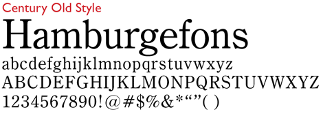
Once an enormously popular choice as a classic, self-effacing text face, it’s been virtually replaced by Times (New) Roman, which has been bundled with every computer operating system for 25 years. Designed for Century magazine in 1894 by Linn Boyd Benton, Century Old Style sets tightly like Times, a newspaper face, so it works well over narrow measures. It is, as you say in typographese, “economical of space.” But it’s brighter on the page than Times, and I’d like to see more of it again. It belongs to a three-member family, with no bold italic complement. Buying information for this and the other nine faces is in this article’s penultimate paragraph.
Another oldie from the ranks of text faces is Plantin. An uncopyrightable name, Plantin is applied to a number of similar faces from various foundries. Shown here is a version created by Bitstream under the name Aldine 721:
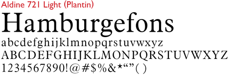
The most popular version of Plantin available today was designed for Monotype by Frank Hinman Pierpont back in 1913. It’s named after the 16th-century Antwerp printer Christopher Plantin, although there’s no record of him ever using a type just like this. It is, however, inspired by classic Dutch designs of the epoch, as was Stanley Morison’s Times. Plantin has signature short descenders, and its overall sturdy design allows it to work better than most text faces in display roles.
Although it dates back to 1907, Morris Fuller Benton’s Clearface has a contemporary look, especially in the ITC evocation shown here:
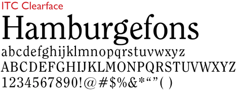
Slightly condensed, Clearface is bright and full of movement, with curious italic-like features here and there, as in the v and y. The lower case a is jaunty and distinctive. It’s very readable, and although too busy for book work, it’s a good face for shorter passages of text, as in brochures and open magazine layouts. The ITC version is available in four weights.
Raleigh wasn’t really ever in the typographic Top 40, but it still gets my vote for more exposure:

The original single-weight version of this face was designed by Carl Dair for Expo ’67 in Montreal and was called Cartier, after the French explorer. After his death, the face was acquired and renamed Raleigh, in an unseemly display of British chauvinism. Adrian Williams added display weights, and Robert Norton the text weight. Raleigh has a stately quality that’s distinctive without being distracting. It’s disparaged as a book type, but it’s still a handsome text face in other contexts. Monotype has released a family of faces based on a redesign by Rod McDonald of Dair’s original, called Cartier Book. It’s too new to be eligible for revival, but it rates a look too.
The last of my straight-ahead text picks is Hermann Zapf’s 1952 design, Melior. The version shown here was drawn by Herr Zapf for Bitstream and is called Zapf Elliptical 711:

It’s classic Zapf. Clear and open, with a wide stance and no extraneous decoration. The round characters are slightly squarish. Its italic is essentially an obliqued roman, save for the a, f, and k. It’s a great all-purpose text face that seemed to slide out of fashion during the 1980s, after a brief resurgence as a typeface of choice among computer magazines.
Like Zapf’s Optima (see “Marrying Types: Sans on Sans”), Eras is a sans serif faces that’s unusually easy to read. Here’s the ITC version:
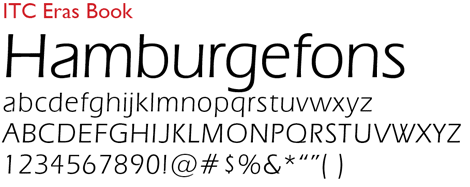
Designed by Albert Boton and Albert Hollenstein in the latter’s Paris studio in 1961, Eras is nothing if not elegant, with its fine modeling and slight incline. Its variety of weights makes it a versatile display face.
Aldo Novarese is better known for his prodigious output of contemporary takes on modern (as in Bodoni) typeface design, but his 1962 Eurostile was an instant classic when it appeared:
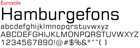
Its squared-off round characters are crisp, mechanical, and its overall feeling is almost cold. Eurostile gave birth to generations of sci-fi movie type, and 50 years later it still looks modern (as in NOT Bodoni).
Adrian Frutiger’s 1954 Univers is arguably the classic Swiss typeface design. But that didn’t stop Frutiger from outdoing himself 22 years later with his eponymous type, Frutiger:
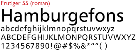
Frutiger’s aspect is more open than Univers, the hooks of its a and g, for example, not looping back to their bowls, but stopping near the horizontal. It has a fresher, more contemporary feel, with a sleekness that older Swiss faces lack. It has many imitators. The Frutiger family has 28 members, spanning five weights, with condensed and italic variants. If you’re only going to have one humanist sans serif in your library, you’d do well to make it Frutiger.
Colin Brignall’s Italia, created in 1974 for Letraset and adopted by ITC, looks a little bit dated these days:
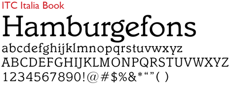
But I like it anyway. Its quirks include dramatically sloping serifs on some letters, a Venetian e, and a t with a cocked crossbar that gives it the appearance of looking up. None of its three weights has an italic version, but its book weight is still workable for short texts, if not for books.
My last nomination is Friz Quadrata:
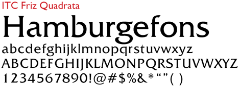
Created by Ernst Friz in 1965 and popularized through its inclusion in the ITC library, it was one of the flavors of the decade in the 1980s. Since Friz designed it, several weights and italic variants have been added by other designers. You still see it from time to time (just look at the title and credits for the Law & Order TV show), and its invocation of classical incised types gives it a timeless quality. Its open bowls give it a certain lightness, despite its relatively heavy stroke weight. Now that you don’t see it at every turn, it’s safe to use it again.
None of these fonts are hiding, and a web search for any of them by name will turn up a host of places to buy. The top contenders include www.fonts.com (Monotype), www.myfonts.com (Bitstream), www.linotype.com, ITCfonts.com, and FontShop.com. Happy shopping.
I’m sure that many of you have been using these faces all along, and perhaps just as many are happy to see these same faces sent packing. I invite both groups to use the “Comments” box below to name other types that you feel have gotten short shrift or have been unfairly or prematurely relegated to the Old Typefaces’ Home. I recently saw a website that offered 163,000 fonts—surely there’s one among them that you’d like to champion.
This article was last modified on August 12, 2021
This article was first published on August 9, 2010
Commenting is easier and faster when you're logged in!
Recommended for you
TypeTalk: What Are Web Fonts?
TypeTalk is a regular blog on typography. Post your questions and comments by cl...

Type, Image, and Border Fonts for Festive Occasions
A collection of great fonts for a multitude of festive uses


