

As you probably know, writers (like me) writing articles for publications (like CreativePro.com) typically have a limit on the length of what we write. A 500-word article is a short, focused piece while a 2,000-word article can touch on a bunch of areas or fully explore one focused line of thought. Going much beyond 2,000 words exits the realm of magazine-style articles and enters the lands of novella, essay, and even short ebooks—none of which fit into magazine-style publications (like CreativePro.com). Once in a while, though, there’s a way to put more information into a piece than fits within the word count. That’s today’s article.
Like the Tardis, this article is bigger on the inside. Here’s my 600-word article with about 6,000 words of excellent design facts, figures, and information that would have taken me months of weekly articles to delivery to you on my own. And all of this great information is packaged in infographics that are fine examples of data visualization from which to draw your own infographic design inspiration. Like that famous time-traveling blue box, this article is bigger on the inside and, thanks to the infographics, attractively packaged. It’s actually part one of a two-part series, with 25 infographics, with about 6,000 words contained by 600, in each installment.
Scattered throughout are even a few infographics about infographics. Be careful with these! Reading them for too long is tantamount to staring too long into the heart of the Tardis! You could become omniscient or a vegetable. (Incidentally, here’s a nifty Doctor Who timeline infographic.)
Each thumbnail links to the full-sized graphic on its original Website. For your convenience we’ve made each of those links pop open in a new tab or window. To return here, simply close that tab or window.
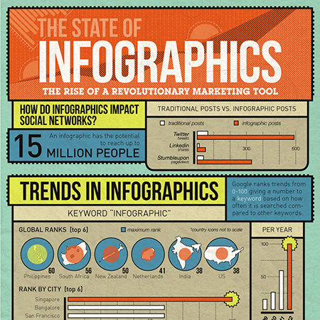
The State of Infographics: The Rise of a Revolutionary Marketing Tool
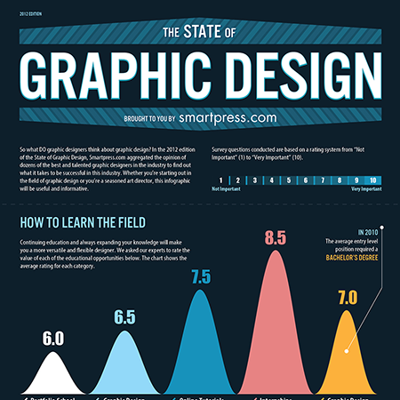
The State of Graphic Design, 2012 Edition
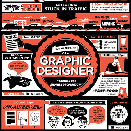
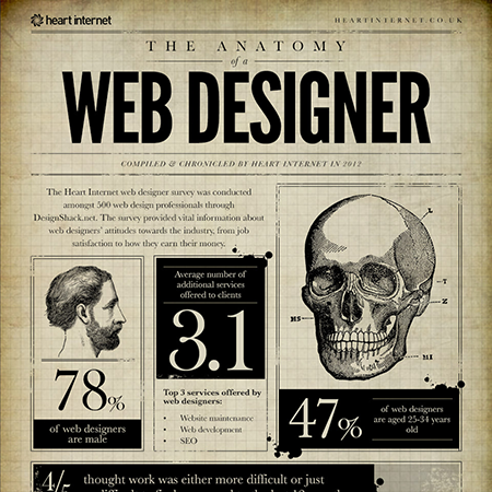
A Day in the Life of a Graphic Designer
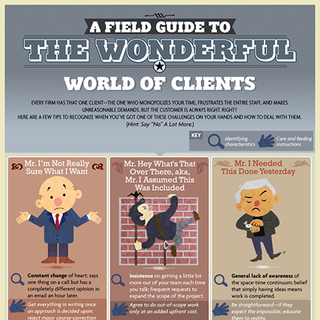
A Field Guide to the Wonderful World of Clients
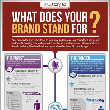
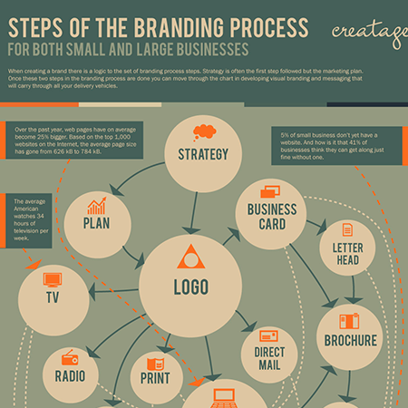
What Does Your Brand Stand For?
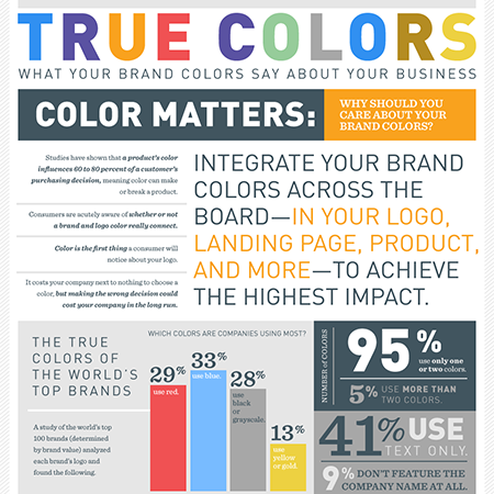
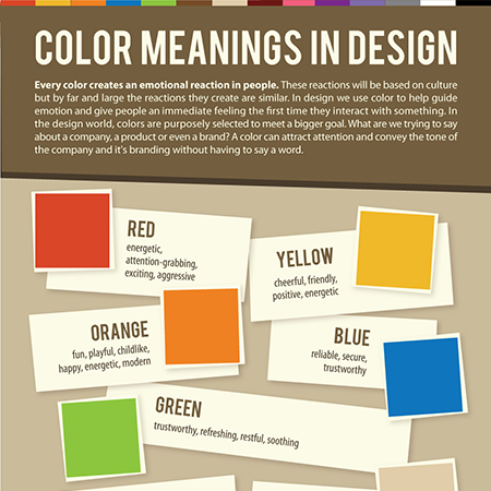
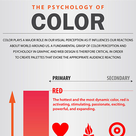
True Colors: What Your Brand Colors Say About Your Business
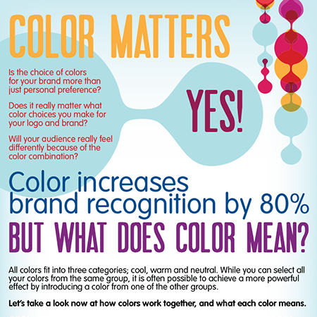
Color Increases Brand Recognition by 80%
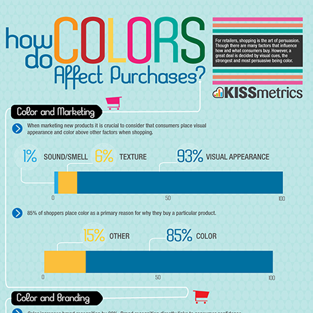
How Do Colors Affect Purchases?
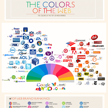
The Colors of the Web: The Colors of the Top 100 Web Brands
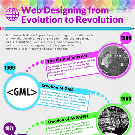
Web Designing from Evolution to Revolution
What to Put Above the Fold for Successful Blog Design &
Why

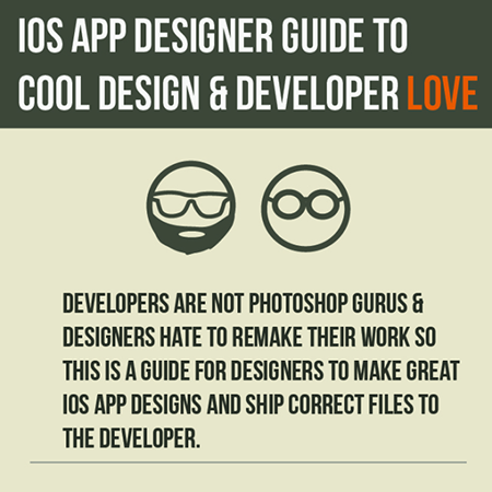
iOS App Designer Guide to Cool Design & Developer Love
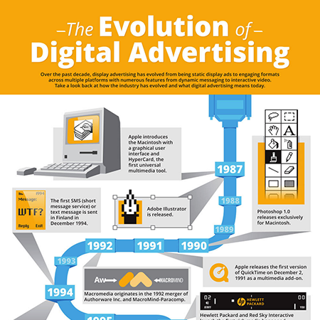
The Evolution of Digital Advertising
If you really like infographic design and data visualization, as I do, follow my Infographic & Data Visualization Pinterest board. You might also want to check out 25 Space-Related Infographics, from August 2012, right after, and inspired by, the Curiosity rover landing on Mars.
Please note: This article links to resources hosted on external Web sites outside of the control of CreativePro.com. At any time those Web sites may close down, change their site or permalink structures, remove content, or take other actions that may render one or more of the above links invalid. As such neither Pariah S. Burke nor CreativePro.com can guarantee the availability of the third-party resources linked to in this article.
This article was last modified on December 13, 2022
This article was first published on February 11, 2013
Commenting is easier and faster when you're logged in!

Recommended for you

Recipes for Applying—and Ignoring—Text Wrap in InDesign
Learn when to apply and when to ignore Text Wrap in InDesign.

How to Highlight Text for Clarity When Designing a Presentation
Learn how to bring attention to important text for better clarity when designing...

How to Add a History Panel to InDesign with Scripts
Wish InDesign had a History panel? Try these scripts that allow you to access al...