Return to “If You Can Read This, You’re Hired”
The Translations
Thanks to Patrick Martin for sending visual translations of the want ads that were so good, I decided to co-opt them for my own use here.
Figure 1 translated:
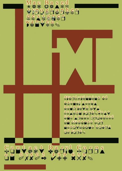
Figure 2 translated:
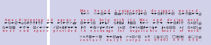
Figure 3 translated:
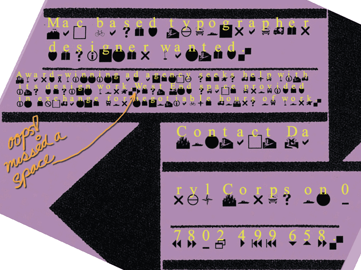
The snarky comment about the missing space is courtesy Patrick Martin — just like a typographer to notice!
The Winners
Forty-six people wrote in with the correct answers. Many more made a valiant effort but missed the crucial addition of “Mac and” in Figure 2. Several people translated “Mac and” as “Mac end,” which I counted as an incorrect answer until one of you showed me that there is, in fact, a defensible reason for that answer.
I’ve alphabetized the winner list below by first name because a few people didn’t include their full names. If you’re on this list, you’ll receive your InDesign Magazine download information within a few days of this article’s publication date!
Amy Kelley
Amy Smith
Angela R. Stewart
Beata Acs
Charles Chandler
Charles Kindall
Chaya Weintraub
Chrissie Palmatier
Clint Ward
Dale Mauk
David Wilson
Deborah Johnson
Don Derenthal
Don Walker
Douglas Stram
George Morten
Graham Wise
Jami Drost
Joel Chia
John Hawn
Jon Hegstrom
Jon Nedry
Jon Wilcox
Karen Gaboury
Kelly Kolton
Laurel Warwick
Lisa Fleischmann
Luvindulli
Margaret Torrance
Maria Anelli
Michael Crumley
Michael Sesto
Mikael Stokkebro
Nelce Kernes
Nick Hall
Nur Monson
Patricia Ward
Patrick Martin
Paul Oratofsky
Pierre
Ressa Mccray
Richard Baskett
Russell Stuber
Seth Benson
Stacy Fontenot
Steve Hume
This article was last modified on June 17, 2023
This article was first published on March 27, 2007
Commenting is easier and faster when you're logged in!

Recommended for you

What Ever Happened to the Fonts that Used to Come with InDesign?
Cue the Grumpy Old Man voice: Back in MY day, Adobe applications came on DISCS,...

More Fonts Are Being Retired from Creative Cloud
Heads up, folks. On June 15, 2020 a number of fonts will be retired from Adobe...