


Market research indicates that almost 90% of page layout software users never tinkered with the vital controls that determine how the spacing of every character and word in their text is managed. These controls lurk under the intimidating rubric of hyphenation and justification.
Instead, most people trust their programs to do the right thing: always composing nice type automatically, by default. It doesn’t always work. In this column, you’ll learn how to actively manage hyphenation and justification and discover that it’s not so daunting after all.
Composition Basics
As I described in the article “Hy-phen-a-tion,” when a program composes type, it tries to fit as many characters as it can on each line, a process called justification. Its primary tool for this is hyphenation, packing as much of the last word on each line as the rules of hyphenation will allow. Together they give their names to the mechanism of text composition: hyphenation and justification, or H&J.
After hyphenation, the other key element of H&J is flexing the spaces between characters and words.
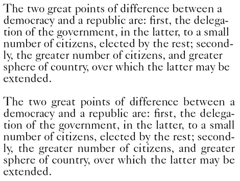
Here’s a simple illustration of how this works in most word processors. In the following text, the upper paragraph is set flush left, ragged right. In the lower sample, it’s set with justified margins, an effect achieved solely by expanding the spaces between characters and words.
In page-layout programs, though, the H&J is more complex. These programs can flex word and character spaces before they attempt to hyphenate, because often the best solution to filling a line is to make it slightly tighter, eliminating the need for hyphenation. Here, for example, is that second paragraph again, followed by a version in which the program has been allowed to squeeze spaces slightly as well as expand them:
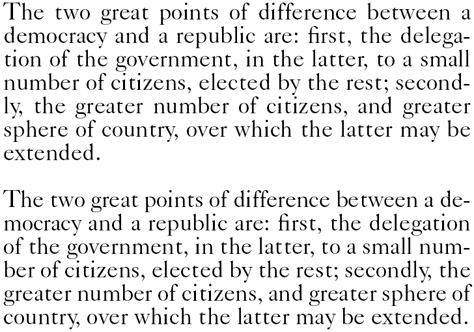
The result is much more even spacing, without the stretching that was particularly evident in the first and fifth lines.
But how do you know what solution is best? The simple answer is that the spacing between characters and words should be as close as possible to that created by the designer of the typeface you’re using. This is achievable because those designers build into each font the spacing that works best for that face. This is defined by the side bearings of each character (the slivers of space on the sides of each one) and the width of the word space, which is defined as a character in every font.
When you set type with a ragged margin, what you normally get is this “natural” spacing. When you set with justified margins, this spacing becomes distorted.
Your job is to keep the distortion to a minimum, and the means to accomplish that are your H&J controls. You decide (a) whether to allow any hyphenation, (b) how many characters must precede and follow a program-inserted hyphen, and (c) how many consecutive hyphenated lines you’ll allow. The more hyphenation flexibility you allow your program, the less it will have to rely on adjusting spacing to fill lines.
Your more subtle controls lie in defining the ranges in which you’ll allow your program to flex word and character spaces. If these ranges are too extreme, you get very pinched or very loosely spaced type. Neither are pretty, and too-tight type is difficult to read. Slack spacing increases the likelihood of having tight lines sit above or below loose ones, and the clash of their color is distracting. (Tight lines look darker, loose lines lighter.) You can also end up with whole paragraphs setting tighter or looser than their neighbors, making for blotchy-looking pages.
Spreading the Damage
How much to allow spaces to be to stretched and squeezed depends on your type’s measure, or line length. Over a wide measure (say, 25 or 26 picas), as in a hardbound book, lines can routinely contain 11 or 12 words and 60 or 70 characters. That’s a total of over 80 spaces that can be subtly stretched or squeezed to justify a line with little disruption to a type’s ideal spacing.
In a newspaper column, though, you find the same words as in a book (hence the same hyphenation issues), but a measure of only about 12 picas, filled with 5 or 6 words and about 35 characters. The only way to fill such lines is to make more exaggerated spacing adjustments.
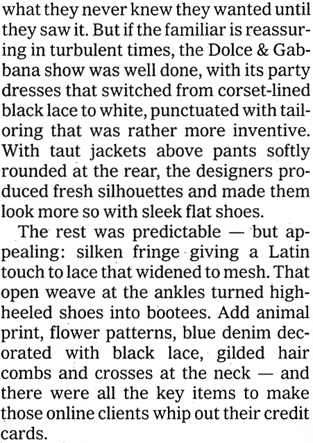
This scan of real newspaper type illustrates the line-to-line spacing variations that are inevitable when setting type over narrow measures. The original was set in relatively small 9-point type (over a 12-pica measure), but this couldn’t keep the first paragraph from setting tight and the second from setting much looser. The difference in color between the two paragraphs is apparent.
The upshot is that you can afford more restrictive spacing controls for long lines, to assure that that spacing is consistent among them. But over narrow measures, you have to allow more spacing flexibility, which is why the spacing of newspaper type often ends up so distorted. In in-between measures, there’s a rainbow of intermediate solutions.
The Goldilocks Solution
All page-layout programs have similar approaches to specifying H&J spacing ranges. They let you specify one value for how tight you’ll allow word and character spacing to get, a second value to define how loose you’ll allow it to be, and a third value that’s juuust right. These values are typically called minimum, maximum, and optimum or desired. In InDesign, they’re found under Justification in the Paragraph palette menu. In QuarkXPress, they’re in the Edit/H&Js dialog box.
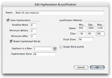
In QuarkXPress’s Edit Hyphenation and Justification dialog box, shown here, you define the ranges in which the program can manipulate word and character spaces, as well as set guidelines for how hyphenation should be handled.
Both InDesign and QuarkXPress consider a value of 100% to be “normal” for word spaces, from which you range above (for maximum) and below (for minimum). On the other hand, they consider 0% to be normal (that is, a 0% deviation from normal) for character spaces, a value you vary with positive and negative values for maximum and minimum.
It’s always prudent to fix the optimum spacing values for both word and character spacing at 100%, or the equivalent. This tells the program that its goal is stick as closely as possible to the spacing defined in the font itself.
Generally, the optimum value is the only one that affects how ragged-margin text is set. Both QuarkXPress and InDesign only take maximum and minimum spacing values into consideration when setting type with justified margins.
What Values Work?
Even at a given measure, no one set of H&J values will always work. Your typeface makes a difference, because some—say, Bodoni—need a looser set and look particularly bad when allowed to set tight. By contrast, some typefaces, such as Times Roman, were designed for newspaper use and have slightly compressed character widths. Settings that work for such faces over narrow measures won’t work for a wider-setting book face, such as Garamond.
Sans serif faces tend to suffer more from tight spacing than seriffed faces do. They also need special treatment in wider measures, where spacing that’s too loose can make these faces look particularly airy.
Point size also matters, because that helps determine how many characters (hence spaces) appear on each line.
Nevertheless, there are some guiding principles to keep in mind and a couple of starting recipes that I can recommend.
Principle number one is that tight type is harder to read than loose type.
Aesthetics aside, doubling the width of a word space does less damage to the readability of type than halving it. Your minimum and maximum values, then, shouldn’t be symmetrical—you should always allow relatively less tightening than loosening. When programs can’t compose lines without violating your specified spacing ranges, they always set lines too loose, never too tight.
For a book-width measure of 25 picas or so, then, I’d recommend trying the following values as a starting point.
Word spacing
Minimum 90%
Optimum 100%
Maximum 125%
Character Spacing
Minimum -5%
Optimum 0%
Maximum +10%
For narrow newspaper and newsletter columns in the 12 to 15 pica range, try these more liberal ranges:
Word spacing
Minimum 80%
Optimum 100%
Maximum 150%
Character Spacing
Minimum -10%
Optimum 0%
Maximum +25%
The Proof of the Pudding
To judge the effectiveness of your settings, look for loose and tight lines. These are easier to see in print than on-screen. In narrow measures, look for dark or pale paragraphs, signs that the program can’t find a happy spacing medium. Note that such problems may mean that you’re using too large a point size for the measure, in which case you’ll be hard-pressed to find a cure through tweaking H&J settings.
Look for excessive hyphenation. In wide measures it means you haven’t provided enough flexibility to find good line-ending solutions through spacing adjustments. In narrow measures, loose lines can result from not letting the program hyphenate enough; raising the number of consecutive hyphens can help.
InDesign can highlight lines that couldn’t be set without violating your H&J specs. You can turn on the feature in the Composition dialog box under the File/Preferences menu. The system uses three intensities of yellow to highlight badly set lines, the darkest being the worst. This is distracting while building pages, but it’s useful when first establishing your H&J specs as well as during proofing.
Turning on InDesign’s Highlight H&J Violations option flags in three shades of yellow any breaches of your specified spacing ranges. The palest, least serious of these are often so minor as to not be worth fixing.
More Exotic Solutions
InDesign has a couple of additional H&J tricks that haven’t been widely adopted elsewhere yet.
One is glyph scaling. This allows you to specify a range in which you’ll allow the program to alter character widths to help find line endings that result in more even type color. This manipulation drives some type purists insane, but it’s OK with me. If widths are altered in the range of ±2%, it’s virtually impossible to spot the difference. It’s surprising what a difference this tiny adjustment can make.
InDesign also gives you the option of using either its so-called Single-line or Paragraph composer. The first composes type one line at a time, without regard to how other lines have been set. The Paragraph composer composes whole paragraphs at a clip. If it comes to a line late in a paragraph that can’t be composed within the stated spacing limits, it will go back to the beginning and look for alternative line-endings that can create a better outcome for the troublesome line. Although it’s slightly slower than the Single-line composer, it often yields better results.
Recycling Your Efforts
QuarkXPress allows you to create named H&J settings that you can apply through its Style/Formats dialog box. Giving them intelligible names helps when you want to re-use them (for example, “24-pica 13/14 Perpetua”).
For InDesign, H&J specs are set from within the Paragraph palette, and they can’t be saved independently. To recycle H&J settings for future use, then, save them as part of a paragraph style, again with a logical name.
Taking control of H&J isn’t very complicated, and the results are well worth the minute or so of effort it takes to customize your H&J specs for individual situations. The appearance of your type is too important to let it happen by default.
This article was last modified on August 13, 2021
This article was first published on December 16, 2009
Commenting is easier and faster when you're logged in!

Recommended for you

Willoughby Design and the Evolution of a Typographic Paper Promo
Nothing makes a designer happier than paper and type. So when Neenah Paper asked...
Type Posters, Prints, and Notecards
You don’t have to be a full-on type nerd to appreciate the artwork for sal...

Hand-Lettering Lovers, Rejoice
You may have heard Lisa Congdon’s name before. She’s an artist, illu...