
Photoshop offers Warp, which allows you to bend artwork. Warp is great for cylindrical mapping, or bending art in a flag-like wave. The Liquify filter allows you to push pixels around as if you were working with wet finger paint. But to place artwork realistically on an irregular surface, you need Displacement Maps.
Displacement mapping requires two players: The image you wish to warp (whose pixels you wish to displace), and the image to be used as a map (the displacement map). Usually, maps are grayscale images.
In this exercise, we need to “print” a logo on a sweatshirt so that it falls realistically down in the folds of the cloth.
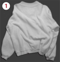
1. To create the map, duplicate the image: Image > Duplicate. Name the image ShirtMap (Figure 1).
Figure 1: Duplicate the image to begin creating a Displacement Map.

2. Convert the image to grayscale: Image > Mode > Grayscale.
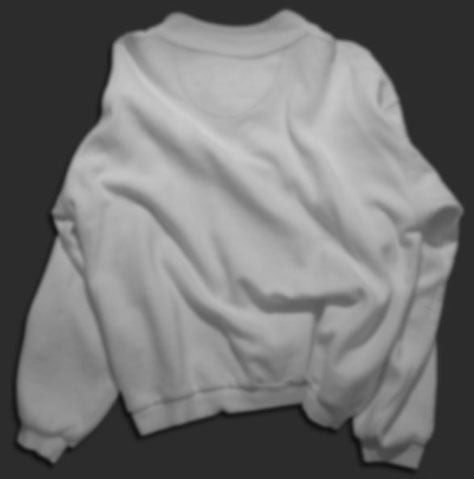
3. If there’s a lot of little granular detail, the mapped artwork will go into every little nook and cranny. You just want the artwork to follow the general shape of the cloth, not every little tiny nub. So blur the image to smooth out texture, but keep the “bends.” Choose Filter > Blur > Gaussian Blur. Experiment with the sliders until the surface is smooth, but you still have the light-and-dark of the fabric’s folds (Figure 2).
Figure 2: Blurring the grayscale map enables the artwork to follow the large folds of the fabric smoothly, without being roughened by the texture of the fabric itself.
4. Save the map image as a PSD or TIFF. You can close it or leave it open?—?it doesn’t matter. But the image must be saved to disk so Photoshop can identify it when you need to use it as a map.
5. Return to your original color image by clicking on its title bar.
6. Place the artwork onto the shirt. You can copy and paste from another image, or use File > Place to bring in either vector art or another image. Use the handles of placed art to scale and rotate as necessary. When you’re finished positioning and manipulating the artwork, click the checkmark in the Options bar at the top of the interface, or press the Enter/Return key on your keyboard (Figure 3).
Figure 3: Artwork positioned, and ready to be distorted by the Displacement Map.

7. If you use File > Place for vector artwork, the artwork will automatically be converted to a Smart Object. While vector Smart Objects offer the advantage of being endlessly scalable with no loss of detail, they won’t allow themselves to play with Displacement Maps. (Note that raster Smart Objects are subject to loss of detail when scaling, since they are pixel-based.)
To convert the Smart Object to pixels so you can distort the logo, make sure you are satisfied with the size and angle of the artwork, and then choose Layer > Rasterize > Smart Object.
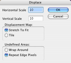
8. Now it’s time to use the Displacement Map. Choose Filter > Distort > Displace. In the Displace dialogo box (Figure 4), accept the default options and click OK.
Figure 4: The default Displacement settings are usually satisfactory, so just click OK.
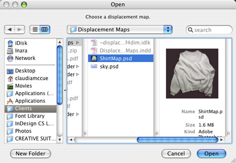
Photoshop then asks which image you want to use as the Displacement map. Navigate to the map image you created, and select it (Figure 5).
Figure 5: Choose the map image you created earlier.
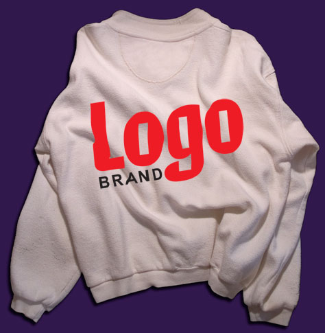
9. The artwork is “bent” nicely, but still looks fake. You need to allow the shading of the shirt show through the logo artwork. To do this, change the blending mode of the logo artwork layer to Multiply (Figure 6).
Figure 6: the artwork seems to be floating above the shirt (immediately below). Change the blending mode of the artwork layer to Multiply, and then the shading of the underlying image shows through the logo artwork (below center). The Blending Mode control is at the top of the Layers palette (bottom).


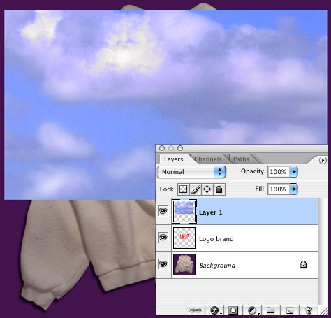
10. For even more fun, you can make the logo artwork act as a mask for layers above, by creating a Clipping Group. Even though we tend to think of masks as needing to be above the content they mask, Clipping Groups work from underneath.
Above the logo art layer, create another layer containing artwork. You can copy and paste, or use File > Place to bring in raster or vector art (Figure 7). You won’t need to rasterize a Smart Object for this trick to work, though.
Figure 7: In a layer above the distorted logo, place artwork to be masked by the shape of the logo art.
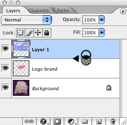
Once the top layer is in place, hover over the dividing line between the log art layer and the new layer above it. Hold down Alt (Windows) or Option (Macintosh), and when you see the strange little icon made of two interlocking circles and an arrow, click on the dividing line.
Figure 8: Creating a Clipping Group. Hover between the layers, hold down the Alt (PC) or Option (Mac) key, and then click (immediately below). The thumbnail for the top layer is indented, and now sports a downward-pointing arrow indicating that it’s masked by the contents of the next layer down. The masked layer also inherits the blending mode of the bottom layer of the group (bottom image).

This how-to originally appeared on Practicalia.net.
This article was last modified on January 6, 2023
This article was first published on February 28, 2011
Commenting is easier and faster when you're logged in!

Recommended for you

Create Your Own Photoshop Filters With Filter Forge
Recently, Filter Forge, Inc released version 4.0 of their unique Photoshop plug-...
Photoshop Power Shortcuts on Adobe TV
After the conclusion of the Adobe MAX conference in May, I posted a news item ab...

Building an Underwater Scene in Photoshop, Part 1
The Oscar-winning film The Shape of Water opens with a stunning sequence in whic...