Antique Gothic Grotesque: Deciphering the Typeface Name Game
The previous installment of this column opened the can of worms known as type classification. It’s the process of assigning names to various kinds of type. The question of whether a face should be called an italic or an oblique is just the tip of the iceberg.
For example, what label would you apply to the following face?
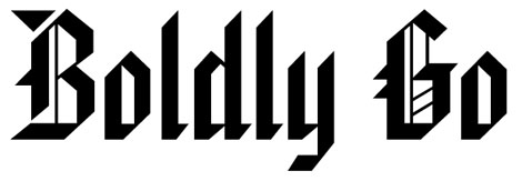
Most of you would probably say “gothic.” But that will get you into an argument with those who reserve that name for faces that look like this:

But in fact, that first sample, designed in 1932 by Morris Fuller Benton, is named American Text. To the 21st-century eye, it looks about as American as lederhosen, and it probably wouldn’t be your first choice for text, either.
Knowing how typefaces are named and categorized is a very practical matter. First, it makes communications clearer among designers, clients, typesetters, and editors. Second, which category a typeface belongs to determines how you set it. Which point sizes you use, which leading and measure you select, and which tracking you apply to your type varies according to whether the face is an old-style or a modern, a geometric of humanist sans serif. These are topics for future columns.
The Face of Darkness
Types resembling American Text were used by Gutenberg for his first movable type, and they copied popular contemporary writing styles. The Italians of the period called this style textura, which refers to its woven appearance and derives from the same Latin word that gave us the term text. Thus Mr. Benton’s reference.
That said, the most common name used in the United States for such types is blackletter, simply because they look so dark on the page. The once-common alternative blackface has been virtually abandoned. The term gothic, though, is still commonly used — particularly in Europe — as is fraktur, which when strictly applied refers to blackletter forms used in Germany. You’ll also see the names Old English and Gothic Antique used from time to time, just to add to the confusion.
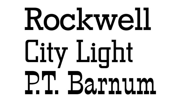
Antique would seem to be a good name for a style with such deep historical roots, but that would be too simple. In the early 19th century, British type founder Vincent Figgins introduced a face that had a consistent stroke weight — sometimes called a monoline stroke — but with bulky, brick-like serifs. Figgins called it Antique, an odd choice for a face with no historical precedents.
Faces like the following now go by the common-sense name slab serif. When they were first introduced they were decried as “monstrosities.” Of these three, Rockwell most closely resembles Figgins’ original. P.T. Barnum was originally called French Clarendon.

As a name for this new species of types, the label didn’t last. It was replaced by the even screwier name Egyptian, which had been earlier introduced by William Caslon IV in 1816 as a name for the first sans serif typeface on record. (As a name for sans serif faces, this didn’t stick either.) Why Egyptian? Simply because Egypt was the flavor of the month in those days, what with Napoleon’s invasion and archaeological excavations and mummies and all.
When square serifs were added to designs based on traditional text faces, they were eventually called Clarendons, after the first design so executed, in the 1840s. Where that name came from is still anybody’s guess.
Although the serifs of different Clarendons vary in bulk, they share the squared-off shapes of the original.

A further distinction between slab serifs and Clarendons is that in the former, serifs meet character stems at a sharp angle. In Clarendons, they join with a curve and are called bracketed serifs. Those of slab serif faces go by the uncharacteristically sensible name of unbracketed.
In the Clarendon characters on the left, the serifs meet the stems with an arcing shape called a bracket, a feature shared with all old-style faces. The serifs on the Stymie sample on the right are unbracketed.

Caslon’s first sans serif type didn’t generate much interest, but by 1830 the look came into style in a big way. In Britain, William Thorowgood introduced a line of sans serif faces that he labeled Grotesque, a self-effacing name for what was at the time admittedly a weird-looking type. The name stuck for the genre.
Except, that is, in the U.S., where about that same time the Boston Type and Stereotype Foundry introduced a line of sans serif types it decided to call Gothics.
The French, in turn, started calling sans serif faces — ready? — Antiques.
This roundabout itinerary could go on and on, but let’s summarize what we’ve learned by means of another quiz. From the following typeface samples — all identified by their real names — what would you surmise is the meaning of the typographic term antique?

Yes, it’s a rare quiz in which all answers are correct, including, “This is nuts.”
Attempts at Consensus
Various individuals and standards bodies have tried to rationalize the many regional and historical naming trends. In the 21st century, it may still make sense to refer to types based on 15th-century precedents as old style, but is it logical to call types from the 17th century moderns?
Ultimately, the names that work best are the ones we all agree on. The Association Typographique Internationale (ATypI) has created a fairly compact, historically insightful taxonomy of types. It’s excellent, and it’s been adopted by Adobe Systems for its own type library. But it suffers in the U.S., at least, from using labels such as Réale and Manuaire, which work best if you’re a type historian who speaks French.
The German Deutsche Industrie Normen (DIN) standards association has created a system using nine categories and some 40 subcategories. Encyclopedic, but a bit unwieldy.
As good as these systems are, I’d like to offer a non-academic synthesis of what I’ve come to know over the years as familiar names for categories of faces that reflect both their appearance and their historical roots. In roughly their order of development they are:
• Blackletter. I use the term because it refers to nothing else. The term gothic is unfortunately ambiguous, and fraktur in some contexts can have a very specific meaning.
Various “old English” faces also fall under the category blackletter.

• Old-style. These are designs based on the types developed in late 15th-century Italy and upon which the bulk of our contemporary seriffed text faces are based.
The earliest of these are often called Venetian. They have a signature angled crossbar in the lowercase e. Jenson is a classic example, as shown below.

Dividing the main body of old-style faces becomes a quagmire. They’re sometimes distinguished by regional influences, such as French (often called Garaldes; think Garamond), English (e.g., Caslon), and Dutch (Times Roman has Dutch roots). But they are all marked by more contrast between the thick and thin parts of their strokes than the Venetians, and the bar of the e is horizontal. As with the Venetians, their stress is angled to the left. (Stress is the angle connecting the thinnest parts of the strokes of round letters, in imitation of a nibbed-pen stroke.) Their serifs are bracketed and meet the stems at an acute angle.
The most obvious change that occurred as old-style designs yielded to what we call transitional was the change in the stress of the characters from slanted to vertical, as the red lines here indicate. The type on the left is set in Bembo, on the right, the transitional Baskerville.

• Transitional. This is a thinly populated group, but one with great historical importance. These faces resemble old-style faces, but the contrast between their thick and thin strokes is more pronounced, and their stress is vertical or nearly so. The transition in question is to the so-called modern faces that followed, which took these features to extremes.
Although the true transitionals appeared in the mid-18th century, designs based on them have persisted over time, particularly the so-called Scotch faces. Developed in Scotland in the 1830s, this style married the stroke weights of old style faces with the vertical stress and right-angle serifs of modern faces. They quickly became the standard for book printing and remained so well into the 20th century.
Although Baskerville is the classic transitional face, W.A. Dwiggins’s Caledonia, created in 1938 and based on Scotch precedents, has many of the same features.

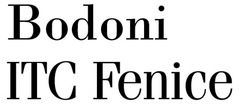
• Modern. These faces are marked by extreme contrast, with the thin strokes of characters reduced to hairlines. They’re based on idealized forms deriving from the work of Philippe Grandjean, who was assigned by Louis XIV to design a royal typeface of strictly rational design. They’re sometimes called Didones, after the Didot family, who helped develop the look. Today they look rather old-fashioned.
Bodoni has become the archetypal modern type, an Italian face built on French precedents. Aldo Novarese’s 1980 Fenice continues the tradition.
• Slab serifs. When these are based on characters with a uniform stroke weight, they’re sometimes called Egyptians. It’s better just to call the slab-serifs. To distinguish slab-serif faces with modulated stroke weights, use the term Clarendon.
Slab-serif Memphis’s name evokes its “Egyptian” roots. Sharing its distinctive squared serifs, the entire Century family are considered Clarendons.

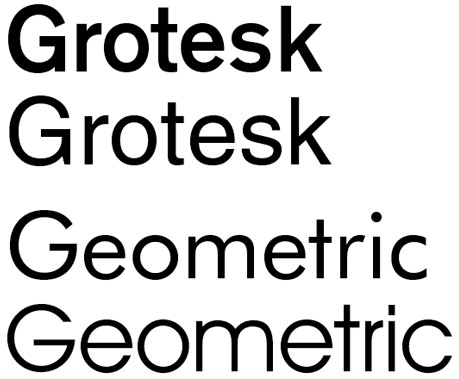
• Sans serif. In practical everyday typesetting and design terms, it’s usually sufficient to distinguish between sans serifs such as Helvetica, which are derived from the old grotesques have some slight variation in stroke weight and some calligraphic influence, and those that are geometric in construction. Geometrics have uniform stroke weights and adhere to a certain mechanical purity, typically featuring perfectly circular forms for Os and for the bowls of characters such as b and p.
In the upper pair of samples shown here, the lineage leading from the 1900 Akzidenz Grotesk to the 1957 Helvetica is apparent. Likewise, the geometric Bauhaus classic Futura set the stage for ITC Avant Garde Gothic 40 years later.
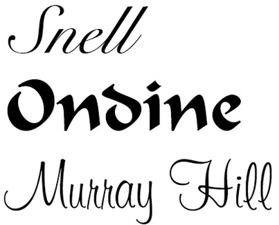
• Scripts. These are faces that rely mainly on calligraphy for their forms, including handwriting and brush lettering. Here are a few examples:
Not Enough Cubby Holes
The problem with any scheme for categorizing typefaces is that you end up feeling obliged to have a place to file every face that’s ever been made. That’s hard enough without today’s self-conscious trend to create faces that defy categorization. At some point, you just have to toss a lot of them in the “Others” basket.
That there’s been no Linnaeus to universalize type classification might not so terrible. There are worse things than having fanciful or imprecise names for creative works. The important thing is being able to communicate clearly about type, even though typeface names alone are often insufficient to get the message across.
With the next few columns, I’m going to start addressing some nuts-and-bolts typesetting issues, starting with kerning. If you’re impatient to see some specific aspect of typesetting discussed, just let me know by clicking the word Comments below.
This article was last modified on August 15, 2021
This article was first published on October 5, 2009
Commenting is easier and faster when you're logged in!
Recommended for you
Creating Better Brand Images with Graham Clifford
Branding is the term used to describe the creation of an identity for a product,...
InDesign Type: Choosing the Right Leading
By understanding and applying a few key principles, you can determine the proper...

The Sign Painters
It’s easy to take for granted that the existence of digital tools for creating g...


