

At Macworld Expo on January 9, Steve Jobs unveiled the iPhone, which combines a phone, widescreen iPod, and Internet device in one slim package (Figure 1).
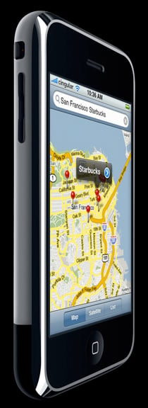
Figure 1. The new iPhone is 4.5 inches tall, 2.4 inches wide, and 0.46 inches thick.
The traditional business community will look at the iPhone the way it always looks at Apple products. “Not enough security.” “Won’t work with my (fill in the blank).” “Too expensive.” “A consumer product.” They don’t realize that the iPhone is the beginning of a massive change in computing. There are millions of people chained to desks who should be out in the world, talking to customers and interacting, while also checking email, reviewing inventories, and working out the night shift schedule. They don’t really need a big computer.
Yes, those solutions exist now, but there’s something about Apple that makes the concept seem realistic. Like his buddy, Al Gore, Steve Jobs has an uncanny knack for getting people excited about ideas (easy computing, global warming, the Internet, digital music, etc.) that are not particularly unique and seem almost inevitable once presented on bigger-than-life rear-projection screens.
Unchained Melodies and Spreadsheets
So doesn’t true mobile computing change how we present information? It certainly should. The Web for a large desktop screen and the Web for an iPhone are considerably different (Figure 2). Only the transmission of the Web has become mobile, not the content, which is currently designed for people sitting in chairs, completely dedicated to the information at hand.
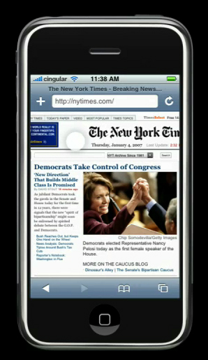
Figure 2. Is this the best way to read The New York Times on a tiny screen?
The digerati talk about Web 2.0 or the Semantic Web. I say, what about the Small Web? What does it mean to make your network available and fully functional to people with 3.5-inch screens as the window? You think it’s tiresome waiting for a Flash animation to load now? See what it feels like while you’re standing in line at the airport.
As Jobs’ mentioned in his keynote, one problem with previous mobile devices was that their limitations meant designers were forced to create with one hand tied behind their backs. Users, however, want full Web functionality. While the first iPhone can’t completely replace a traditional computer, the foundation is there.
Small Is Beautiful
We need less information. We save too much, we have access to too many things, we over-protect and over-value meaningless drivel that was once thrown out at the end of most days or certainly most years. It will be refreshing to see companies struggle with down-sizing information the way they have down-sized everything else. But down-size they must! (Maybe we should issue “word credits” the way they issue carbon credits-spew out too many words and you have to trade with a bunch of Buddhist monks so it evens out.)
This is good news for the creative community, where less-is-more has long been the thing. It’s also good news for designers who have strong print aesthetics — mobile design has more in common with print than with the Web. You don’t approach designing a 3 x 5 postcard the same way you do a letter-size brochure.
Now is the time to start lobbying for more staff, pitching to clients, and working on new self-promo pieces. The eBook has finally arrived, only it sings and dances, too. What a great new format. It requires new design techniques, of course, but most exciting, it requires editing. People on the move want billboards, not encyclopedias.
Uh oh. Didn’t we fire most of the editors a few years ago? Time to ride through all the brew pubs and Starbucks in the land shouting, “Come back. We need you! You matter again!”
No Time to Waste
If I were running a creative company, I would fight for me (and my clients) to have an iPhone-specific Web site by the product’s June release date, and to have all PDF downloads available in an iPhone-optimized format at the same time. Don’t take a “wait and see” attitude. Take a chance. Start re-designing your information and its architecture for this format. It’s different and it matters.
This article was last modified on May 19, 2023
This article was first published on January 12, 2007
Commenting is easier and faster when you're logged in!
Recommended for you

Making Lightweight Animated GIFs in Photoshop
Still images can look great on websites – but moving images are more atten...

Veer Marks Industry-first with New Shuttleboard Interactive Lightbox
Veer, a provider of visual elements and design-related products to the creative...
Magazine PIB Ad Revenues Continue to Rise
Total magazine rate-card-reported advertising revenue for the month of October i...