

Each month “Around the World in ePublishing” looks at a different digital publication—sometimes an ebook, sometimes an etextbook, sometimes a digital magazine or catalog. With each publication we’ll examine the techniques and technologies used, the good and bad choices the designer and publisher made, and sometimes even how to incorporate the same features and effects into your own publications.
This time we’re looking at Huffington, a digital magazine app from the Huffington Post.
What Is It
iPad magazine app built using Adobe DPS.
Cost: Free.
Get it: Here.
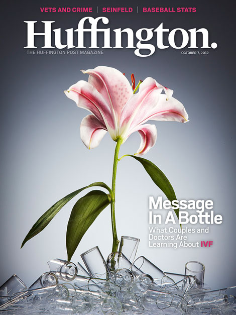
Figure 1: Huffington digital magazine.
Huffington is a digital magazine app for iPad-only and not to be confused with the Huffington Post apps for iPhone and Android tablets and phones. The former is a digital magazine app built using Adobe Digital Publishing Suite and incorporating some content exclusive to the app. The latter is a front-end graphical user interface to the content of huffingtonpost.com.
Although some magazine apps list in the App Store as free only to charge you for every issue thereafter, Huffington really is free. Once upon a time each weekly issue cost $0.99, or you could subscribe to a full month for $1.99 or an entire year for $19.99; now, however, the publication has wisely gone totally free. All new issues are free, as are back issues going back to June 2012. Subscribing in-app delivers each new issue automatically (also free, see Figure 2).
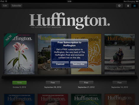
Figure 2: Free is good.
The Good
With the exception of a few flaws mentioned below in The Bad, the magazine is very well designed (see Figure 3). Ironically—and there’s a lot that’s ironic about Huffington—though there never has been a print edition of the publication, this app feels more like a printed magazine than most other magazines that do also publish in print. The layouts use consistent grids, lines of force, and print-influenced page geometry. Even the page background works to provide the illusion of a printed magazine—it’s an off-white color very close to the tone of physical magazine pages.
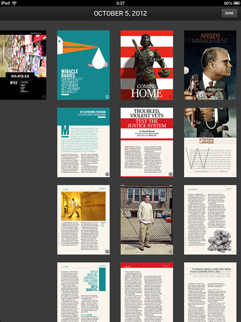
Figure 3: This iPad-only magazine looks like it was designed for print.
The app is always up to date as many of the headlines, particularly in sections like “Pointers” and “TFU,” open in-app browsers containing live Web content. The “Letter from the Editor” page similarly opens Twitter and Facebook to the Huffington accounts.
Embedded browser windows are also used to enable a feature Web users take for granted but most magazines can’t offer: conversations around articles. Many of the articles and department pages include balloons like those in Figure 4. The balloons are buttons that pop open the comments about the article and a comment submission form so that the current reader can join in on the conversation (see Figure 5). The number inside the balloon identifies the number of comments so far on the article. Of course, what’s happening behind the scenes is that the publication’s website is hosting the comments and the button is opening an embedded Web browser connecting to the comments page. Readers won’t necessarily know that, however, and if the same article is presented in Huffington and on HuffingtonPost.com, the conversation can expand rapidly, increasing readers’ time in the app and inspiring them to return to follow the ongoing conversation. That’s reader engagement gold.
Figure 4: Some articles include conversation buttons displaying the count of comments.
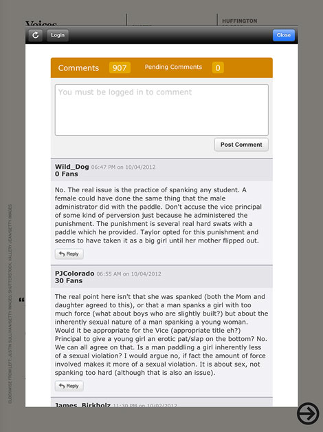
Figure 5: Readers are engaged in the article through conversation in a way few magazines offer.
Arrows are used as simple, consistent iconography to communicate when readers should swipe down and right.
The use of a horizontal-scrolling timeline via a Pan & Zoom overlay is a perfect way to present infographics such as the timeline about the effect the Wild Card has had on Major League Baseball each year since 1995 (Figure 6). And the use of popups to provide contextual content on the rogues in the former Disney child star gallery is very well done, even though the main image isn’t. Each star’s face is a button that activates a one state of a multi-state object containing all the “Celeb Record Sheets” (see Figure 7).
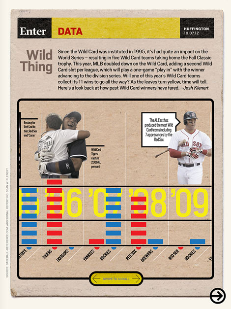
Figure 6: A Pan & Zoom overlay lets readers scroll horizontally through a timeline.
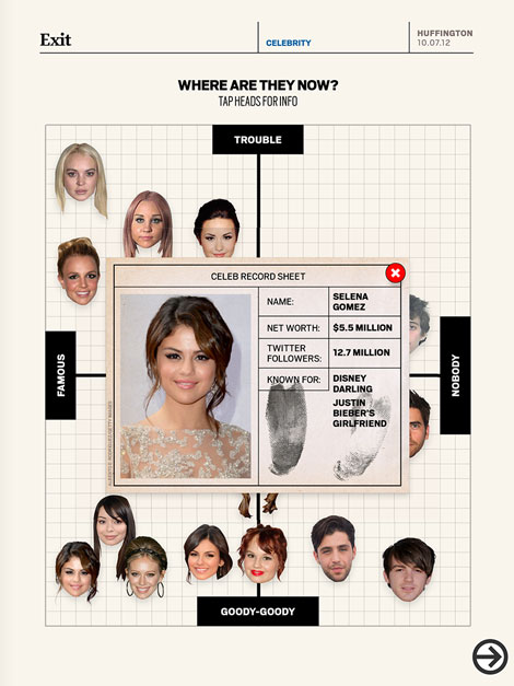
Figure 7: Popups triggered by the face-buttons provide additional information.
The Bad
Other than the good layout, the first thing that pops from the pages is the rich imagery. Like any good magazine, Huffington is loaded with photos. Obviously this is not a “bad” of the magazine. What could be better, however, is the treatment of photo-heavy layouts such as the one in Figure 8, which, ironically, is the “Moving Image” feature. Instead of setting all those static full-page (and a couple of not-quite-full-page) images in separate pages like a print magazine, the designers of Huffington should have taken advantage of the medium’s ability to create image slideshows. Let readers swipe horizontally to change images on the same page rather than have to scroll down to the next page. Of course, a counter argument could be made that maintaining the established scroll-down navigation, with the familiar down-pointing arrow icons, works better than introducing a new lateral-swiping action and corresponding directive icon to the reader.
Figure 8: A pictorial in the “Moving Image” feature is, ironically, presented as static images on multiple pages.
Some of the imagery, too, is amateurish. Take Figure 9 for example. The car image is obviously squished.
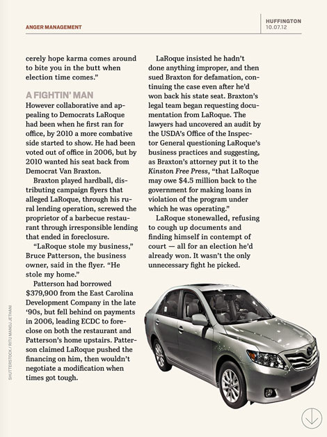
Figure 9: An unintentionally compact car.
Another example of less than stellar design is the “Where Are They Now?” feature in Figure 10, which I praised above for its popups. There’s a lot that could be improved about that infographic. This wouldn’t be the first time the demands of a weekly publication schedule have led to rushed art.
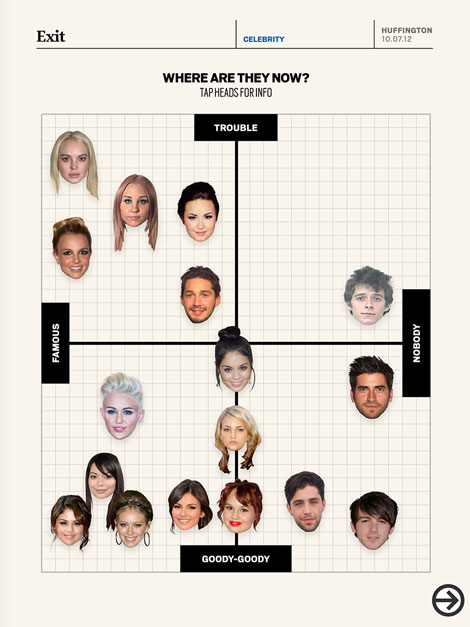
Figure 10: Although the point gets across, this design could have been much better.
Cross-branding with other Huffington Post properties is also so-so. Obviously all the online features such as comments and the blurbs in the “Pointers” section connect to content on HuffingtonPost.com, but they don’t really promote HuffingtonPost.com. Moreover, HuffPost Live, which presents news and editorial in video format, is mentioned only once in the pages of Huffington. That page would be the one in Figure 11. Why didn’t the editorial director of the app embed videos from HuffPost Live into the magazine? Why aren’t more of the stories connecting to videos that relate to the copy? The cross-branding could be much stronger not only in the app but on the other services as well. Huffpost Live doesn’t even use the established colors of the Huffington Post brand. I would really like to see Arianna and company follow the lead of The New York Times and the Wallstreet Journal, cross-promoting and connecting all the properties with a strong, unified brand identity.
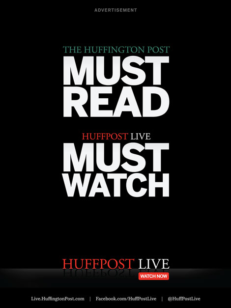
Figure 11: Only here in this full-page ad is the reader really presented with cross promotion of Huffington Post properties.
Let Me Feature Your ePublication
Do you produce electronic publications? If so, I’d really like to see them for possible profiling in “Around the World in ePublishing with Pariah Burke.” I’m interested in any type of modern electronic publication built as EPUB, KF8, MOBI, PDF, digital replica, or interactive tablet publication. Please send one or more examples of your publication—or URLs thereto—to ep*******@*******ah.com?subject=ePublishing%20World%20Example%20Submission> ep*******@*******ah.com .
This article was last modified on December 13, 2022
This article was first published on October 8, 2012
Commenting is easier and faster when you're logged in!

Recommended for you

Five Career Challenges Every Designer Faces
Five challenges familiar to designers and advice for coping with them.

Making Lightweight Animated GIFs in Photoshop
Still images can look great on websites – but moving images are more atten...

How to Find and Insert Stock Imagery in PowerPoint
Nowadays you never have to leave PowerPoint to access high-quality (and sometime...