

Typography
When speccing type, have you ever been confused by which fonts were included with your OS or application? This handy chart spells it out. Via the InDesign User Group on Google.

With so many great fonts out there it’s tough to select which ones to include in CreativePro.com’s Best of the Blogs, but these two just screamed, “Show me!” The first is a riff on our old friend Helvetica. Helveticons are icons, dingbats, and symbols based on Helvetica Bold. Thanks to Swiss Miss.
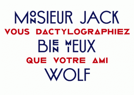
The second is the Helmut typeface from Superscript 2, posted on Swiss Legacy.com.
Noupe.com’s three-part series on type comes to a close with this post on how to pull together your typographic elements: hierarchy, combinations, and formatting. This may be stuff you already know, but the real-world examples and a note about the difference between type for print and the Web add a little extra.

OpenType is a phenomenal font format (say that three times fast) but not every OpenType font takes advantage of contextual alternates. Nick Shinn investigates on ilovetypography.com.
Photography
The Digital Story explains how to get better shots by using the Lens Correction feature in Adobe Camera Raw.
With graduations and summer vacations around the corner, many people will be seeing the world through a viewfinder or LCD screen. As a savvy snapper you’ll undoubtedly be asked for guidance. Beyond Megapixels offers these strategies for coping with inevitable questions:
- “What equipment should I buy?“.
- “Should I upgrade my camera or should I buy a better lens?“.
- “How can I get the most mileage out of the lens I have?“
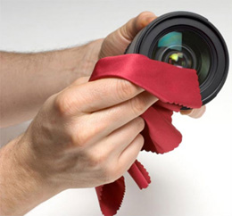
Unplugged tells you which tools to use when cleaning your camera lens. Hint: the corner of your t-shirt does not qualify. Perhaps you’ll want to start with a video, also via Unplugged, that shows How to clean your DSLR camera lens. The video is labeled as the Nikon Help Hotline, but this is not an official Nikon product. Also, the instructions are given in subtitles accompanied by annoying music that runs for the entire 8-plus minutes of the video, so be sure to turn down the volume.
Equipment is only one corner of the triangle, of course. You’ll also need to learn to develop your photographic design skills. (Tell your advice-seeking friends, too.) This one came via TWIPPHOTO.
You’ll also want to check out “The Secret of Creating a Strong Image” on Digital Photography School, where you’ll find five tips for taking memorable photographs.
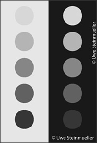
HDR (High Dynamic Range) photography records the brightest and darkest colors in a scene that fall outside the normal range of a digital camera. It lets you capture color and contrast without compromise. DPReview has posted Chapter 2 of Uwe Steinmueller’s upcoming e-book on HDR photography. You’ll find the link here to chapter one as well.
Shutterbugs everywhere are looking forward to hitting the open road to photograph the glories of summer. Before heading out, learn how to pack like a photographer. According to this post on Chookooloonks, it involves more than tossing your stuff in a camera bag.
Photoshop & Lightroom
Russell Brown is a legend in Photoshop circles thanks to his unique ability to explain and entertain. If you haven’t been privy to “Dr. Brown’s” brand of lunacy, check out this video about two add-on panels for Photoshop CS5: Mode (authored by Mike Hale) that lets you apply different blend modes to individual layers, and GuideGuide (authored by Cameron McEfee) that gives you InDesign-like guides in Photoshop. See “Free for All: Spring into Photoshop Freebies” for more on GuideGuide. John Nack alerted us to Russell’s video.
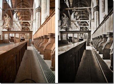
HDR imaging, discussed above, looks especially awesome in black-and-white. Watch the process of converting a color photo into an impressive high-dynamic range black-and-white image using Bridge, Photoshop’s Pro HDR, and Photoshop. A neat technique from Tip Squirrel.
The title of this Tip Squirrel post is “Ten Things Beginners Should Know in Photoshop,” but it’s a handy tip sheet of valuable shortcuts that apply to all pixel pushers.
![]()
With the rise of ebooks, it makes sense to have a book icon stashed in your image library. Here’s a little how-to for creating an open-book icon. It’s from PSD.TUTs.
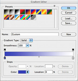
Photos that suffer from dark exposures can be improved with Photoshop gradients. Photoshop Support shows how.
Lightroom users should take note of these two tips. First, Julieanne Kost says that the fastest way to make keyword lists is to use a simple text editor. Then Tip Squirrel helps you locate missing files in Lightroom.
InDesign & Illustrator
This is a neat idea: Lorem Pixum is the Lorem Ipsum of images. It generates placeholder images so you can layout pages without the actual graphic.
Try it at out at creativebits.
InDesign trainer Cari Jansen has just launched Latitude 3195, an e-magazine about InDesign and the Digital Publishing System that’s produced with those tools and published on the iPad. Posted on InDesign Secrets.
InDesigners respond to the proposition: “I once had a dream that involved InDesign. It went something like this…” The answers are hilarious. Now you fill in the blank. Thanks for the tip, Design Geek.
Many people who rock Photoshop and InDesign get stage fright when dealing with Illustrator. In these video clips, you’ll see 11 things beginners need to learn to love Illustrator. The insanely talented and just plain insane Russell Viers narrates. Via Caveat Lector.
Acrobat
Ever want to batch print PDF files not in the default random order, but in the alphabetical order you prefer? Keith Gilbert has a handy hack.
Many of us add comments to a PDF in Acrobat using the text box. You go to print the file and eeek! the comments didn’t print. What the…?! Design Geek shows a nifty workaround that requires “burning” the comments into the PDF for printing.
Web
Conflicts can arise when a designer accustomed to the precision of print begins to work with a Web developer. Let’s say that one of them has control issues. Crankiness ensues. Jeffrey Zeldman advises Web coders how to make peace.
And continuing in a grumpy vein, Simon Pascal Klein reveals his top five peeves of Web design. It’s hard to argue with him.

Think about including natural elements in your next Web design. Youthedesigner showcases 33 Websites inspired by nature. Some of these interpret “nature” loosely, which makes them that much more interesting.

You don’t have to open a graphic application to make a good-looking button for your website. Line25 shows you how to create a button entirely in CSS3.
Getting pixel-perfect Web images when rotating or nudging images in Photoshop can be tricky. Smashing Magazine shows how to avoid hackneyed pixels.
Design
Print buyers know that die cuts cost a pretty penny. You’ll see why after watching this fascinating video of how a die cut book is made (in this case Jonathan Foer’s Tree of Codes), from Creative Review.
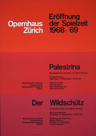
One signature of the graphic design school called Swiss Style is clean lines, precision layouts, and strong typography. It’s more than just slapping Helvetica on the page and waiting for yodels of appreciation. If you aspire to mastering Swiss Style (aka International Style), read about its history and grasp its mechanics. You’ll also learn how to translate Swiss Style to the Web. Via ffffound.
Designer Daily News takes a bold step in declaring 10 examples of great magazine design, and only one title is a household name. See if you agree.
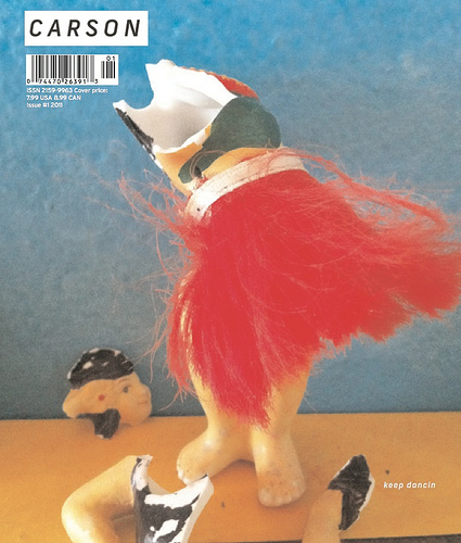
The first issue of David Carson’s magazine (he of RayGun magazine fame, among other iconoclastic design work) is out. It’s called Carson, naturally. Bucking a trend, the magazine is deliberately print only. MagCulture has the scoop.
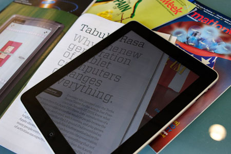
At the other end of the spectrum, Unplugged picks the best digital magazines for the iPad. Video clips show what makes these titles stand out.
One of those best iPad magazines is Wired. And, in case you missed the memo, Adobe is sponsoring free downloads of Wired‘s May issue for the iPad.
Creative Business
Dropbox is a godsend for transferring large files or serving as temporary storage. Lifehacker shows how Dropbox can be a “killer collaborative work tool.”

YouTube has dreamed up an unusual way to teach its contributors about copyright issues and fair use: a video featuring an animated squirrel. I kid you not. Via PaidContent.
As the stock-image market opens its doors to more photographers—pros and amateurs alike—it’s time to get serious about rights and releases. Microstock Diaries explains the necessity for and development of a spreadsheet that tracks photo releases.
Personalities
Publication designer Roger Black seems to always have his finger on the pulse of design trends and technology. He’s the co-founder of both the type design firm Font Bureau and the template design company Ready-Media that produces off-the-rack layout packages for publishers. Black is currently developing Treesaver, a browser-based scalable digital publishing system. I’ve always found Black to be eloquent and entertaining, and he doesn’t disappoint in this interview. Via Grids, the blog of the Society of Publication designers.

Digital cameras are a dime-a-dozen today, but did you ever stop to think how digital cameras came into being and who made the first one? Meet Steve Sasson, the man who invented the digital camera. In this video, via Fast Company Design, you’ll not only hear the history of the digital camera’s development but also see the prototype. It’s pretty amazing.
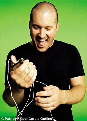
The most influential industrial designer of the past 15 years has got to be Jonathan Ive, the man behind Apple’s breakthrough products (pretty much anything with an “i” in its name). This profile of Ive, published by the Daily Mail in the UK, Ive’s homeland, is a fascinating read. (Did you know he drives a Bentley?) Via Kottke.org.
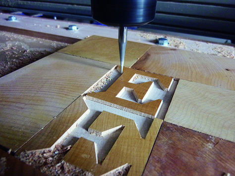
When it comes to influential type design, Matthew Carter immediately comes to mind. This pioneer in digital typeface design recently developed his first font fashioned out of actual, physical wood as commissioned by the Hamilton Wood Type & Printing Museum in Two Rivers, Wisconsin. In this essay in Eye magazine’s blog, Carter writes about how Van Lanen and Van Lanen Streamer came to be. You can buy Carter’s wood type in digital format from Hamilton.
Miscellany
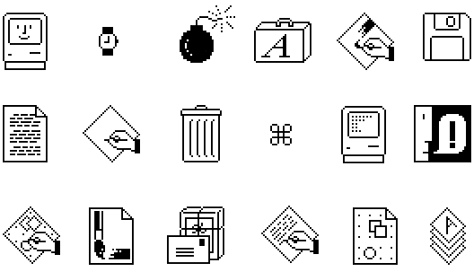
Enjoy this reminder of a simpler time: Susan Kare’s original Mac icons. Via ffffound.
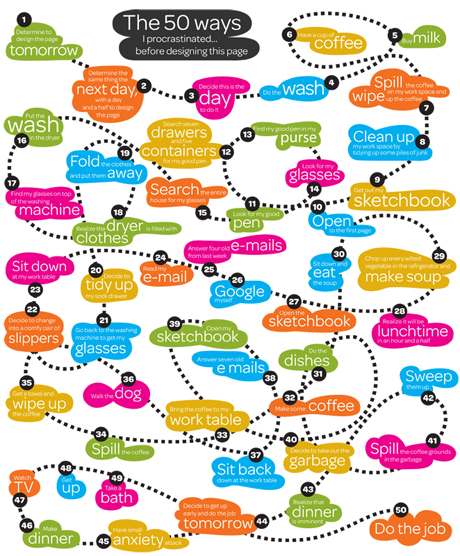
Are you a procrastinator? You’re not alone. Pentagram’s Paula Scher drew a wonderful infographic about all the ways we try not to get work done. I need to hang this in my office.
You know the type, the art director who is constantly looking over your shoulder as you work, offering helpful “suggestions.” It looks something like this. Via Coudal Partners
Finally, if you don’t know about the Web series “Off Register,” get thee to YouTube and check out Sappi’s inside look at commercial printing. The cast includes the press manager, the client rep, and a variety of designers, all of whom want their work to be printed successfully. Is that too much to ask?
This article was last modified on January 18, 2023
This article was first published on April 21, 2011
Commenting is easier and faster when you're logged in!

Recommended for you

Pentax Announces Optio S7 with Advanced Feature
PENTAX Imaging Company has announced the PENTAX Optio S7 compact digital ca...

Creating Editable Extruded Text in Photoshop
Extruded text is a popular effect, and it’s not difficult to create...
Panasonic Introduces Three New FX Series LUMIX Digital Still Cameras
Panasonic today introduced the new LUMIX 7.2-megapixel DMC-FX50 and DMC-FX07 dig...