

Don’t have time to read scores of blogs every day? Don’t worry, I’ve done it for you, and picked out the best posts you shouldn’t miss.
Typography
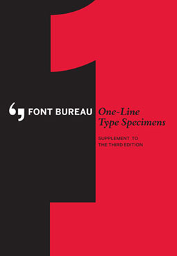
Printed type specimen books are rare these days. Thankfully a few foundries still produce beautifully designed books that show their fonts in all their printed glory. One of my favorites is published by The Font Bureau, which has recently created a supplement to the third edition of its One-Line Type Specimens. Look behind the scenes of the press check, then order the free printed copy.
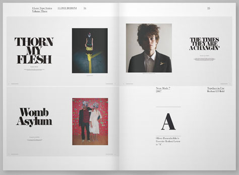
While not a specimen book per se, I Love Bodoni is a lovely book that showcases Bodoni as it’s used in a wide variety of projects. Other volumes in the I Love Type series include books on Futura, Avant Garde, and DIN. In the aftermath of the recent Helvetica hoopla, it’s nice to see an in-depth look at other influential faces. Via Typography Served.
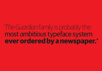
Commissioning a new typeface is a big undertaking for any publication, and when that publication is The Guardian of London, the stakes are high. As Eye magazine says, “At 200-plus fonts, the Guardian type family is ?probably the most ambitious typeface system ever ordered? by ?a newspaper.” Four type experts weigh in on the merits of the family.
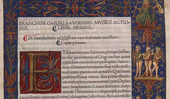
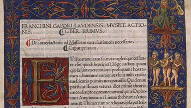
In the medieval western world, highly trained calligraphers painstakingly drew and painted elaborate letters to create magnificent books. Centuries later you can see how illuminated manuscripts were made in a marvelous film by the Getty Museum. Courtesy of The Atlantic.
Photography

Bokeh is a photographic technique that gives a dreamy feel to out-of-focus areas of an image. You can see 30 examples of bokeh photography on Design You Trust. For a more hands-on approach to creating bokeh effects, Craftzine explains how to get the same effect with “an SLR camera, some black paper and a craft knife.”
In the previous Best of the Blogs, Photofocus recommended sketching as a way to improve your image-making skills. As a follow-up, the site advises that you become a better photographer by improving your writing skills.
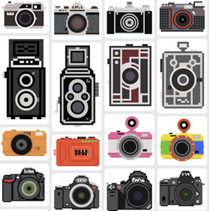
Have a project that needs an image of a camera? Billy Brown is giving away 100 pixelated camera illustrations. The camera types include DSLRs and individual lenses, and also lomography, Polaroid, and disposable.
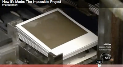
Speaking of Polaroids, watch this neat video of how Polaroid film is made.

Cameron Moll’s blog post says it all: “No Way. SLR Lens Mount for iPhone.”
Photoshop
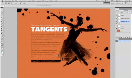
You can create and reshape text fields using Photoshop paths. However, the technique is less intuitive than what you may be used to in Illustrator and InDesign, as this Method & Craft video tutorial shows.
Bring out your inner Avatar or boy wizard by conjuring 3D graphics with three different techniques that involve Photoshop:

First, Web Designer Depot shows step-by-step how to create a stereoscopic illustration using Illustrator and Photoshop.
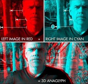
Then watch Deke McClelland create a classic anaglyphic stereoscopic 3D image in Photoshop.
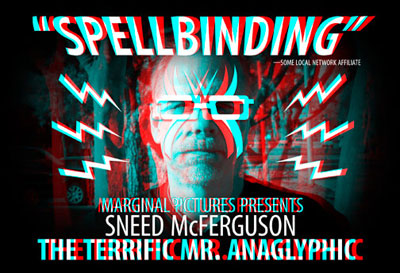
Finally, view another Deke video that shows you how to add solid objects like text to a 3D image. Did you save your 3D glasses from the theater?
There’s no shortage of bad Photoshop images, but these propaganda shots are in another realm altogether. Via Mental Floss.
Swiss Miss points to a good tip on makephotoshopfaster.com that peps up Photoshop.
InDesign
If you’ve ever wondered what error messages in InDesign mean and what you should do about them, read InDesignSecrets’ rundown of InDesign crash reports.
You cutting-edge types may be wondering what’s changed in the Digital Publishing Suite since InDesign CS 5.5 came out. lynda.com has the scoop.
Now here’s a tough choice: “Take your pick: Crawling naked through broken glass or doing a layout in Word”. The responses not only give advice but also offer plenty of opinions about Microsoft’s word processor.
While not an InDesign tip per se, the O’Reilly commentary “Images and text need to get together” points to a design flaw in many books that could be fixed if authors used InDesign or if publishers used better style sheets.
Illustrator
Cropping a raster Photoshop file once it’s placed inside an Illustrator file is a frustrating experience. DesignGeek explains why that is and how to make it work.
Under the subject line Copying from Illustrator to InDesign on the InDesign Talk Google Group, you’ll find under-the-hood information about Illustrator settings and PDF, EPS, and InDesign files. It’s always great to hear solutions from designers who have learned the hard way.
Web
When searching for design work, it’s easy to overlook your own backyard. Test King has tips on How Web Designers Can Find Local Business.
“In recent years there has been a move away from generalist Web designers to specialists such as content strategists, user experience architects, and front-end coders,” starts this Smashing Magazine blog post. It then goes on to explain why you should consider broadening rather than narrowing your expertise. It’s a valid—and compelling—argument.
Creative Business
How does a designer prepare for an interview? Readers of the Core77 boards offer advice. In a somewhat related post, a designer asks Core77 readers their opinions on using graphical rather than text-only resumes in job searches. The responses may surprise you.
Wills and estate planning are not exactly fun topics for anyone, but if you work in the digital realm, Digital Estate Planning for Designers, Photographers and Developers is a must read. From Peachpit Press.
Miscellany
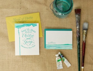
The name of the website Oh So Beautiful Paper nicely sums up what you’ll find. Not only are there examples of beautiful design work on paper (the gorgeous wedding invites almost make me reconsider the institution of marriage), but there are also clever ways to customize your own printed projects, such as this tutorial for adding watercolor accents to note cards.
The colors we use today have fascinating origins based in treachery, lust, and mythology. Find out more as Mental Floss (via Neatorama) deconstructs the color wheel. Next time you use green, remember that pigment maker Carl Wilhem Scheele died of arsenic poisoning.
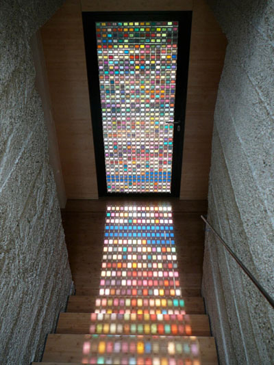
Architects are designers, too, and Armin Blasbichler’s home in South Tyrol is a great example. The floor-to-ceiling stained glass windows are designed as Pantone swatches that reflect the colors of the landscape outside. Via Design Sponge and Gizmodo.
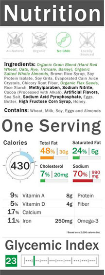
GOOD Magazine co-sponsored a competition to redesign the mandatory nutritional label that appears on food packaging. More than 60 designs were submitted. Now the four winners have been announced. A terrific example of how design can affect our lives.
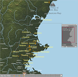
Cartography is an art form unto itself, with the mapmaker navigating the disciplines of geography, history and design. This New York Times article reveals how modern tools are transforming maps, resulting not only in a more detailed look at the world but also a more informed view of historical events.
The blogosphere was full of stories about the closing of Borders bookstores. This post from Felt & Wire, “The past, present & future of books”, is a brief and thoughtful inquiry from a design point of view.
This article was last modified on January 18, 2023
This article was first published on August 1, 2011
Commenting is easier and faster when you're logged in!

Recommended for you

Fontober: Free Sans Serif Fonts
Each Friday this month, we’ll feature a new set of free fonts for your use...

Free Photoshop and Lightroom Webinar
As part of their ongoing Create Now: Ask A Pro webinar series, Adobe is offering...
CreativePro Tip of the Week: Drawing Instant Abstract Art in Illustrator
This CreativePro Tip of the Week on creating instant abstract art in Illustrator...