


Photoshop
Are you taking full advantage of Photoshop’s integration with the rest of the Creative Suite? Its connection to Acrobat is often overlooked. Photoshop PDF files are as versatile and universal as “regular” PDF files and they can be edited, too.

HDR photographic techniques let you capture a wide range of color that brings images to life. Most HDR photography is performed with a DSLR camera that lets you bracket exposures and try out different color settings. You can’t do the same thing with some point and shoot camera, but you can fake it in Photoshop, as this Test King tutorial reveals.

Color correcting an image is one of the trickiest things to do in Photoshop. Not only do color preferences differ wildly from person to person, but the preferred methods for doing so vary wildly as well. Tip Squirrel has a nice tutorial about how to use Color Balance in conjunction with Curves. Another nut from the Tip Squirrel.
Typography
The Atlantic linked to 10 Essential Books on Typography, which goes beyond the usual suspects to include titles such as Cultural Connectives.
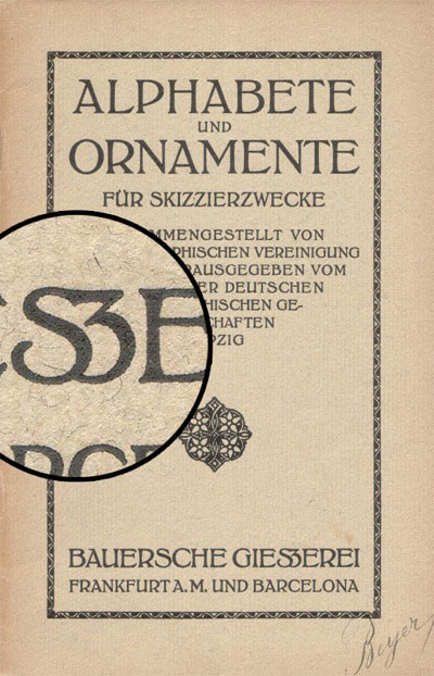
How to Draw a Capital Sharp S proposes that the German glyph called “Eszett” or “sharp s” needs an uppercase counterpart. I rarely (never?) use a Sharp S, but I found type designer Ralf Hermann’s post fascinating as it reveals the thought that goes into character development.
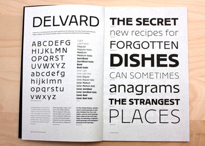
In a previous Best of the Blogs, I mentioned The Font Bureau’s type specimen book. This week Steven Heller writes in The New York Times about a newly released specimen book by Croatian designer Nikola Djurek, who created the typefaces Typonine and Delvard.
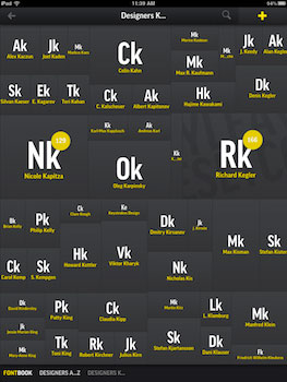
Djurek’s and The Font Bureau’s specimen books are both ink on paper, but The Font Shop has released a new version of its hefty FontBook on the iPad. WhatTheyThink has a hands-on review.
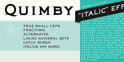
Stuck in a Copperplate rut? Design Work Life makes a case for Quimby.
Photography
Putting a value on your work and your talent is hard for many people. Is my pricing too high? Too low? How does it compare to others? This post from GoingPro advises you on how to price your photography.
Here are two posts with advice on making positive changes in your photography. Digital Photography School asks Are You in a Photography Rut? 11 Tips to Get Out of It! Improve Photography doubles that number of tips with 22 Things You Can Do Today to Change Your Photography Forever, such as “Create a photography bucket list”. Read both posts—there’s surprisingly little overlap between them.
Before you add a vignette effect to another photo, read Hannah Gordon’s Overused Post Processing Effects on Digital Photography School.
This collection of niche blogs made me smile, especially My Daguerrotype Boyfriend.
Illustration
Brush up on your beziers with Examples and Tips For Using Illustrator’s Warp Tools from Smashing Magazine.

As a Midwest gal, I love eating corn on the cob. Another way to enjoy it is by creating a corn cob in Illustrator from Noupe.
Page Layout
I love a good tussle, especially when the fight is about InDesign. A row erupted over on InDesign Secrets about the risks of working with InDesign files directly off a server rather than on the local machine. The debate itself is pretty good, but what’s really fascinating is reading the comments by other InDesigners.
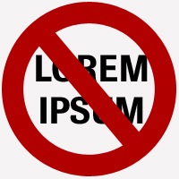
I came across this 2010 post while looking at something else (as often happens in the blogosphere): Lorem Ipsum is Killing Your Designs. From Design Informer.
Publishing

When I think of on-demand publishing, cappuccinos don’t come to mind. But this enterprising bookstore in New York has set up an on-demand publishing shop in its café. And McNally Jackson Books is not the kind of place where files are uploaded to a remote print-on-demand site and returned to you later. Called the Espresso Book Machine, it prints and binds your book on the spot (after a day or so of prepping and proofing the file). Thanks to WhatTheyThink for the heads up.
I’m sure much caffeine was consumed during the making of Longshot magazine, which was produced in 48 hours with thousands of contributors from all over the world. Project organizers were determined to use as much free technology as possible. Reading what was used to make the magazine is eye-opening; I hadn’t considered some of the software “publishing” tools. Wendy McNaughton captured the event in illustration. You can check out the issue here. Thanks to Gizmodo, The Atlantic, and Emptyage.
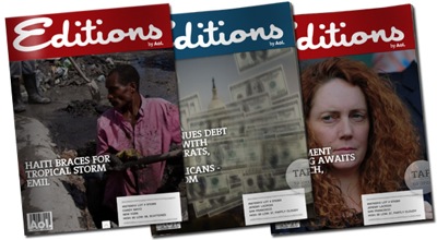
An interesting addition to iPad publishing is the introduction of a new magazine by online pioneer AOL. Called Editions, it’s positioned as “The Magazine That Reads You.” By scanning newsfeeds and your social networks, it creates a custom publication based on your preferences. It even has a mailing label on the cover page! Read about it in Wired’s post, which also includes a video of Editions in action. The Society for Publication Designers (SPD) talked to Editions’ David Robinson to learn about the publication’s design challenges. You can download the Editions application at iTunes for free.

It may look like a 3-D monocle, but a loupe is a pressman’s eye on print quality. So what are pressmen looking for with their magnifying loupes? Quality in Print shows up-close what’s often not visible to the naked eye.
Creative Business
Crowdsourcing is a controversial and divisive topic. Here’s the story of one freelancer who directly and explicitly lost a client to crowdsourcing. From the Creative Freelancer blog.
In-house designers can feel the pressure of crowdsourcing, too, in addition to other outside design sources. HOW magazine proposes that in-house issues are not about design—your skills are a given—but about other attributes you bring to your employer.
Some designers—such as Brian Hoff at the Design Cubicle—have seen a rise in business this year, in some cases substantial increases. What’s causing this uptick and why?
There’s a nice podcast with David Airey on Design Festival. Topics include freelancing, pro bono work, self-publishing, and more.
Miscellany
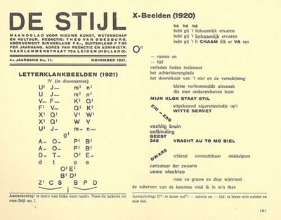
De Stijl, or “The Style” in Dutch, was an important artistic movement in post WWI Europe. It was also the name of an iconic magazine of the era published by Theo van Doesburg. You can now download every issue of the publication in PDF format. You don’t need to read Dutch to appreciate its design. Via Selectism.
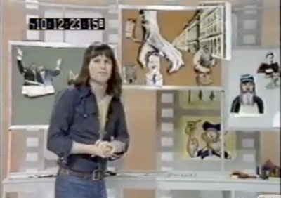
The cult classic television show Monty Python’s Flying Circus opened with surreal animations created by Terry Gilliam. The figures were cut out from sources like Victorian advertising and old magazines, assembled into a scene, and then filmed as a stop-motion animation. Gilliam’s technique was inventive and time-consuming, as this video of the artist in action shows. Thanks to Drawn.
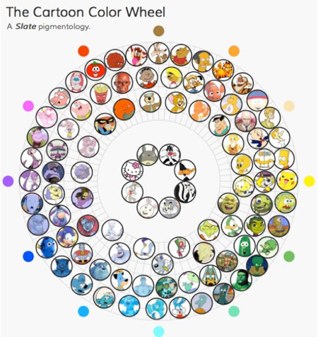
What does a Smurf have in common with the following: Huckleberry Hound, Blue (from Blue’s Clues) and Itchy (of the Itchy and Scratchy Show)? Yes, like the Smurfs they’re all cartoons, but more significantly, these three are adjacent to Clumsy Smurf on the Cartoon Color Wheel. Because all cartoon characters have vividly colored forms, the folks at Slate decided to organize cartoon favorites as hues on an interactive color wheel. So next time a client asks you for a particular shade of orange, ask if she wants Apu, Garfield, or Tigger.
This article was last modified on January 18, 2023
This article was first published on August 15, 2011
Commenting is easier and faster when you're logged in!

Recommended for you

TypeTalk: Typographic Hierarchy
One of the most important aspects of designing with type is the establishment of...

The Experimental Typography of Rus Khasanov
We’ve all seen and used our share of “light” typefaces, but ha...

The Digital Art Studio: Patching Text without the Fonts
How do you fix a typo when you don’t have the correct font? After my beloved stu...