


Typography
I’ve mentioned Designers and Books before, in which 66 designers draw up a list of books that inspire them. Typographer and designer Erik Spiekermann’s list includes classics by Jan Tschichold, Robin Kinross, and Ruari McLean, but it also features two books by a Swiss typographer previously unknown to me, Hans Rudolf Bossard, whose books are only published in German. Let’s get them translated!
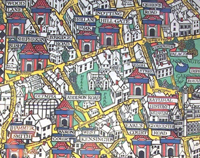
Speaking of unknown typographers, did you know that Eric Gill’s brother Max was a talented letterer, illustrator, and mapmaker? Read about the sidelined sibling in Eye Magazine‘s blog.
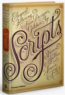
The prolific duo of Steven Heller and Louise Fili recently published a copiously illustrated tome entitled Scripts: Elegant Lettering from Design’s Golden Age. Heller gives some script lettering background on the Design Observer blog. For another take, read Michael Doret’s review of the book on his Alphabet Soup blog.

Changing the body type in a newspaper is a Big Deal, both for the newspaper and its readership, especially when the publication is as notable as the Chicago Tribune. Recently the daily switched from Nimrod to Mercury Text, resulting in many letters to the editor. Chicagoan Anne-Marie Concepcion points to the Trib’s explanation for the switch on her Design Geek Facebook page.
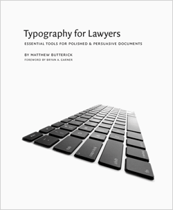
You know the Shakespeare line “The first thing we do, let’s kill all the lawyers”? Momentum is growing to kill the type and formatting of standard legal documents, thanks to the website Typography for Lawyers. The site’s creator is Matthew Butterick, a type designer turned lawyer, who urges his peers to stop the long-line, narrow-margin, ALL-CAP madness to create more readable and accessible documents. FontFeed reports that Matthew has published a book on the subject. Please, for the sake of humanity, let all lawyers adopt his suggestions.
It’s fair to say that the majority of well-known type designers are male. Why is that? Where are the women in type design? asks Verena Gerlach on the blog Typographica. She puts forth a provocative theory having to do with gender and society.
Layout
Sometimes a topic develops into a theme across several blogs. Case in point: a groundswell of blogs about various InDesign and PDF issues, notably file size:
- A post on Google’s InDesign discussion group asked if anyone else was experiencing huge PDF file exports from InDesign 5.5. The resulting thread offered theories and remedies.
- Another incident of a ginormous PDF file exported from InDesign required detective work by David Blatner on InDesign Secrets. The culprit seems to be “document overhead.” Thankfully he explains just what that is.
- InDesign 5.5 and Acrobat X have new features for the creation of accessible, or tagged, PDFs. The InDesigner himself, Michael Murphy, has a video about making accessible PDFs faster and easier in InDesign 5.5.
This InDesign discussion thread on Google intrigued me: A designer received an archive of Word files that was last opened in 1995 (as in Word 1.x to 5.x). Now he’s expected to lay out the content, but he’s got open the old Word files first. How? The respondents had many interesting suggestions.
Photography
Do you have aspirations of being a professional photographer? Read Are you a photographer in waiting? on the aptly named blog GoingPro. You can do it!
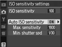
If you’re going to go pro, you need to get familiar with all your camera’s settings, including those that are a couple of menus deep. One such setting lets you limit the range of the automatic ISO. You’ll get the benefits of auto ISO yet maintain control over the results, according to Digital Photography School.
These three simple tips to improve your photography, from Beyond Megapixels, will also prove invaluable.

I love-love-love the concept behind Dear Photograph in which you “take a picture of a picture from the past in the present.” If that sounds too cryptic, here’s an easier albeit longer way to describe the project: Take a photo from your past and physically place it in the scene where it was taken; then take a new photo of that old photo as it appears in reality. Hmm, that explanation is just as convoluted, so you’ll just have to see for yourself. Via Neatorama. By the way, using Photoshop is cheating.
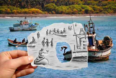
Dear Photograph reminds me a bit of the work of Ben Heine, whose Pencil vs. Camera project is equally intriguing. Heine takes photographs of a scene that he then completes with a pencil sketch, some of which state a point of view rather than capture reality. Another tip of the hat to Neatorama.
Special Cinemagraph Section!
A cinemagraph is essentially a still photograph with movement. The technique is based on an animated GIF file.

You can read about cinemagraph pioneers Jamie Beck and Kevin Burg on Cool Hunting.

A post on Graphic Design Blog shows 22 examples of cinemagraphs.
If you want to how to make your own cinemagraph, read Photojojo’s how-to.
Photoshop and Imaging
Photoshop lets you work on your files non-destructively—that is, without making edits or changes that alter the file data irreparably. If you’re still editing your images the old-fashioned way, Photofocus explains why you should work non-destructively in Photoshop.
Some of Photoshop’s niftier features lie in its content-aware tools, such as content-aware fill, scaling, and healing. If you haven’t discovered them yet, check out this video from psd.tuts that shows how to use the content-aware tools. Magic!
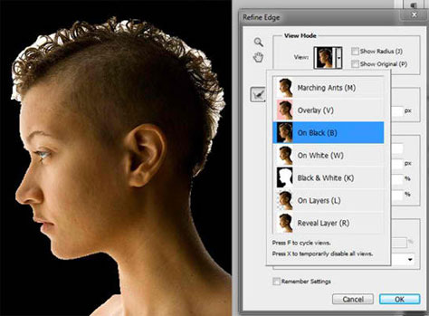
Here’s another Photoshop time-saver: the refine edge tool. Rather than laboriously fine-tuning a mask with the pen tool or whatever, using the refine edge tool lets you select every nook and cranny.
Lightroom is designed to let you edit images quickly and efficiently, but it can also bog down your computer’s response time. Adobe has released a new support document that spells out what you need to optimize Lightroom performance. These tips apply to Photoshop as well, by the way.
Web
Design and typography are often left by the wayside in the rush to create the whizziest website. But as the Internet gets more crowded and as visitors become more impatient, these two factors become increasingly important. These two posts from Web Designer Depot address both: Why Web developers cannot afford to ignore design and Why typography is Web’s greatest media format are essential reading for website developers.
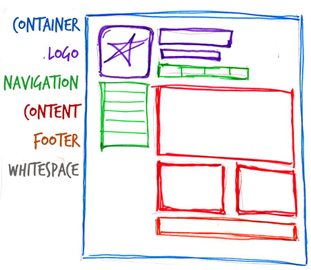
No matter how spiffy your web page, some elements are the same across all sites. These elements form the anatomy of a Web page. Design Festival breaks it down.
Creative Business
Minimalism is definitely in vogue these days. You may want to apply the less-is-more aesthetic to your Web portfolio after you look at these 20 minimal design portfolios on
Designer Daily.
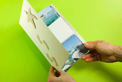
A flip-flap album is not minimal, but it sure is nifty. The booklet-meets-flipbook format is a fun way to show off your photos to family and friends. However, if tastefully and judiciously done, a flip-flap album might serve as a memorable leave-behind at your next job or client interview. Learn how to make a flip-flap book in this Photojojo tutorial.

Many creative professionals feel skittish about self-promotion, yet taking out an ad in a publication that targets your customer demographic seems like a safe bet. That’s not how it worked out for this photographer who tells her story on the Digital Photography School blog.
Marketing a small business is especially challenging when the competition is an established business, has deeper pockets, and sells its goods cheaper. Case in point: A small produce vendor found his business threatened by Walmart. What’s a guy to do? By employing creative marketing, his business not only survived but thrived. There are more examples in this post from Fast Company.
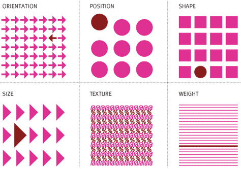
Going back to the drawing board can be a good way to bust through a design impasse. How magazine’s Parse blog suggests that you revisit principles of contrast in terms of color and shape.
Special Oprah Section!
Grids, the blog of the Society of Publication Designers, recently posted a four-part series about the design of O, the Oprah Winfrey magazine.
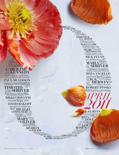
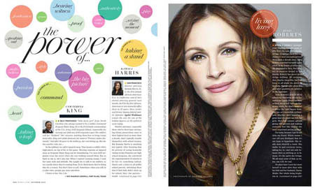
First up in “the Story of O” are examples of the feature section openers.
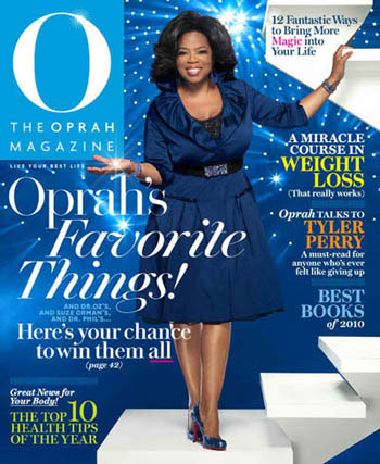
The second installment covered covers.
The third looked at the inside pages.
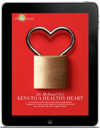
The series wrapped up with the magazine’s iPad edition.
This article was last modified on August 2, 2021
This article was first published on June 23, 2011
Commenting is easier and faster when you're logged in!

Recommended for you
The Paper That Changed Type Design
John Baskerville is known best as the man who, in the mid-18th century, created...
Hermann Zapf, ITC & Apple: The History of ITC Zapf Chancery & ITC Zapf Dingbats
On June 4th 2015 we lost one of the great ones. I’m speaking of Hermann Zapf, th...
Create icons by Typing with Symbolset Fonts
When you need to add some common icons to text, what do you do? Do you open a cl...