

Typographers Jonathan Hoefler and Tobias Frere-Jones, who are the powers behind the Hoefler & Frere-Jones foundry, recently published an article with tips for people designing annual reports and other number-heavy documents.
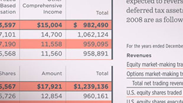
Of course, the article features typefaces from H&F-J, but the advice is nonetheless sound: “For setting text, look for a font with variable-width ‘proportional’ figures; for aligning columns of numbers, choose a font with ‘tabular’ figures. For annual reports, make sure your font has both…”
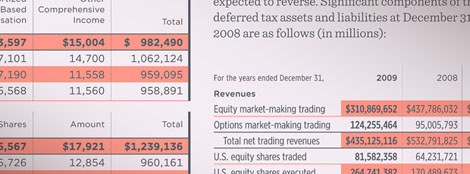
Read the full article for more hints on setting tabular figures, and for information on indices (numbers in circles), extended character sets (great for currency symbols, footnotes, etc.), and fonts in grades.
This article was last modified on December 17, 2022
This article was first published on July 22, 2009
Commenting is easier and faster when you're logged in!

Recommended for you

The Joy of Ornaments
Typographic ornaments used to be a design staple back in the days of metal type,...
Fonts to Help the Homeless
Good things often spring from the union of commerce, art, and charity, as these...

TypeTalk: Step Away from the Computer
TypeTalk is a regular blog on typography. Post your questions and comments by cl...