

In early summer 2005, the United Kingdom book publisher Friends of ED asked multimedia designer Corné van Dooren to create a new range of designs for its Foundation book series. Van Dooren explains that after five years of using images of movie theaters as the source for artwork on the covers, the publisher decided it was time for a new look and feel.
He says that the Friends of ED, especially product manager Pete Aylward, decided that the concept should move away from a technology look to a more organic one. In the tutorial below, van Dooren shares how he created the most challenging cover of the series, for a book written by Sham Bhangal and Kristian Besley.
Merging the Technical and the Organic
by Corné van Dooren
I wanted to create something different for every book cover. I had made a waterfall with pipelines and a three-dimensional wasp for previous covers. For the third cover, I thought up the concept of a tractor with 3D arms attached, stacking up the stacks of hay.
Although the image looked fine, it didn’t fit with the previous covers. The tractor looked too realistic. So the next idea was to make it a spaceship collecting hay. But I must have taken it too far, because it looked too cartoon-like. Then the idea was altered and we put pipelines in the field because I had used them before on the waterfall cover (Foundation XML for Flash).
But again the feeling just wasn’t right. So then I did the best thing I could have ever done. I put the cover away for a couple of days. After a few days I started again from scratch. It worked out great. I dropped the photo I took of the field of hay for a photo of a forest and put the pipelines back in — but this time with 3D flowers. The background photo is from iStockPhoto, simply because the deadline was too tight for me to run into a forest and take a photo myself.
Basically, I use the same setup for every cover. I do this so the book series will have a consistent look, and it makes my work easier!
I used Photoshop to create the same grid on all the covers. Figure 1 shows the white background with the colored wave over it. On top of that I placed a grid to make it look more techy. Figure 2 shows the addition of other repeating elements: white waves, a colored ball on the left, small balls all over the cover, and the white >> marks indicating movement.

Figures 1 and 2.
Next I took a photograph sent to me by the publisher (Figure 3) and altered it to express the organic vs. technology look. The idea was to have pipelines running through this forest image and have a bunch of 3D flowers pop out of the tube in the front.

Figure 3.
Designing 3D elements can of course be done in Adobe Photoshop. It takes some time to get the shades and highlight right, but it can be done. To save time though, I always use Maxon’s Cinema 4D XL. Cinema 4D is a 3D tool along the lines of Autodesk’s 3D Studio Max and Alias’ Maya. Once I created the pipelines with Cinema 4D XL, I placed them in the Photoshop file.
Figure 4 shows the first step of adding 3D pipes to the scene. I cut out the big tree bark, moss, and such at the front and placed the pipelines below that layer. I thought the image looked too fake, so I colored the pipes and put some extra shades in the image. Figure 5 looks a lot better.
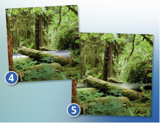
Figures 4 and 5.
Then there’s the matter of the pipe that is supposed to be shown at the front of the image. I placed another 3D pipeline there, this time going upwards. Where the pipe ends I put the 3D flowers I designed in the 3D package (Figure 6). I actually designed only one flower, but by rotating it in the 3D software and rendering it with different colors, it looks as if I’ve designed more.

Figure 6.
Figure 7 shows how I placed the 3D flowers and pipeline in the Photoshop document. I tried to make the pipeline look more like part of the image by adjusting the colors and adding slight shades (Figure 8). Unfortunately, this time I didn’t feel it worked out that well. I felt the pipeline at the front was standing out of the overall visual. It just didn’t fit in. Instead of playing for hours with colors and shades I decided to add a photorealistic element on top of the layer with the pipeline.

Figure 7 and 8.
With the element in place (Figure 9), the 3D pipeline fit in better in the overall image. It still didn’t entirely fit in the image because the pipeline appears to be lighter than anything else in the image. So do the flowers, but that’s okay as I want them to stand out a bit — they represent the technology.

Figure 9.
A flower close-up (Figure 10) shows that they consist of the fully rendered elements, yet also contain some wireframe lines to indicate they were made with 3D technology.
I wanted to add two more touches to the image before I placed it in the other document with the grid. I added more photorealistic touches in the form of yellow roses (Figure 11). This time the additions weren’t placed there to make the image look more realistic; I added the roses to balance the yellow colors in the image.

Figures 10 and 11.
Next I added 3D mushrooms on the tree in the back to bring a consistency in the cover designs (Figure 12). On the other covers I had also designed something 3D-like using white dots and lines. The mushrooms are drawn in Photoshop, though because of the line work and dots they appear to be a bit 3D.

Figure 12.
The image below shows what happens once the manipulated photo is placed in the other document (Figure 13). You can see the elements bring depth to the design. The blue wave appears to be gone, but it’s not. Now that I’ve placed the photo in the document, it’s time to bring back the blue wave to create the overall color of the cover. I’ve given all of the covers a color scheme so they’re part of a series of designs, yet also have something different (apart from the photo).

Figure 13.
The keys to coloring the cover are Photoshop’s layer blending mode and layer opacity, some of Photoshop’s finest assets.
To bring back the blue color of the wave, I set the layer blending mode of the photo to Luminosity and the opacity to 30%. Then I copied the photo layer and set its layer blending mode to Darken and the opacity to 30%, revealing a pale photo on a light-blue wave (Figure 14).
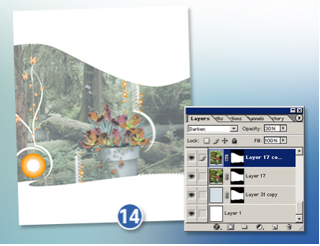
Figure 14.
To bring in more of the blue and darken the photo, I added a couple of layers with a blue wave. I also continued to copy the photo layer and keep playing with its layer blending mode and opacity. After doing this a couple of times I achieved the blue look I wanted the photo to have (Figure 15). Note: the blue wave layers generally only have a layer blending mode of Linear Light or Color, and the photo layers have a layer blending mode of Overlay, Lighten/Darken, and Normal at low opacity.
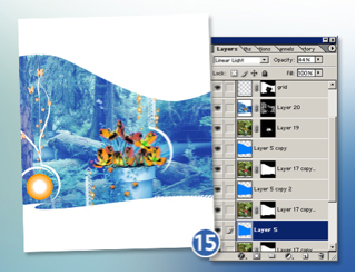
Figure 15.
Satisfied with the look and feel of the image, I added the credits (Figure 16). These elements are always in the same place, but the author’s name and the title (in this case, the black Flash 8 text) change.

Figure 16.
A new cover for the Foundation book series was complete. Well, okay, there was one more step — a step I often forget. Because I was to deliver this Photoshop document to the publisher, I had to give my layers clear names (Figure 17). Otherwise, the person opening the Photoshop document could never find back the various elements I used in the cover.
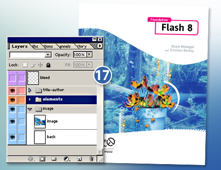
Figure 17.
As you can see, I made a Photoshop document with layer sets called “Image”, “Elements,” and “Title-Author.” In the “Image” set there’s the manipulated photo. In the “Elements” set there are elements such as the grid, circles, and white waves. The “Title-Author” set contains the publisher’s logo, book title, and author name. The layer called “Bleed” indicates the safe area for printing. And that’s it — now the file really is ready to go.
Want to know van Dooren’s thoughts on stock photos versus originals photos, client relationships, and more? Read the interview on page 2.
This article was last modified on January 18, 2023
This article was first published on November 16, 2005
Commenting is easier and faster when you're logged in!

Recommended for you
How to Move Photos Between Lightroom and Photoshop
When it comes to working with photos, Adobe gives you two powerhouse pro tools,...

How to Create Lithopanes in Photoshop
The introduction of 3D printing direct from Photoshop opened new gateways for ma...

Making Lightweight Animated GIFs in Photoshop
Still images can look great on websites – but moving images are more atten...