


The characters in the fonts we use have very distinct shapes, finely and painstaking delineated. When printed in solid colors—typically black—the shapes and subtleties of these characters can be reproduced with great fidelity. But when printed using screened colors—especially when using several inks—the edges of the characters are defined by a haze of dots rather than a crisp edge between color and background. It’s a formula for fuzziness.
To a greater or lesser extent, this phenomenon afflicts all type that’s set using blended colors and type that’s reversed out of a blended-color background (including a half-toned photograph). The following illustration shows why blended colors—as opposed to solid colors—are a problem.
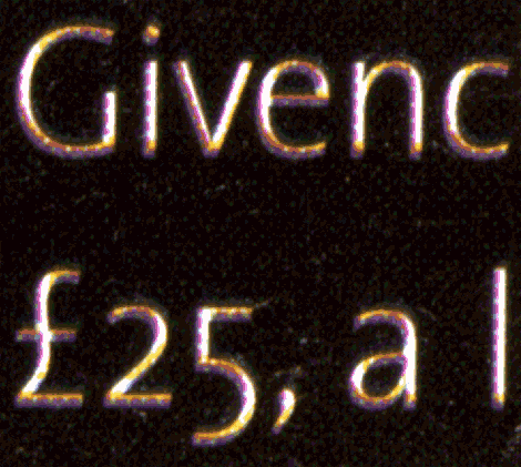
Figure 1. The following type, scanned from a glossy magazine, was set at 20-point and looked quite clear on the page. But up close, you can see the dramatic difference in character sharpness between the screened, blended color used on the left and the solid black used on the right. Note also how the color dots of the screened type interact with the background color, blurring the margin between the two.

At 20-point, the potential for blurriness is reduced by the big difference between size of the type and the fineness of the halftone dots used to create the blended colors. But as the point size gets smaller, the edges of the characters printed in blended colors become relatively less crisply defined. The same effect is at work when you reduce the point size of type onscreen—the component dots of the images become relatively more apparent and the type becomes less distinctly defined and harder to read.
Text-sized type rendered in a blended color always runs the risk of blurriness. The risk increases according to the background that the type is printed over. The best results will always appear over a blank, unprinted background. When printed over another blended color, the dots whose colors are shared between type and background will tend to cause a haze or aura around the characters, making them less crisp.
When type is reversed out of a blended-color background, the same effect comes into play. In this case, though, the edges of the characters are rendered by the dots of the background, and the shapes of letters are created by the absence of ink. The net result is the same: The edges of the characters are irregular, their contours created by the array of dots in the CMYK ink colors.
Figure 2. In close-up, you can see that the outlines of these reversed 10-point characters are defined by dots rather than lines. Even in this simple sans-serif face, details are blurred and roughly rendered.

In reverses, you also have to reckon with ink spread, because printing ink has a tendency to spread out a little when it’s applied to paper, especially coated paper. For normal black-on-white type, ink spread simply makes it ever so slightly bolder. But ink spread in reversed type makes the type thinner and more fragile. Certain features—thin strokes, hairlines, serifs—can be eroded to the point of disappearing, and characters can appear to break up.
All of the above is bound to happen to some degree in even the finest print job. But when the four inks used to print a color page fall out of register, type rendered in blended colors and type reversed out of a blended color take a beating.
Figure 3. The type below was set in 9-point and reversed out of a very dark photographic background. Bad registration has caused the dots in all colors to slightly overlap the character forms, making only small parts of them truly white. At real size on the printed page, you can’t see the precise details of this color creep—all you can see is type that looks underexposed, filled-in, and blurry, with some characters almost illegible.
A press check could have caught the misregistration in the above example, but the problem was foreseeable because of the choice of typeface and point size. The chosen type is both too small and too spindly to work well in these conditions.
The keys to getting type to look good in such situations is to choose a typeface without too much fine detail. Avoid “light” weights, as well as italics. Prefer sans serif faces over seriffed ones. And when you do use a seriffed face, consider using a semibold or bold weight, and avoid faces that have very fine features, such as hairline serifs of very thin strokes. Also avoid small point sizes, as even hefty faces will suffer color-dot erosion at small sizes.
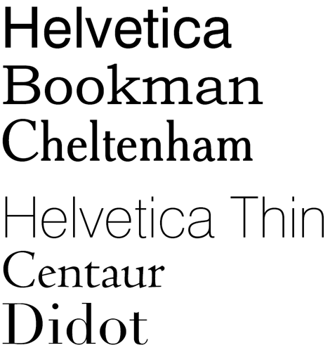
Figure 4. The top three faces in the sample below are better choices for printing in color or in reverse because of their heavier stroke weights, lack of delicate features, and modest contrast (the difference between the thick and thin parts of the character strokes). The three lower faces, which lack these characteristics, are bad candidates for use in such situations.
Another way to reduce the problem is avoid blended colors altogether for small type and for backgrounds for small, reversed type. Using a screened pure color—C, M, Y, or a spot color—goes a long way to reducing the “noise” surrounding each character outline by eliminating several inks and reducing the impact of imperfect registration.
Figure 5. The following type is reversed out of a screened magenta-only background. The edges of the characters are noticeably sharper than those reversed out of a four-color blended tint. The same would be true if the type were printed in a single ink color on a white background.

A 50% tint of a single color will still be reproduced in print as an array of halftone dots, but having the dots in only one color will yield crisper edges for your type. Printing solid, unscreened colors for type or background is even better.
Lastly, remember contrast. Screening type always makes its edges less distinct—even when using only black ink—because the white spaces between the spots of ink will merge with the white background and soften its focus. When using colored inks, the edges become softer still, further reducing contrast against the background. In such situations, type can become a chore to read, and that’s the last thing you want.
This article was last modified on August 12, 2021
This article was first published on June 23, 2010
Commenting is easier and faster when you're logged in!

Recommended for you
InDesign Type: Choosing the Right Leading
By understanding and applying a few key principles, you can determine the proper...

Hand-Lettering Lovers, Rejoice
You may have heard Lisa Congdon’s name before. She’s an artist, illu...

Designing with Lead-ins
Lead-ins draw attention and add flair to text by highlighting the opening words,...