Create a Classical Page Grid in InDesign

This article originally appeared in InDesign Magazine #35, April/May 2010. Subscribe now!
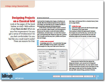
Look at the pages of the book below, an early 1900s edition of Les Fleurs du Mal. What are your first impressions? Do you get a sense of timelessness? Do you feel comfortable? Do you feel like you could read it easily? There are reasons for that.

In this article, you’ll learn how to use Adobe InDesign to create a classical grid. Its symmetry, wide margins, and homogeneous texture put the reader at ease and evoke tradition, timelessness, and even luxury. To create this classical grid, you’ll geometrically divide the page into a perfect mix of margin and live area; that is, where you’ll place text and images.
Click the image below to read the article as a PDF:


Rufus' bio here.
  • Anonymous says:

    I remember a rule for setting out a text box on a page, used by calligraphers, and it goes like this:
    for any page (height + width – diagonal)/12 = x
    Use 2x for top margin, 3x for side and 4x for bottom. For a two page spread use 3x for left, centre and right.
    You can use the space outside the box for headers, footers, page numbers etc. Always looks dignified.
    Ray Kenyon – Melbourne, Australia

  • Anonymous says:

    Lovely ….now all we need to do is get the client to accept that luscious white space!

    Thanks for the tip!

  • Anonymous says:

    I have been designing books and printed material for a lot longer than this fellow and the first thing that strikes me with this so called classic page grid is the narrow gutter margin. There is nothing more certain to turn off the reader than not being able to easily read text towards the gutter especially in a publication with many pages.

    Try using a golden section principle for classic proportions instead. Also, trust your own eye.

    Melinda Rene, Brisbane, Australia

  • Anonymous says:

    I am horrified that this article reduces “classic design” to a few ruled lines that may or may not turn out to be practical on any given page, especially those with an aspect ratio that results in the gutter swallowing text.

    Good design involves knowing when to break “rules” like this in order to achieve Good Design. That knowledge does not result from blindly following schemes and formulae, it comes from listening to printers and observing the practicalities of boring mechanical things like the way thick books swallow narrow gutters.

    Nice try, but there’s a lot more to layout than this formula.

  • This calculator might interest you. This calculator creates a harmonious and pleasing grid layout using Tschichold’s “golden canon of page construction”. It creates a document with text area of same proportion to the page size. Where the inside margins total the width of the outside margin. And baseline grid aligns to document grid. https://www.jeanlou.net/grid-layout-calculator/golden-canon/

  • >