*** From the Archives ***

This article is from December 7, 2010, and is no longer current.

CreativePro.com Embraces Web Fonts

Way back in the 20th century, CreativePro.com and Extensis belonged to the same company. We parted ways early in this century, but I’m happy to announce that we have once again worked together to bring you something cool: high-quality typography on the CreativePro.com Web site.
Extensis debuted its WebINK Web font service earlier this year, and we were keen to try it out. You’re looking at the results as you read these words. On the advice of Extensis’ type expert Thomas Phinney, we chose the Cora Web family. It’s designed by Bart Blubaugh and published by TypeTogether and is, of course, available through WebINK. Cora never shouts, but we hope it will quietly improve your reading experience.

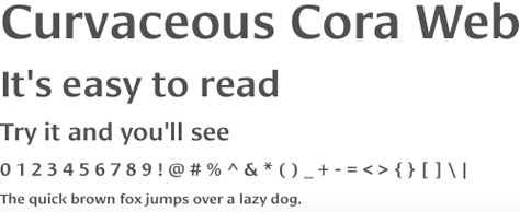
You might wonder why we bothered, since the change doesn’t knock you over the head. We’ve been writing about the recent rise in availability and popularity of Web fonts, and frankly, it was time for us to walk the walk. Web fonts are the future of Web design. Now that we’ve entered that future, we look forward to exploring it further. Thank you, WebINK, for making it so easy!
For more information on WebINK, including a 30-day free trial, go to https://bit.ly/gYrshp. If the Web fonts concept is new to you, read “What Are Web Fonts?”
And please, let us know what you think of the change by clicking the “Comments” button above or below this article.

  • SnapKat77 says:

    Sorry, but I don’t like the new font. Maybe it’s because it’s new and I’m not used to it yet, but I’m not finding it comfortable to read articles in a font that feels very calligraphic to me. I actually thought something was wrong the first time I visited the site after the implementation. It just seems too fancy.

  • Anonymous says:

    Hard to read in Firefox, particularly at the default size. I find I have to enlarge it if I’m going to read more than a few sentences.

  • Anonymous says:

    First, I think it’s commendable for CP to try out Web fonts. I’m wondering how much you budgeted for your monthly or annual payments to Extensis for the use of the fonts.

    That’s the issue I have with Web fonts in general: you have to keep paying for them for as long as you use them, and it costs more to use them on larger or more popular websites. Please correct me if I’m not thinking about this properly… (“I want to believe.”)

  • Jay J Nelson says:

    Sorry about that. I didn’t mean to post anonymously — just forgot to log in. So, how much would it cost CP to use these Web fonts, and how many styles are included?

  • Anonymous says:

    This new font is definitely harder to read, on a crystal-clear 1920×1200 display. The previous text had a larger x-height with no stroke variations. It seems that what was learned about legibility in the past decade is thrown out just because a new technology is available, but not needed.

    I, too, thought something was wrong when I first came upon the change. Please go back.

  • Terri Stone says:

    Yes, WebINK does have a monthly fee that varies according to site traffic. (Pricing tiers are broken down at https://www.extensis.com/en/WebINK/pricing/index.jsp .) Whether that monthly fee is “reasonable” depends on each site and its revenue system, of course; everyone has to decide that for themselves.

    Since Web fonts via online services are so new, there may be pricing experiments/changes as time goes on. I’m looking forward to this industry niche’s evolution.

    I’ll also be interested to see how many sites decide to bypass the online services and do homegrown Web fonts. (How-to is at https://creativepro.com/article/expand-your-web-design-font-choices-part-2 .)

    Terri Stone
    Editor in Chief, CreativePro.com

  • Terri Stone says:

    I really appreciate your take on Cora, everyone! This is very interesting.

    Terri Stone
    Editor in Chief, CreativePro.com

  • Anonymous says:

    Hard to read in Safari @ default size. It seems wispy to me and letter spacing is too tight. FWIW

  • Jay J Nelson says:

    OK, bad joke. But I keep imagining someone designing a beautiful website that they’d like people to see forever… except that if they stop paying their monthly bill for the font, the website design would collapse. Somehow that just doesn’t seem right…

  • Anonymous says:

    I find it amusing that you are talking about legibility and ease of reading while casting your words not in black & white but gray and white. You don’t have to actually read the text, just “sense” it and hope you get it right. [sigh!]

  • Anonymous says:

    Sorry, very, very hard to read at default size. What are your designers checking this on – a 10 year old crt or something? In Safari, FireFox & chrome on a 3-year old iMac I can barely make out the words. WAY too small. Is it that hard to get this stuff right?

  • Anonymous says:

    This new typeface is AWFUL for readability, using Google Chrome, without needing to increase the type size. Did you even test this website for readability before making it go “live?”

  • Anonymous says:

    I find the new font much harder to read. I find myself having to look at the words longer, it just doesn’t quickly flow to read a sentence.

  • Anonymous says:

    Looks good in Safari and I have good eyesight…

  • Anonymous says:

    Way too small at default, and I have 20/20 vision so…

  • Anonymous says:

    I was looking forward to seeing what this font would look like, but I must say that I think the result is pretty unpleasant. Some of the letters look like they haven’t been rendered properly and the look in general is patchy. I’ve checked it on a few browsers. Readablilty is good, but style is bad. I wouldn’t propose to use this font as it is in any web design. Pity. It looks like the choice for body text is still between Verdana and Georgia.

  • PKD18 says:

    Whichever font you used in the body of your web fonts article appeared “choppy” on my machine (PC running Friefox). It seemed very odd seeing a less than perfect font telling the story of how good new webfonts are.

  • >