

How’s this for a typographer’s mission statement: to provide the swiftest access to the author’s thought. That lovely and loaded little phrase comes from Stanley Morison, one of the greatest typographical figures of the 20th century. I found it in the introduction to Cyril Burt’s A Psychological Study of Typography (Cambridge University Press, 1959).
Burt made his reputation (and earned his knighthood) for his psychological and statistical studies about education and learning, but he came to the study of typography with very little specialist background except as that of an experienced reader. Likewise, his subjects were run-of-the-mill readers drawn from the general public.
What impressed Morison about the study, apart from Burt’s investigative techniques, was how the scientific method bore out what he and typographers and calligraphers over the centuries held to be received—but hitherto undocumentable—truths. The book, out of print, but available from second-hand outlets via online portals including Amazon.com, is a fascinating and compact account of how mechanical processes (such as specifying leading and point size) and psychological influences (such as the use of aesthetically pleasing typefaces and familiar layout styles) combine to make reading more or less facile.
As Morison always hammered home, ease of reading is the key. As he put it, the measurements applied when setting type—point size, leading, and measure, for example—don’t affect comprehension per se; rather they affect the reader’s comfort, making the act of reading more or less pleasant. Pleasant is good.
Burt’s study indicates that how the application of these measurements translate into readability is contextual. For example, the optimal point size for text depends on the age of the reader. Pre-schoolers and those learning to read, according to Burt, are most at ease with 24-point type, at least in part because during this developmental stage, character identification is still a big issue. As the brain learns to read whole words at a time, the comfort level for point size begins to drop: to 18-point for 7- and 8-year-olds and 14- to 16-point at ages 8 to 10. Age and preferred point size converge at 12. Adults found their comfort level at 10-point, although college students—reading intensively—were equally comfortable with 9-point. Not surprisingly, as people get older, type looks better when set a bit larger, with seniors preferring 11- and 12-point type. A second adolescence, as it were.
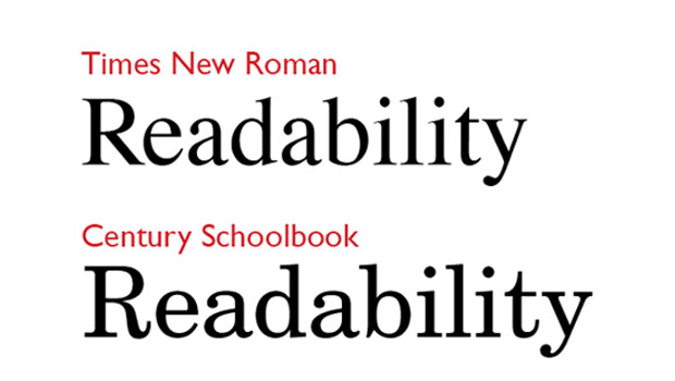
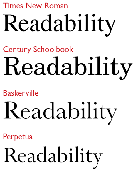
It’s noteworthy, though, that Burt’s age-related studies were carried out using Times New Roman, a newspaper face that’s slightly condensed and slightly bolder than classic book faces, as shown in Figure 1. For his tests with kids, his results probably would have been somewhat different if he’s used a typeface specifically designed for junior eyes, such as Century Schoolbook, which looks positively bulky in comparison to Times.
Figure 1: Compared to Burt’s benchmark Times, designed for newspaper use, Century Schoolbook is far more muscular, designed for the eyes of a beginning reader. By comparison to both of these, text faces such as Baskerville and Perpetua look quite delicate, and test subjects, had they been subjected to them, may well have preferred to see them set in somewhat larger sizes.
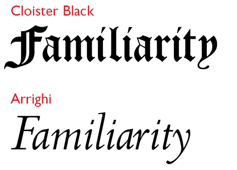
Another powerful theme running through Burt’s study is the positive influence of familiarity on readability. Point sizes, typeface choices, and line lengths that might normally be considered out of the fold are comforting to those habituated to them. This is borne out by history. In the 16th century, italics were the norm for books (they saved space, hence paper, hence money), although today they’re disparaged for long texts. Likewise, readers of German blackletter types (see Figure 2), in their day, had reading speeds and comprehension levels on a par with those of Latin-based texts.
Figure 2: Blackletter (or fraktur) faces are difficult on the eyes and brains of those unfamiliar with reading them, but they’re no challenge for initiates. Likewise, italic types, which these days slow down reading speeds, were once standard fare for classics and novels alike.
Following on from these observations, is Burt’s fascinating discovery that people will tolerate a fairly wide range of reading comfort levels depending on what they read. When reading material that engages them (professionally, say, or works by their favorite novelist) they are more likely to find themselves at ease with unfamiliar typographic conditions (smaller point size, say) than they would with other reading material that’s either more casual (a waiting-room magazine, say) or obligatory (a boring annual report). In fact, readers tend to find more pleasing the typefaces used for their favored reading materials than with those same faces when used for text they feel obliged to read. In practical terms, this is an argument for using classic, familiar typefaces for texts which need to seduce a reader, where unusual designs tend to be off-putting.
This article was last modified on August 2, 2021
This article was first published on June 5, 2012
Commenting is easier and faster when you're logged in!

Recommended for you

TypeTalk: What Are Web Fonts?
TypeTalk is a regular blog on typography. Post your questions and comments by cl...

Annie Atkins: Graphics and Typography for Film
Annie Atkins has what many designers would consider a dream job – she creates gr...

How to Solve Typographic Widows and Orphans
Discussions of typographic widows and orphans normally start with an argument ab...