


Your client is a college art department that’s asked you to design a 1-month activity schedule that meets the following requirements: It must convey the nobility of the school and the artistic spirit of the month’s events. It must be handy to use, printable in-house, and inexpensive. Oh, and it must be done by tonight.
How do you turn in quality work on such a tight schedule? In the same way you do any job — methodically. The difference is that you limit type and colors to the basics and your layout to a simple configuration.
 Work with what you have. The page is a strong vertical line; the brush image is an even stronger line. Placed parallel, they work together; crossing, they have friction and energy, and in this case the brush becomes a header, too. The centerline is the point of highest contrast in the image.
This article has expired. However, you can still read the article by buying it from the Before & After site. Look for the article called “0616 – Design on a Centerline.” Since we’re big fans of the magazine, we recommend you subscribe for a full 32 articles (that’s four print issues for $42 or 32 downloadable PDFs for $24).
This article was last modified on January 6, 2023
This article was first published on April 7, 2006
Commenting is easier and faster when you're logged in!

Recommended for you

First Baseline Blues
In every frame of text you set, it’s vital that the alignment of your type...
Make a Quick Bar Chart (or an amazing geometric shape) with Transform Sequence
I love it when InDesign does stuff for me? not necessarily when it tries to...
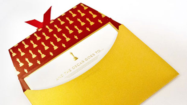
Get a Sneak Peek at the Oscars Envelopes
Press Release Marc Friedland, founder and creative director of Marc Friedland Co...