

“Before & After” Magazine”

You can subscribe to “Before & After Magazine” in PDF or Print.
Click here to learn more.
New fonts pop up faster than you can say “Garamond Bold.” Then why is finding type that’s easy to read still akin to finding a needle in a haystack? By following just seven rules (from “pick a typeface with similar character widths” to “avoid quirkiness”), you can sweep aside the hay to pinpoint legible, readable fonts.
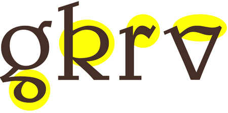
Your eyes would soon tire of this typeface.
This article has expired. However, you can still read the article by buying it from the Before & After site. Look for Issue 21. Since we’re big fans of the magazine, we recommend you subscribe for a full 32 articles (that’s four print issues for $42 or 32 downloadable PDFs for $24).
This article was last modified on January 10, 2022
This article was first published on July 18, 2005
Commenting is easier and faster when you're logged in!

Recommended for you

How to Make Alternate Text Styles in Microsoft Word
Working in Microsoft Word? Shawn Jordison shows you how to spruce up your docume...

Heavy Metal Madness: Put on a Happy Face!
When I met my wife Patty back in the very early ’80s, it made perfect sens...

Font Fetish: Meyer Two
This blog isn’t always about recently released typefaces, and this entry p...