
This story is taken from Before&After Magazine
A strong, vibrant photo can be the star player in your design. But what if the photo is so strong that it overshadows everything else on the page? That’s when it’s time for a little strategic “swiping”; using an image editor, you erase part of the image so that text is visible, but the image’s power remains. After seeing all the examples in this how-to, you’ll be inspired to try it yourself.

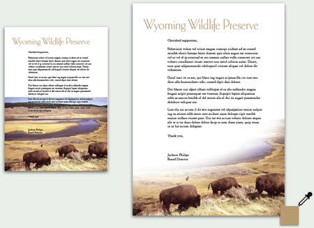
“Here, a horizontal image is incompatible with the vertical space. Solution? Follow the image’s natural lines, and fade it into a sweeping composition. The panoramic backdrop fades slowly into the distance, leaving the viewer’s attention on the buffalo. The dressy, willowy typeface, colored to match the grass, is a sophisticated contrast to the heavy, earthy scene.”
Click here to download this issue of Before&After as a PDF file.
This article was last modified on December 12, 2024
This article was first published on May 10, 2005
Commenting is easier and faster when you're logged in!

Recommended for you

For Position Only: Drupa Wants to Pump Printing Up
If you thought your feet got tired walking around Moscone Center during Seybold...

Exploring Color Combinations with Data Merge
Learn the clever trick for showing all possible permutations of colors in a logo...
Setting Exact Space Between Objects in InDesign
Learn two methods to use when you need a precise amount of space between items i...