

Creativepro.com readers can subscribe to “Before & After” at a discount. Click here to learn more.
We’re accustomed to thinking of monograms as a relic of another era, one in which propriety and tradition were of utmost importance. But if you think of a monogram as a personal brand, then these letter-based logos are as relevant today as ever.
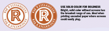
Creating a monogram is an interesting design exercise. You need to incorporate letters or even words in a concise format that delivers graphic punch. Color is critical as is choice of typeface. But with monograms especially, less is more.
In this feature from our partner “Before & After” magazine, learn how to compose a monogram of style and distinction that can be used for either personal branding or business marketing. It all begins with a circle.
This article is a reprint from the archives “Before and After,” you’ll see references to older version of software. The design concepts, however, are timeless.
We’ve posted this story as a PDF file. All you do is click this link “Monogram Logo Conveys Character” to open the PDF file in your Web browser. You can also download the PDF to your machine for later viewing.
To open the PDF, you’ll need Adobe Acrobat Reader. Get it here:
 .
.
To learn how to configure your browser for viewing PDF files, try these tips from Adobe:
- Click here for Explorer on the Mac
- Click here for Explorer on Windows
- Click here for Navigator on Windows
- Click here for Navigator on Mac.
This article was last modified on July 18, 2023
This article was first published on July 9, 2003
Commenting is easier and faster when you're logged in!

Recommended for you

Quark Publishing System 3.5 Previewed at NEXPO
Quark Inc. today announced the forthcoming release of its publishing workflow so...

iPhone 13 Pro: The Best iPhone Camera Yet
Apple's newest iPhone offers a host of new features that leverage sophisticated...

Before&After: Design a Multi-Purpose Flier
Learn how to create a template for that low-cost workhorse—a single-sheet flier,...