

“Before & After” Magazine”

You can subscribe to “Before & After Magazine” in PDF or Print.
Click here to learn more.
There’s nothing wrong with having a certain design style. But what if your style is formal and you’re creating collateral for a folk festival? For the design to work, you’ve got to use type, colors, images, and layouts that are authentic to each particular project.
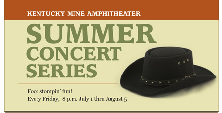
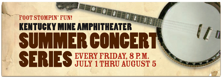
The original Web banner (top) for an outdoor concert series set under 150-foot pines is neat, smooth, and completely wrong for the event. The revised Web banner (bottom) projects energy, musicality, and a true sense of place.
This article has expired. However, you can still read the article by buying it from the Before & After site. Look for the article called “0617 – How to look real.” Since we’re big fans of the magazine, we recommend you subscribe for a full 32 articles (that’s four print issues for $42 or 32 downloadable PDFs for $24).
This article was last modified on January 10, 2022
This article was first published on August 24, 2005
Commenting is easier and faster when you're logged in!

Recommended for you

Tip of the Week: Using Optical Margin Alignment
With this InDesign tip for using Optical Margin Alignment you can create improve...
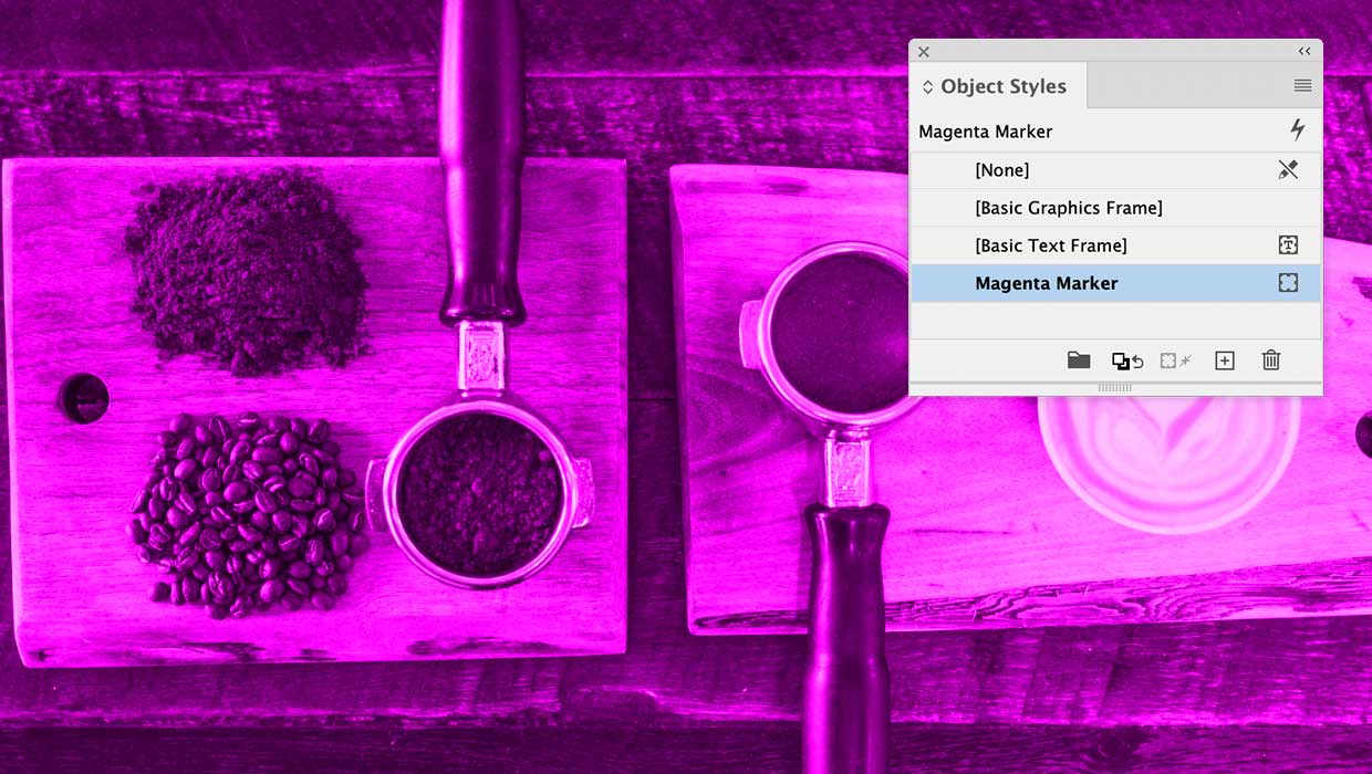
Object Styles for Marking Content in InDesign
How to use objects styles that make it easy to spot images that need work
Making an Animated Route Map
Remember those cool flight maps from Raiders of the Lost Ark and the other India...