

This story is taken from “Before & After” Magazine.

You pay attention to colors in your photographs. You may even use a color management system to ensure that the colors you see on screen are the same as the ones that print. Yet do you pay enough attention to the colors that surround the image? The colors you use in your design can lessen the impact or change the meaning of a photo.
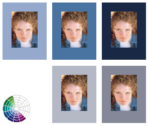
It all goes back to the color wheels we used as kids to learn about color. Colors can coordinate, complement, or clash to different effect. Start by selecting tones from your image itself then experiment with the color wheel for endless options.
This article was available on CreativePro.com for a limited time only. However, you can still read the article by buying Issue 31 from the Before & After site. Since we’re big fans of the magazine, we recommend you subscribe for a full 32 articles (that’s four print issues for $42 or 32 downloadable PDFs for $24).
This article was last modified on January 3, 2023
This article was first published on May 2, 2003
Commenting is easier and faster when you're logged in!

Recommended for you

Live Subtitles and Real-time Translation in PowerPoint
Learn about a game-changing PowerPoint feature that offers your presentation aud...

Wrapping Text Around an Anchored Object
Wrapping text around anchored objects can be challenging. Here are a few tips.

How to Create Numbers in Circles Within a List in InDesign
Learn how to put numbers inside of custom circles in InDesign—even if they are p...