
Designing Web Sites That Sell: Components of Commerce

Excerpted from “Designing Web Sites That Sell” (Peachpit Press).

Peachpit Press is offering this book at a discount to creativepro.com readers. Follow this link.
Many commerce sites have paid the price for poor usability and interaction design. From these failures and from others’ successes, usability experts have identified some best practices for the interaction design of commerce sites. In this section, we cover the best practices for navigation, search, shopping carts, checkout procedures, forms, personalization, and accessibility.
Navigation
In a mall store, a customer looks at a shelf and knows how many different products are available. Stores have predictable layouts, and signs label different departments when needed. At checkout time, you head to the registers at the front of the store.
Online, there are no consistent and reliable ways to get similar information. Given the Web’s lack of conventions, the interaction designer is also charged with developing a good navigation scheme to help customers make sense out of a site.
Good navigation shows a visitor their location in the site’s structure. It provides a reliable base when everything else changes. Good navigation reinforces the purpose of the site and how to use it. It makes content easily accessible.
On most commerce sites, there are three different types of navigation at work: global, local, and contextual.
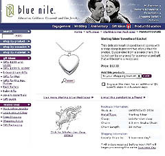
Figure 1: Blue Nile is a good example of a Web site that has consistent global, local, and contextual navigation.
Global Navigation
Global navigation gives the customer a picture of the overall organization of the site such as major sections or product categories. It is a reliable guide that is available on every page, usually at the top or left side. Global navigation enables lateral navigation across the site’s hierarchy (see figures 2 and 3).

Figure 2: Amazon.com’s space-efficient tab-style global navigation has been widely adopted in the commerce world because tabs are easy for customers to understand.
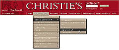
Figure 3: Christie’s pull-down style menu of global navigation gives customers access to deep layers of category and subcategory content from any page on the site.
Usability specialists agree that global navigation should consist of the following items:
- Site logo: Every page should have a logo to identify what site the customer is on. Usually, the logo is hyperlinked to the home page. No matter where the visitor ventures on the site, they should have a quick way to get back to the beginning.
- Major sections: After the information-design phase, logical site groupings should be obvious, but there may be too many options. To be consistent with the “chunking principle,” sites should limit major sections to a maximum of nine items. Any more makes it difficult for the customer to quickly make sense of the choices. Pick the most appropriate items based on the customer’s tasks and offer a link to a site map that supplies the rest.
- Link to the help section: Customers might run into something they don’t understand and your team didn’t anticipate. A simple link to the help section might retain customers that might otherwise leave out of frustration.
- A way to search: If a customer is unable to find what they want through browsing, they should be able to search. Although their chances of finding what they want are not guaranteed, it’s an important option to offer. We cover searching later.
- A way to view the shopping cart: In a bricks-and-mortar store, customers always have a cart or basket in hand. On a commerce site the customer should be able to access their cart at every moment.
Some usability experts suggest not putting a lot of navigation choices on inside pages. That suggestion might work if customers always entered a site through the home page. But many customers enter by clicking on a link that lands them on category or product pages. Customers must be able to quickly orient themselves in the new site. Breadcrumbs are a great way to provide such context simply.
This article was last modified on January 8, 2023
This article was first published on September 18, 2002
Commenting is easier and faster when you're logged in!

Recommended for you

Swap Out Placed Pages with Relink
If you're tired of having to do the whole File > Place routine over and over jus...

FontAgent Pro Provides Font Management and Repair for QuarkXPress 7 Users
Insider Software today announced the immediate availability of the industry...
Tip of the Week: Turning Off Typekit
How to turn off Typekit font synching in the Adobe Creative Cloud app if you don...