
Digital Photography How-To: Converting Color Photos into Black-and-White Images
This story is taken from “Exploring Digital Photography” (Element K Journals).
Creativepro.com readers can subscribe to Element K Journals at a discount. Click here to learn more.
Black and white images have a special elegance that puts them in a class by themselves. Many people admire black-and-white photography, but the average digital camera only takes pictures in color. This means you need to convert your image to Grayscale, as black-and-white images are commonly called on the computer, to make them for yourself.
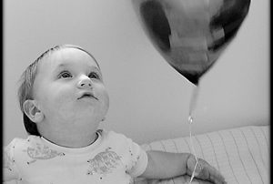
In Figure 1, you can see a colorful image that we’ll convert to black and white. While the process isn’t difficult, we’ll show you that a grayscale conversion isn’t quite as simple as it seems if you really want to get good results.
Figure 1: Even though we liked the colors in this image, we thought it would also make a nice black-and-white image.
In this article, we’ll show you how to convert color images to black and white while avoiding unexpectedly flat results. Then, we’ll show you three different methods for converting your images to grayscale starting with Photoshop’s default method of switching modes. Next, we’ll show you how Lab color can separate the luminosity of an image from all the color, which results in a black-and-white image. And finally, we’ll show you the best method — which is also the one that requires the most finesse — the Channel Mixer. Then, once you’ve converted your image to black and white, we’ll give you some tips for getting optimal printed results.
Contrast Fundamentals
The chief difference between color images and grayscale images isn’t an absence of color, but a difference in contrasts. A grayscale image consists of black, white, and grays that form a range from light to dark. It has contrast in terms of luminosity, or brightness levels.
While color images also have luminosity contrast, they frequently have two other types of contrast as well: hue and saturation. An image with a complementary color scheme, red and green, for example, has hue contrast, but the brightness value (luminosity) of the colors may not differ significantly once they’re converted to grayscale, as you can see in the top example of Figure 2.
In saturation, contrast is based on how much a color differs from a neutral gray. Saturation contrast doesn’t necessarily translate to good luminosity contrast either, as you can see in the bottom of Figure 2.
If your image relies on hue and saturation for contrast, then you’ll have more difficulty converting it into a rich black-and-white image. Many similar tones will flatten or dull the power of your grayscale images. However, you can work around it, as we’ll show you.
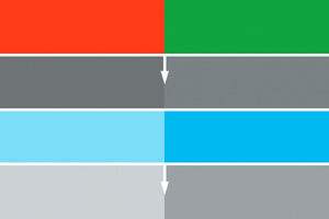
Figure 2: Hue and Saturation contrast don’t necessarily translate to Luminosity contrast.
Instant Black and White
The most obvious way to convert a color image to a black and white image is to simply switch the image from RGB mode to Grayscale mode by choosing Image > Adjust/Adjustments > Grayscale. This enables Photoshop to toss all the color information instantly. You can see our results in Figure 3. Our image is certainly black and white now, but it’s also a little flat. All the tones are very similar, which is the drawback to merely switching to Grayscale mode. You have no control over the results. If many of the tones in your original image are dark or rich, you could end up with something downright muddy. Some people avoid this by simply bumping up the contrast of their original image before converting to Grayscale, but that causes you to lose some detail in the highlights and shadows.
Convert your image as described and then save it with a new name. Now, you can use it as a reference to compare with our other two methods. Next, reopen the original file to start the next section.
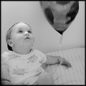
Figure 3: Just converting to grayscale will most likely leave your tones a bit on the flat side.
Separating the Colors
A somewhat better way to convert your image to Grayscale is to use Photoshop’s Lab mode. While this mode isn’t as commonly used as RGB, Grayscale, and CMYK, it can come in very handy for certain operations such as image sharpening and making the conversion to grayscale. This is because Lab mode separates an image into channels in an interesting way. Lab separates the Lightness component (luminosity) of an image into its own channel. All the colors of an image fall into either the a or the b channels, enabling you to utilize the Lightness channel on its own.
To convert your image to Lab mode, choose Image > Adjust/Adjustments > Lab Color. Then, switch to the Channels palette and click on the Lightness channel. Copy and paste it into a new document and then save it for comparison. More likely than not, your results will look at least a little better than a simple Grayscale mode change, as you can see by comparing our image in Figure 3 to Figure 4.
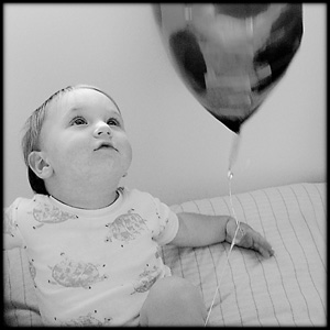
Figure 4: The Luminosity channel in Lab mode can be used to make a grayscale image.
Channel Surfing
The best way to convert an RGB image into a grayscale image is the Channel Mixer. This nifty feature allows you to mix the channels of your image to refine the tones and create optimal luminosity contrast. To see how it’s done, choose File > Revert to return your test image to its original state. Then, bring up the Channel Mixer by choosing Image > Adjust/Adjustments > Channel Mixer. Since you’re making a grayscale image, the first thing you need to do is select the Monochrome option in the lower-left corner. This gives you your black and white image. Now, by default, the Red slider is always set at 100 while the other sliders are set at 0. Adjust the sliders of two or more color channels until you get a good result. For our image, we used R: 50, G: 58, B: 10, as you can see in Figure 5. The Constant slider adds an overall brightness or darkness setting to your image.
Your percentages will vary depending on the subject matter of the original image, but you’ll probably find yourself working mostly with the Red and Green channels rather than the Blue, as it tends to be darker and noisier.
Keep in mind that a negative value inverts the channel before applying it to the output channel. As you make adjustments, compare the image you’re working with to the reference images to make sure you’re staying on track and actually making improvements.
Once you’ve finished, click Save. You can see our results in Figure 6. Even though your image looks like a black and white image, it’s still an RGB file. If you look at the Channels palette, you’ll see that the Red, Green, and Blue channels look exactly the same. You can either save your image as an RGB file, or you can convert it to Grayscale and it won’t change at all visually. However, we’ll show you some reasons you may want to leave it in the RGB format for printing.
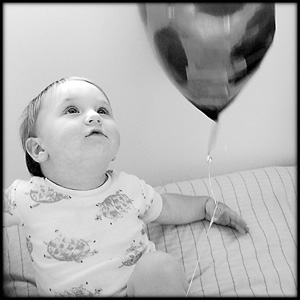
Figure 5: The Channel Mixer lets you mix individual channels.
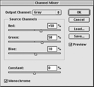
Figure 6: You have the most control over the image’s tones when you use the Channel Mixer.
Printing Black-and-White Images
Even if you’ve converted your image to Grayscale, you may not want to save it in Grayscale mode. If you’re printing images on your home printer, you’ll get better results by leaving your image in RGB or CMYK. This is because a grayscale image only triggers the black ink in a printer and you’ll only get the 256 tones that are in the grayscale image. If you print a black and white image in RGB, all of your inks will print, and while your image may not be quite as neutral, you’ll have a lot more richness in your printed tones than is possible with just one ink.
If you’re sending your image to a company like Ofoto or Shutterfly, it makes little difference if you save the image as a Grayscale or an RGB image because the image is printed on color paper regardless and will have at least a slight cast. Be sure to attach the sRGB profile if you save a color file or the Gamma 2.2 profile if you save as a grayscale image.
A Touch of Gray
We’ve given you an overview of different methods of converting your RGB images to black and white or grayscale. In our experience, the best results come from working with the channels, which get the closest to the source and provide the most image information and control options.
This article was last modified on January 3, 2023
This article was first published on May 16, 2003
Commenting is easier and faster when you're logged in!

Recommended for you

How to Extract Images Using Photoshop’s Refine Mask
Splitting Hairs with Refine Mask We can only accomplish so much using manual mas...

Creating Custom Shadows in Photoshop
Learn how to create shadows that add a whole new layer of meaning to a photo.

How to Prepare Raster Images for Use with Illustrator Brushes
In the process of testing Illustrator features released last June in the Creativ...