


dot-font was a collection of short articles written by editor and typographer John D. Barry (the former editor and publisher of the typographic journal U&lc) for CreativePro. If you’d like to read more from this series, click here.
Eventually, John gathered a selection of these articles into two books, dot-font: Talking About Design and dot-font: Talking About Fonts, which are available free to download here. You can find more from John at his website, https://johndberry.com.
Romano Hänni prints hand-set type by letterpress, a technique that’s hardly cutting-edge in our digital world, but the work he produces is by no means quaint or old-fashioned. He draws on the traditions of letterpress printing—including the modern tradition of “Swiss” typography that set such an austere standard half a century ago—to create new work that plays with those conventions at the same time it honors them.
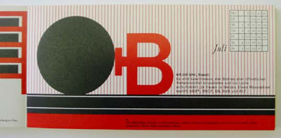
Detail of “Kalendarium” (Calendar), from 1987, designed and printed by Romano Hänni
Hänni is known in Europe for his design of magazines and newspapers, but his own experimental books and ephemera show his aesthetic at its most refined. San Francisco printer Jack Stauffacher calls Hänni’s letterpress work “among the finest being done today—really more characteristic of the pre-computer generation of letterpress masters, and exemplary in both design and execution.”
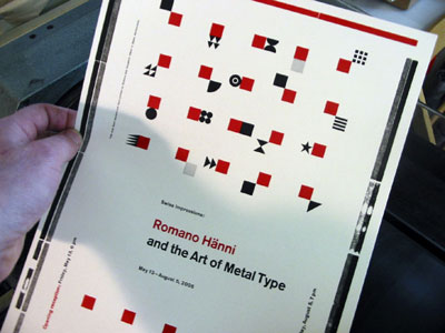
Hand-printed proof of the announcement for Hänni’s exhibition at the San Francisco Center for the Book
At his workshop in Basel, Hänni works on the hand press with the most traditional of colors—black and a little printer’s red—using type-related shapes and forms in all of his designs.
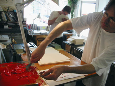
Hänni (right), in his studio in Basel, mixing ink and preparing it for the press
From Books to Newspapers
Hänni’s other area of expertise is the design of newspapers. He was responsible for the redesign of the Basler Zeitung, where a combination of a strict but complex grid and lively forms of information pack a lot onto the front page without any sense of cacophonous clutter.
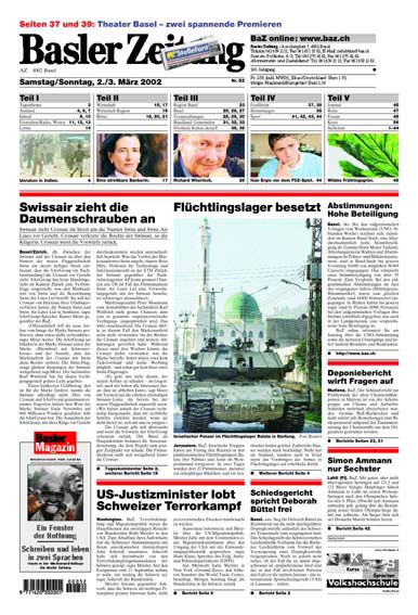
Front page of the newspaper “Basler Zeitung” from 2002, designed by Hänni
“Transferring the bibliophilic aspirations of a hand-press booklet to the typography of a daily newspaper is a tremendous challenge,” says Hänni. “I strive to transfer my respect for lead-type letters to their pixel-based successors.”
Hands-on in San Francisco
An exhibition of Hänni’s work has just opened at the San Francisco Center for the Book—an appropriate venue for such hands-on work. Jean-Benoît Lévy, Claudia Dallendörfer, Michael Bartalos, and SFCB artistic director Steve Woodall put on the show. Hänni will teach a two-week master class at SFCB this summer, along with Jean-Benoît Lévy, in which students will design, hand-set, print, and bind an edition of a small book, without using computers. The class description calls it an “immersion in pure typography,” where students can use the strict limitations of the process to “explore the relationship between the infinitely diverse properties inherent in computer-based typography and the unique look and feel of traditional metal typesetting.” At the end of the workshop, on August 5, SFCB will host a “Finissage,” showcasing the work produced in the master class and celebrating the end of the exhibition. Hänni will also speak at the California College of the Arts on July 28, on the hand-printed book and newspaper design.
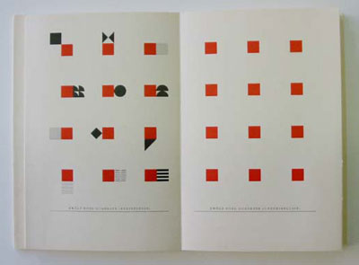
A highly abstract spread from Hänni’s “Typographische Notizen” (Typographic Notes), 1992
The exhibition will be up in the gallery at the Center for the Book until Aug. 5. If you’re in San Francisco, it will be well worth your stopping by to see it. Viewing work like this, especially seeing it first-hand rather than just reproduced in design annuals or on the screen, can give you a jolt and remind you of what’s possible—and of where the art you practice came from.
This article was last modified on February 16, 2022
This article was first published on May 16, 2005
Commenting is easier and faster when you're logged in!

Recommended for you

dot-font: Serifs from the Portuguese
dot-font was a collection of short articles written by editor and typographer Jo...
Download Second dot-font Book for Free
From digital to print to digital again—that’s the path John D. Berry...
dot-font: Wading into the Dutch Type Library
dot-font was a collection of short articles written by editor and typographer Jo...