

dot-font was a collection of short articles written by editor and typographer John D. Barry (the former editor and publisher of the typographic journal U&lc) for CreativePro. If you’d like to read more from this series, click here.
Eventually, John gathered a selection of these articles into two books, dot-font: Talking About Design and dot-font: Talking About Fonts, which are available free to download here. You can find more from John at his website, https://johndberry.com.
“Hands up,” said program chair John Hudson, “everyone who can remember the theme of last year’s conference in Rome.” It was an unfair question, perhaps—a little like calling a snap quiz—but he made his point: Not a hand was raised. (The theme in Rome had been “The Shape of Language / La forma del linguaggio.”)
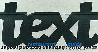
Hudson hoped that this year’s theme, “Between Text & Reader,” would stick in people’s minds a bit longer, and he and co-chair Ross Mills did their best to ensure this by putting together a densely packed, tightly interwoven program of talks and panels and demonstrations that all focused on that undefinable but crucial space between the text and its reader. There were talks about the design of books, about the design of newspapers, about the design of information, about the design and use of typefaces in Arabic, Hebrew, and Chinese, and, most notably, about legibility and readability.

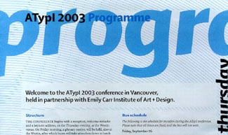
An inviting program—both the printed schematic and the events that it described
That last may sound dry, but in fact it was the hot topic of the conference. Several presentations touched on the subject, but it was Kevin Larson’s two talks—especially the second one, “The psychology of word recognition”—that got everybody talking. (I missed this, and I came to regret it. But with multiple tracks of interesting programming, you’re always missing something.)
Larson, who works with Microsoft on the readability of ClearType, exploded the notion that we read by recognizing the shapes of words, using exhaustive research on reading and eye movements to make the case (apparently long accepted among linguists) that we perceive all the letter shapes and the space between them at the same time, putting the whole together in an instant into something that we recognize. Gerard Unger followed Larson with a more lighthearted but quite serious look at the “ergonomics” of typography, trying to get away from received opinions about the aesthetics of type and get at the fundamentals of how readers use the type that they read.
Sometimes what lies between text and reader is dinner.
Tangible Meaning
Robert Bringhurst was the keynote speaker, and the theme “Between Text & Reader” was practically ready-made for him. Bringhurst is best known in the type community for his influential book “The Elements of Typographic Style,” but he is equally adept as a poet, a book designer, and a student and translator of North American native languages. His deep, rich, sonorous voice, which he uses as an instrument when he speaks in public, led his audience into contemplation of the ideas that he wove into his speech, entitled “The tangibility of meaning.”
He meant “tangibility” quite literally: “Once,” he said, “almost no one learned to read who did not also learn to write—in both the physical and literary senses of the word. For as long as that was so, readers felt their way through texts. Reading was tactile as well as visual, because readers knew the moves that made the letters they were reading.” This couldn’t be less true today, and Bringhurst explored just a few of the implications of that fundamental change. He brought in the recently created writing systems for several indigenous oral cultures, as well as the “typefaces” we create out of pure pixels and imagination. He set a high standard of discourse for the rest of the conference—and for the most part it was maintained.
Conjunction of Time & Place
Vancouver was a wonderful place for a conference, and the Emily Carr Institute of Art & Design (ECIAD) was an excellent venue for most of the program. (The first half-day consisted of a single track of lead-off talks in the auditorium of the Westin Bayshore hotel, after which the action switched over to ECIAD and broke into multiple strands of programming in the school’s smaller spaces.) The school is located on Granville Island, a former industrial area that now boasts a very good farmers’ market, art galleries, and shops, and of course a variety of seafood restaurants, all tucked underneath the Granville Bridge in the heart of the city. The closeness of everything (except the Westin) made for a cozy conference, well integrated into the urban fabric of Vancouver.
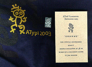
Jim Rimmer cast the conference’s petroglyph mascot, Shamus, as a piece of 48 pt type—one of the items handed out to attendees in their goodie bags.
Everything seemed to go well, both on the surface and behind the scenes. We were treated to extraordinary weather—hot, sunny days that belied Vancouver’s rain-coast reputation—but even without that, the cheery helpfulness and obvious enthusiasm of the students, faculty, and staff of ECIAD, and the invitingly jumbled rooms and buildings of the school’s campus, would have made the experience work.
This was a relatively small conference (the last figure I heard was 260 attendees), but that fit the venue very well. About 30 percent of the attendance was Canadian—more than is often the case from local design communities. Amazingly, more than half the members of the conference ended up going to Saturday night’s Gala Dinner, a stand-up affair at Bridges restaurant, right on the dockfront of the island. Friday night’s traditional auction, which was also well attended (with an open bar during the whole auction, to get people loosened up so they’d part with their money), had one of the best selections of items for sale of any ATypI auction; it saw a lot of spirited bidding, and ended up bringing in more money for ATypI than any previous auction. (Not bad in an economic downturn.)
There is always talk of whether ATypI conferences are the best place for the type community to gather, and of how ATypI can reflect the ever-changing nature of the type business. In a time when cash is tight for almost everyone, individuals will make pragmatic decisions about where to go and where to spend their money—go to Vancouver? go to TypeCon? go to the St Bride conference? stay home?—but among the organizations that put on these events, there is a tradition of cooperation. This year’s ATypI, for instance, saw the exhibit of the winners of the annual typography and type-design competitions of the Type Directors Club from New York, alongside a series of exhibits brought to Vancouver through the auspices of SOTA (Society for Typographic Aficionados): the winners of the 2002 Morisawa awards for type design, an international poster show, the work of nineteen South American type designsers in “Letras Latinas,” a showing of the six typefaces submitted to the Typeface Twin Cities project, and SOTA’s own unjuried showcase. (These exhibits were in an airy central passageway at the school, and were constantly attracting students as well as attendees.)
Between Conference & Attendee
Program highlights for me were Bringhurst’s keynote speech, Yasmine Nashabe Taan’s illustrated tour through the street typography of Beirut, and Gerard Unger’s second talk, on legibility in type design. I would have liked to catch both Keith Tam’s talk on Chinese typography and Shelley Gruendler’s on Beatrice Warde, but both of them were first thing in the morning—and I’m not much of an early morning person.
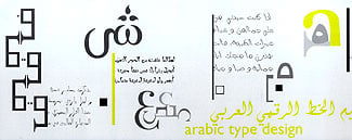
Part of a card about Arabic type design from Yasmine Taan, of the Lebanese American University in Beirut.
The real highlight, of course, was getting together with friends, making new ones, reaffirming cross-cultural ties, and exchanging new ideas. Each ATypI conference is like a little temporary town or village, or perhaps an annual fair like the ones they once held in medieval Europe (distant ancestors of today’s gargantuan trade fairs). It’s where we come together, again.
This article was last modified on February 23, 2022
This article was first published on October 6, 2003
Commenting is easier and faster when you're logged in!

Recommended for you
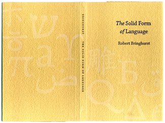
dot-font: Solid Language
dot-font was a collection of short articles written by editor and typographer Jo...

Download Second dot-font Book for Free
From digital to print to digital again—that’s the path John D. Berry...
dot-font: It’s Alive!
dot-font was a collection of short articles written by editor and typographer Jo...