


dot-font was a collection of short articles written by editor and typographer John D. Barry (the former editor and publisher of the typographic journal U&lc) for CreativePro. If you’d like to read more from this series, click here.
Eventually, John gathered a selection of these articles into two books, dot-font: Talking About Design and dot-font: Talking About Fonts, which are available free to download here. You can find more from John at his website, https://johndberry.com.
The magazine Upper & lower case no longer exists. This shouldn’t come as news, but I’m always surprised at how many former readers don’t seem to have absorbed this information. “Haven’t seen that around in a while,” they’ll say, shaking their heads. Indeed they haven’t: U&lc ceased publication, at least on paper, with its final issue, vol. 26 no. 2, in 1999. I know; I was editing it at the time.
An online version still appears today, published by Monotype Imaging, which bought the assets of International Typeface Corporation after ITC’s parent corporation dissolved it at the end of 1999. The current U&lc Online is quite different from the online publication that we were doing while I was at ITC, but you can find most of the archives of the old U&lc Online if you dig on the site. These include a few articles that were published in the printed U&lc, as well.
But if you’re looking for something you can hold in your hands, you may want to seek out a new book out from Mark Batty Publisher that attempts to capture some of the spirit of U&lc’s long run. U&lc: influencing design and typography is a retrospective—three-quarters of the book is devoted to large-size reproductions of notable articles and page spreads from the magazine’s 100 issues—with four new articles at the front that explore how U&lc was created and grew. The book’s format is smaller than the tabloid-size pages of U&lc, but spacious enough to show off the page spreads properly and keep the text comfortably readable. The pages were all scanned directly from copies of the magazine.

Two of Herb Lubalin’s page designs from 1978 issues of U&lc
Self-Promotion
This column might fall dangerously close to the category of tooting my own horn, since this is a book that I edited and designed (with the considerable help of Nicole Recchia and Gina Nastasi at Mark Batty Publisher, who tamed the twin dragons of permissions and production). Naturally, I think it’s a wonderful book, and you should all rush right out and buy a copy. But what makes it interesting as a hook to hang a column on is the responses people have had, to the book and, through it, to the existence of U&lc itself.
I won’t repeat too much from my own introductory article, about the changing nature of the type business and how U&lc both influenced and responded to the use of type in graphic design. The important points are that ITC itself was founded to take advantage of the freedom of photographic typesetting; and that the most effective way to publicize ITC’s typeface designs was to publish a lively tabloid magazine, print it inexpensively on newsprint, and send it out for free to everyone in the graphic-design world. U&lc’s founding editor and designer, Herb Lubalin, promoted ITC faces by showing them in use—in dramatic and varying ways—and his successors carried on this practice. In particular, when Margaret Richardson was editor in the early and mid-1990s, she invited a different designer to handle each issue. If you were a reader during that period, there was no telling what the next issue might look like, but you knew it would be flamboyant and novel. And it would explore ways to use type.
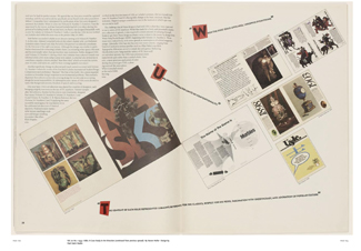
A spread, designed by the Paul Davis Studio, from Steven Heller’s article about U&lc in the magazine’s 20th-anniversary issue (1993)
And Now?
Nobody is doing that today, or so it seems. Several designers I’ve talked to recently have lamented the lack of any large-format publication that features new and experimental typography with new typefaces. In the 1980s, Emigre was doing for digital type what U&lc had been doing for phototype, but it’s been a long time since Emigre featured large-scale graphic experiment; today Emigre takes the form of a book-size theoretical journal. Adobe’s Font & Function showed off Adobe typefaces attractively for a while, but that’s long gone too; and its style was more traditional than cutting-edge. FontShop has done some remarkable melding of content and page design in various publications, but always at a fairly compact size. Quark is about to revive its magazine X-Ray, which is a good promotional move in the current market, but X-Ray sounds more like the sort of tips-and-tricks guide that we see so much of.
The arguments against printed magazines are obvious, in a time when paper-free publishing can be done easily on the Web. But the primary use of type is still on the printed page, and the satisfaction of holding a printed piece in your hands cannot be exaggerated. Designers like to see print. And they like to see it big. (Although I personally liked the small format that U&lc moved to in its last few issues, and I think that designers Mark van Bronkhorst and Deanna Lowe did wonders with it, many of the readers found it less effective, less engaging, and ultimately less memorable or noticeable.)
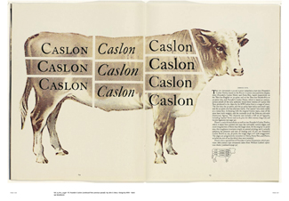
Mark van Bronkhorst’s startling way of presenting the various styles of ITC Founder’s Caslon on U&lc‘s new smaller page size (1998).
Is there a place for something new, a publication of some sort in a large format, where graphic designers who know how to use type can show off and push our expectations of typography? One where the content and its presentation are one and the same, not fighting each other but integrated at every level?
Maybe not. But I think there are a lot of people who’d like to read it.
This article was last modified on February 16, 2022
This article was first published on March 21, 2005
Commenting is easier and faster when you're logged in!

Recommended for you

dot-font: Revival Meetings of Mind
dot-font was a collection of short articles written by editor and typographer Jo...
dot-font: Design in a Bind
dot-font was a collection of short articles written by editor and typographer Jo...
dot-font: Avant-Garde Page Design
dot-font was a collection of short articles written by editor and typographer Jo...