

dot-font was a collection of short articles written by editor and typographer John D. Barry (the former editor and publisher of the typographic journal U&lc) for CreativePro. If you’d like to read more from this series, click here.
Eventually, John gathered a selection of these articles into two books, dot-font: Talking About Design and dot-font: Talking About Fonts, which are available free to download here. You can find more from John at his website, https://johndberry.com.
I’ve written about this subject before, but it’s a recurring problem, I’m afraid. I keep thinking that maybe, if I explain it clearly enough and show examples, everyone reading this column will get the point and the problem will vanish from the face of the earth.
A quixotic hope, I know.
The problem is printing a document without having the right fonts available. (I hate talking about “documents,” but this has become the general term for any kind of extended text—letters, books, reports, brochures, even advertisements—that’s created on a computer.) When this happens, the printed result doesn’t look like it’s supposed to. Trouble is, these days it may look close enough that only an attentive typographer would notice the difference before it’s too late.
“Too late” means after the document has been printed and distributed. That’s way too late.
Not the Whole Book?
This problem hit close to home recently, when I got a copy of a new book of essays by a critic I know, John Clute. This book, “Scores: Reviews 1993-2003,” was published in the UK by a small press, Beccon Publications. Clute is a highly literate, highly intelligent book critic, one whose erudite but headlong prose style lends itself comfortably to long lines; I know this from experience, because I designed and typeset his previous collection (“Look at the Evidence“) myself. I had nothing to do with “Scores,” though, except that I was looking forward to reading it.
Imagine my astonishment when I opened “Scores” and discovered that the entire book was typeset in Adobe Serif and Adobe Sans—the two default substitute fonts used by the type engine in Adobe products (see Figure 1).
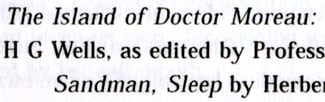
Figure 1: Part of the heading for a review in “Scores,” with Adobe Serif trying to mimic the missing fonts.
I assume the text was meant to be set in Rotis Serif, the face used on the jacket; certainly the general shape and spacing resembles it. I don’t know what face the author’s sans-serif interpolations in the text were meant to be in (it doesn’t much look like the spacing of Rotis Sans, though it could be). A lot of typographers dislike Rotis, with its oddly diagonal curves in letters like “e” and “c,” but if that’s the typeface the designer used in the book, then it shouldn’t be replaced with a fake (see Figures 2 and 3).
Figure 2: The awkward letter shapes, ungainly proportions, and lack of a real italic are telltale signs of font substitution using Adobe Serif or Adobe Sans.
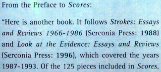
Figure 3: This is the same passage, quoted on the flap of the dustjacket, typeset in the proper typeface: Rotis Serif roman and italic.
The easiest way to spot this substitution is in the italics: Adobe Serif doesn’t have an italic, it just slants the roman when italics are called for. The other clue is that the ascenders (the strokes that jut up from letters like b and d and h) are actually a bit shorter than the height of the capital letters—the reverse of normal proportions—but that’s a subtle difference to spot in this particular typeface.
This is only the second time I’ve seen an entire book typeset without the proper fonts (the other was from another usually conscientious publisher), but I’m seeing the telltale Adobe Serif and Adobe Sans all around me these days, in printed material where someone wasn’t paying close enough attention.
When the Font’s Not There
Fonts are computer programs—small programs, to be sure, but nonetheless programs. They have to be on your computer before you can use them. (Or they have to be available to your computer somehow; they might be stored on a server that your computer has access to.) Some fonts come installed already when you buy the computer, but someone had to put them there; they don’t just appear by magic. When you’ve got a font installed on your computer, you can use that font in whatever program you’re using—a word-processor, a page-layout program, or anything that lets you format text.
But here’s the catch: If you want to print that document someplace else, the computer it’s printed from also has to have the font available. If it’s not there, then the second computer has to substitute something else for the missing font. There are several systems for replacing missing fonts—from the old default of setting everything in Courier to the latest digital mimickry—but the best you’ll get is something that looks “sort of like” the font you wanted.
Several years ago, Adobe came up with a very clever system for dealing with this problem of missing fonts. They wanted to make it easy for their business customers to trade digital documents back and forth without having to worry about whether everyone had the same fonts. One way, of course, would be to embed the fonts in each document you create, so the fonts travel along with the document itself; the trouble with this is that the recipient is getting the fonts for free—and fonts, like any computer program, take a significant amount of time and money to create.
The other way is to mimic the missing font on the other end of the transaction—and that’s what Adobe figured out how to do. Using their own “multiple master” font technology (this is actually what it was created for), they invented two elastic, malleable, morphable Ur-fonts, one with serifs and one without: Adobe Serif and Adobe Sans. You can’t choose these typefaces from your font menu; they exist solely for the purpose of font substitution.
The designs of the two typefaces are as generic as possible, but their really important function is to change their shape. When they’re used to mimic a missing font, they don’t imitate the exact outlines of that font’s characters, but they can imitate the characters’ widths. And they do. (The multiple master technology is what allows them to looks decent as they do this, rather than looking like distressed Silly Putty.) The letters may not look the same as the letters in the original document, but they take up exactly the same amount of space. The line endings don’t change, the pagination doesn’t change, and the recipient can get some idea of what the document is supposed to look like.
The End Result
If the missing font is something really distinctive—a script, say, or a blackletter—then neither Adobe Serif nor Adobe Sans is going to look much like it, even with identical character widths. But if the missing font is something like Times Roman or Helvetica—something so generic that many people don’t even notice it—then the faked fonts may pass cursory inspection and no one will be the wiser.
But everyone will be the poorer—especially the readers. The fine points of type design and typography do affect how a text looks and how it’s received, even if very few people have an eye trained to notice the difference consciously. For a quick proof and approval of a business document that someone else is going to send out, looking at faked fonts may work well enough; but for any printed matter that’s got to make an impression in the real world, having the right fonts is crucial (see Figures 4 and 5).
Figure 4: Detail from an ad for Bauman Rare Books in the New York Times Book Review, printed without the right fonts. The huge caps and the short ascenders are clues that this is Adobe Sans and Adobe Serif, not the intended typefaces.
Figure 5: Detail from another Bauman Rare Books ad, this time with the correct fonts available.
Eternal Vigilance?
Adobe Serif and Adobe Sans are designed on sturdy if generic lines; they’re meant to be perfectly readable in business communications where the sender has neglected to include the fonts when sending a memo or report to others in a company. (The same thing happens, using PostScript Type 1 fonts on a Mac, when you send the screen fonts but not the printer fonts to a printer; the type may look fine onscreen, but when it’s printed, the system substitutes Adobe Serif or Adobe Sans. I’ve seen this in subway posters in New York City, in standing signage systems in a San Francisco art museum, and in display ads in magazines and newspapers.) The net effect in “Scores” is that the book is still readable (a good thing—these essays deserve to be read); it’s just more awkward and less inviting. And it’s certainly not what the book designer intended.
There’s only one guarantee of getting everything right in printed matter: look closely at the final result. (This was true long before anyone ever heard of anything called “font substitution.”) Check the type. Watch for bits of unexpected Courier, but also learn to notice the telltale signs of Adobe Serif and Adobe Sans—or employ a proofreader who can. (Production proofreading is quite different from editorial proofreading, and both steps are necessary in any publishing process.)
Every time a page is output, check it again. Assume nothing. Step back and look at the big picture before you approve a proof; but check all the details too. Paying attention will pay off in the end.
This article was last modified on February 21, 2022
This article was first published on February 16, 2004
Commenting is easier and faster when you're logged in!

Recommended for you

dot-font Book Free to Download
Back in 2007, longtime CreativePro.com author John D. Berry gathered a selection...

dot-font: The Vico Collaboration
dot-font was a collection of short articles written by editor and typographer Jo...

dot-font: The Typographic Art of Matthew Carter
dot-font was a collection of short articles written by editor and typographer Jo...