


dot-font was a collection of short articles written by editor and typographer John D. Barry (the former editor and publisher of the typographic journal U&lc) for CreativePro. If you’d like to read more from this series, click here.
Eventually, John gathered a selection of these articles into two books, dot-font: Talking About Design and dot-font: Talking About Fonts, which are available free to download here. You can find more from John at his website, https://johndberry.com.
It’s always easier to be negative than to be positive. But it can also be useful. As I was writing in my last column about typographic trends, I realized that among those “trends” I could have mentioned a couple of new typographic errors that are becoming widespread. Both of them are the result of changes in technology, and lack of attention in design and production. I point these out here in the hope that you won’t fall into these traps in the future.
Upper- and Lowercase Numerals
There are two kinds of figures used for expressing numbers: “uppercase” numerals, which stand as tall as capital letters, and “lowercase” numerals, which are the height of the lowercase x-height and have ascenders and descenders. Uppercase numerals are also called “lining” figures (because they all line up neatly with each other) or “modern” figures (because they were introduced around the time of the “modern” style of typeface, at the beginning of the 19th century). Lowercase numerals are also called “old-style” figures (since all figures, before the advent of modern typeface designs, were lowercase). It’s helpful to think of them as uppercase and lowercase, though, because that reflects where each kind works best.
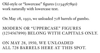
A digression: Most uppercase figures are also “tabular” figures—that is, they all have precisely the same width, so they’ll line up in columns of figures. Sometimes this means that the “1” seems to float in an overly wide space; other times the type designer uses a wide base and a projecting ear to make the “1” look wide enough to play with the other numbers. It’s a tricky design problem. Some type designers in recent years have designed typefaces with tabular versions of the lowercase figures; with these you can set, say, an annual report using the less-obtrusive lowercase figures and still have neatly aligned columns of figures.
Just to confuse matters, there are also variants in a few typefaces, such as the three-quarter-height figures in Monotype’s Bell, and various almost-lining figures with very slight extenders such as the numerals that Matthew Carter designed for the popular text face Miller.
Let the Numeral Fit the Text
For many years, the “Adobe standard” character arrangement (which is by no means limited to Adobe) has put uppercase figures into every font, even old-style text faces that had never had uppercase figures in the first place. (The ultimate absurdity is Monotype’s addition of uppercase figures to Centaur, which mars an otherwise beautiful old-style typeface.) It’s still terribly common to see running text set with these cap-height figures, when the typeface family has perfectly good old-style, lowercase figures but they’re in an Expert Set that the typographer hasn’t bothered to use. Since lowercase figures fit in comfortably with lowercase letters, it makes sense to use this kind of figure for dates and other numbers that appear in the middle of running text. If you use uppercase figures instead, the numbers all stick out like so many sore thumbs. We’re used to seeing this, but it’s ugly.
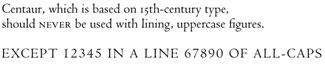
Old-style typefaces like Centaur were never intended to have numerals the height of the caps, and uppercase figures look clunky in text—although they’re handy for lines of all-caps.
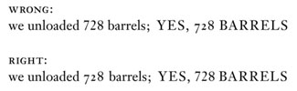
A newer error, however, is almost the opposite: using a font that has lowercase figures as its default, such as FF Meta or FF Scala, and not switching to uppercase figures when a number appears in the midst of a word or line that’s all in caps. Lowercase figures in a line of uppercase letters look every bit as silly and distracting as uppercase figures in a line of running text.
The typographic “trend,” I suppose, is simply not paying attention to the choice of numerals in a type family, and not choosing the right kind for the job.
Wrong Font
The other, more glaring error is font-substitution: that is, the wrong font appearing in place of the one the designer intended. This occurs when a file gets sent from one machine to another, and the necessary font isn’t present at the receiving end. It used to be that the default substitute font was Courier, which is at least pretty obvious; these days, however, it’s more likely to be Adobe Serif or Adobe Sans, which Adobe Type Manager uses automatically to mimic the character widths and general style of a missing typeface. The mimicry is useful in quick-‘n’-dirty business communications where exchange of documents is necessary but the exact look of the fonts isn’t; it’s a disaster in anything that really needs to look the way it was designed.
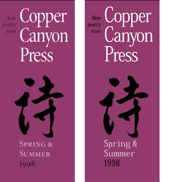
A brochure design that uses the typeface Minion: with the correct font (left) and when ATM tries to mimic fonts that aren’t on the system (right). The brochure was printed correctly after I discovered the substitution in a PDF proof.
Most people can’t tell one typeface from another, and apparently a lot of graphic designers can’t, either. The number of times I’ve seen font mimicry in ads, flyers, brochures, even large directional signs in museum displays, is astonishing.
It’s the typographic curse of the moment.
This article was last modified on March 9, 2022
This article was first published on September 9, 2002
Commenting is easier and faster when you're logged in!

Recommended for you
dot-font: Between Text & Reader
dot-font was a collection of short articles written by editor and typographer Jo...

dot-font: Zapfs on Paper and Onscreen
dot-font was a collection of short articles written by editor and typographer Jo...
dot-font: Avant Garde, Then and Now
dot-font was a collection of short articles written by editor and typographer Jo...