

dot-font was a collection of short articles written by editor and typographer John D. Barry (the former editor and publisher of the typographic journal U&lc) for CreativePro. If you’d like to read more from this series, click here.
Eventually, John gathered a selection of these articles into two books, dot-font: Talking About Design and dot-font: Talking About Fonts, which are available free to download here. You can find more from John at his website, https://johndberry.com.
Boston-based Font Bureau has been a purveyor of high-end type design since its founding in 1989, and throughout that time it has supported its activity with well-designed materials that show its typefaces to their best advantage. With a type library of more than 600 fonts, Font Bureau may be a “small” digital foundry in terms of number of people, but it’s a large resource that has an outsized impact on the world of design.
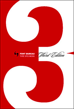
Font Bureau’s latest font specimen book, its third.
From Custom to Retail
The new Third Edition of Font Bureau’s type-specimen book goes beyond the first two—which were already exemplary. This edition is, first of all, hardbound, so that it will presumably hold up more effectively to the rigors of real-world use as a design-studio tool. It includes more typefaces, of course—that’s the usual reason for any foundry to issue an updated specimen book. (Font Bureau’s previous edition came out in 1997.) It adds extra pages to many of the type showings, pages laid out like posters or magazine pages that show the faces in use in a somewhat more exuberant way than the simple text blocks and headline collages that Font Bureau has perfected in the past.
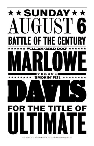
A battle for supremacy between Font Bureau fonts Bureau Grotesque, Giza, Old Modern, and Smokin’ Pete Davis.
With this edition, too, we get to see not only the “Retail Library”—the fonts we can buy normally, just like the products of other digital type foundries—but also the “Studio Library,” made up of typefaces originally commissioned by and created for publications and corporations for their own use, but now available at higher prices to larger customers (or those with deep pockets). “Studio font families,” says the introduction, “are available exclusively from Font Bureau, priced and licensed under conditions close to custom fonts, a frequent source of query.” (In other words, if you’re interested in these fonts, call us.) “These font families contain additional features such as multiple sets of figures or closely spaced weights to compensate for the rough-and-tumble production techniques common at daily newspapers.” And if you pay the premium for a nearly-custom family of typefaces, you’ll get hands-on treatment: “a high level of involvement of our Boston studio staff which reviews your choice of fonts to ensure we’ve made all the right choices for your requirements.” Every type-specimen book since the 16th century has been a promotion for the foundry, so it’s not surprising that this one publicizes Font Bureau’s custom and high-end work.
It would be interesting to survey today’s designers of digital type to find out how many of them make their living primarily from custom typefaces commissioned by magazines and other publications. Certainly Font Bureau’s bread and butter has been creating or expanding type families as part of the frequent redesigns of various high-profile magazines, such as “Esquire,” “Newsweek,” and “Entertainment Weekly.”

FB Interstate
In a world of rock-bottom retail prices for digital fonts, this is certainly where the money is for type designers. A common business arrangement would be for the client who commissions the design to have exclusive use of it for a period of time—usually a year or two—after which the designer is free to sell it to others. This gives the publication an exclusive look that nobody can duplicate at first, but it also gives the rest of the design world a chance to catch up eventually—and the type designer a chance to reap small but continuing rewards.
The Readability Series
Typefaces that haven’t appeared in previous Font Bureau catalogs include the first three shown in this edition: the Poynter series, Bureau Roman, and Fuller Modern. All three of them were developed as newspaper faces—a highly specialized form of type, with exacting and finicky requirements. The Poynter series (Poynter Oldstyle Text and Display, Poynter Gothic Text, and Poynter Agate) was created by Tobias Frere-Jones, sponsored by the Poynter Institute, to be a comprehensive new family of newspaper typefaces that could be used in varying ways by different newspapers around the world.
Unlike so many 20th-century newspaper faces (including Bureau Roman and Fuller Modern), Poynter Oldstyle is not based on a 19th-century “modern” style; Frere-Jones went much farther back, to the oldstyle types of 16th-century Dutch punchcutter Hendrik van den Keere, to find the basis for a new, highly legible text face and its display companions. To allow newspapers to compensate for the variations of impression from one printing press to another (or for varying paper stocks), Poynter Oldstyle Text comes in four minutely different “grades” (they’re not called “weights,” since each of them includes a regular and a bold weight already, as well as italic and small caps). The four versions are basically identical, except for very slightly changes in the stroke thickness from the lightest grade to the heaviest grade.
(I wonder whether these different grades could be used on the same page at different sizes, to simulate the effects of optical scaling found in some typefaces. Usually optical scaling involves wider letterforms and slightly larger x-heights at small sizes, in addition to the thickened strokes, but Poynter’s “grades” could very well give a smooth, even effect as type sizes change. More in keeping with the designers’ intent, graded fonts like these could be used to good effect in magazines where different sections are printed on different kinds of paper stock. “Metropolis” magazine is an example that comes to mind.)
The complementary sans-serif Poynter Gothic Text and (for use at truly tiny sizes) Poynter Agate were both developed from drawings at the Smithsonian by Morris Fuller Benton, the master type designer for the American Type Founders in the early 20th century.
Benton is clearly a favorite inspiration at Font Bureau. Bureau Roman, commissioned by the Washington Post as a text face, “revisits” Benton’s Century Oldstyle (and comes in no fewer than five grades), while Fuller Modern derives from ATF Century Expanded—also by Benton.
From Readable to Outré
This edition of Font Bureau’s specimen book is arranged in a new way: based on legibility. The “most readable, if not the most exciting” typefaces lead off, while “the more visually interesting, if less legible, fonts can be found toward the rear of the book.” It’s a unique approach, as far as I can recall. No attention is paid to what category a type design might fall into, or whether the typeface has serifs or not; the only criterion is legibility. That’s why the first three type families are the “Readability” faces designed for newspapers; they’re followed by a number of text families like Proforma and Miller, but not far into the book we run across Belizio, a dramatic Clarendon (slab serifs, but with curving brackets) that I usually think of as a display face but that is, in fact, very readable at text sizes.
Typefaces in the front of the book are shown at both display and text sizes, with significant chunks of two-column text so we can judge how the face looks in use. Typefaces in the latter half of the book are given only display showings—single lines of type in varying sizes and weights and styles—which seems appropriate to the way they might be used. The last typefaces shown in the book (apart from a couple of ornament fonts) are Barcode, Bradley Initials, and Alpha Bloc and Geometrique—faces that no one in their right mind would consider using except at large size for single words or phrases.
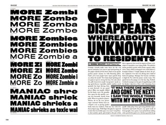
FB Rhode
While the text settings throughout the book consist of nonsense phrases that contain all the letters of the alphabet (“grumpy wizards make toxic brew for the evil queen and jack”), the headline settings show off not only the type itself but the wit of the people who compose these samples. In the fine tradition of 19th-century specimen books, Font Bureau intrigues and amuses us with its choice of headlines. Often enough, a page of varying type ends up telling an implied story (“OUTDOOR CINEMA / Problem with starting the movie during daylight: I always miss the beginning / Minor Characters / DISAPPEAR AFTER ONLY 23 MINUTES”) or running a riff on a theme (“OLD KITCHEN / The offices of Grate, Peel, Squeeze, & Bake / NEW CULINARY LAW FIRM / Handling cases in wrongful stir fry, negligent marinade, baker’s comp”). In addition to this playfulness, the actual text, brief though it is, that explains each typeface and its origins is pithy, witty, and to the point. (The description of Griffith Gothic, based on C.H. Griffith’s typeface for telephone directories, Bell Gothic, tells how Tobias Frere-Jones retained “the pre-emptive thinning of joints as a salient feature.”)

FB Giza
Numerography
One last detail makes this type-specimen book notably useful: a page in the back explaining clearly—and showing—the different styles of numerals that are possible (oldstyle, lining, tabular, and so on), and three pages listing and showing all the kinds of numerals available for each of the typefaces in the book. This is a very handy reference. If you were choosing a typeface for, say, an annual report or something else that required a lot of numbers, you might do well to flip to this addendum to see at a glance what the options are.
A good type-specimen book is a pleasure to browse through, as well as a functional tool. This one makes me want to have all the typefaces in it at my fingertips, and to put them to use right away. That’s exactly what it’s supposed to do.
This article was last modified on March 23, 2022
This article was first published on March 15, 2002
Commenting is easier and faster when you're logged in!

Recommended for you

dot-font: Room with a View
dot-font was a collection of short articles written by editor and typographer Jo...
dot-font: Neutral Sans?
dot-font was a collection of short articles written by editor and typographer Jo...
dot-font: Letters as Art
dot-font was a collection of short articles written by editor and typographer Jo...