


dot-font was a collection of short articles written by editor and typographer John D. Barry (the former editor and publisher of the typographic journal U&lc) for CreativePro. If you’d like to read more from this series, click here.
Eventually, John gathered a selection of these articles into two books, dot-font: Talking About Design and dot-font: Talking About Fonts, which are available free to download here. You can find more from John at his website, https://johndberry.com.
ParaType is the largest and best-known type manufacturer and distributor in Russia. The ParaType catalog, Digital Typefaces: ParaType Originals 1984 to 2004, a hefty hardcover volume with a bright orange cover, is a major compendium of typefaces, not only in Cyrillic but in the Latin alphabet as well.
The Cyrillic alphabet is used for many languages: several of the Slavic languages (the alphabet was created in the 9th century by Greek missionaries to the Slavs) as well as the non-Slavic languages of some of the peoples encountered across the breadth of Asia by the Russian Empire and later the Soviet Union. Just as the Latin alphabet is used by English and German, Spanish and French, the Cyrillic alphabet is used by Russian and Serbian, Bulgarian and Macedonian.
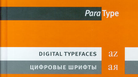
Cover of the ParaType Originals catalog
Translating the Forms
ParaType has a long-standing relationship with several Western type foundries. ParaType and International Typeface Corporation had a program for more than a decade to create Cyrillic versions of popular ITC faces like ITC Garamond and ITC New Baskerville. (Typefaces with Art Nouveau roots, such as ITC Benguiat and ITC Korinna, have been especially popular in Moscow and St. Petersburg in the last decade, because they’re reminiscent of the styles of lettering that were fashionable just before the Russian Revolution of 1917.) ParaType has done similar work for Bitstream, Emigre, and FontShop, among others; for example, all of the many weights and styles of FF Meta are all available in Cyrillic versions done by ParaType.
Latin and Cyrillic versions of FF Meta
If you read a language written in Cyrillic letters, the chances are that you’ve been seeing ParaType’s typefaces for a long time. If you’re a graphic designer in Russia, then of course you have the ParaType catalogs on your bookshelf. But if you’re a Western designer with no clients in Russia, why would you want this catalog, or the fonts in it?
Russian Creativity
The answer comes from the many original typefaces either created by ParaType or distributed by ParaType for other Russian designers. (There is a separate catalog for fonts not developed at ParaType but distributed by them.) It’s common practice today, when designing a digital Cyrillic typeface, to include at least the basic Latin characters as well, giving the font more versatility in a multilingual world. What this means for Western designers is that they may discover, among ParaType’s offerings, new typefaces that are fresh and unknown to their clients.
Sometimes these faces are digitized versions of typefaces designed in Soviet times for older printing technologies at Polygrafmash, the state-supported type design bureau. New Journal is one of those: designed in 1963 by Mikhail Rovensky as a text and display face (in regular, italic, and bold) with a slight but remarkable downward taper to the vertical stems. In the lowercase, the effect is more pronounced in the Cyrillic than in the Latin, because our alphabet has so many rounded characters compared with the many vertical strokes in lowercase Cyrillic. The Cyrillic cursive (italic) is closer to the Latin in that regard, with more rounded letterforms. Used for a Western language, New Journal is probably most striking in all-caps. There are certain Latin letters that look oddly cramped, such as the capital J and the lowercase g; but there are Western typefaces that treat these letters much the same.
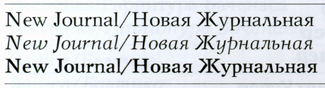
New Journal, with its distinctive tapered stems
Not surprisingly, the Latin complements to Cyrillic typefaces aren’t always as noteworthy. Bannikova, a text and display family that ParaType’s catalog describes as “one of the best original typefaces of Soviet typography,” is clearly more interesting in Cyrillic than in Latin. The Cyrillic looks noticeably darker on the page, and it has a more distinctive character because of the many little details along the x-height and the baseline, where the more rounded Latin lowercase doesn’t have so many strokes to work with. The design was inspired by both 18th-century Russian type and the humanist types of the Renaissance—a creatively mixed heritage. Bannikova was originally designed at Polygrafmash in 1946-51 by Galina Bannikova; it was revised and digitized in 2001 by Lyubov Kuznetsova (who also digitized New Journal).
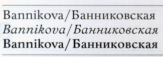
Digital version of a popular typeface designed in the late 1940s by Galina Bannikova
On Display
Some of the original display faces in this catalog work every bit as well in Latin as in Cyrillic letters. Oleg Karpinsky’s three-weight typeface Dublon, designed for ParaType in 1994, is wonderfully peculiar: a Bauhaus-like geometric sans with a whimsical white inline that shrinks as the type weights grow bolder, giving an Op Art effect. Karpinsky designed a serif version five years later, called Dublon Brus, which is nearly as effective.
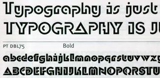
Details of two weights of Dublon, a playfully geometric display face
The relationships between Russian and Western type foundries date back a long time, and borrowing and imitation have gone on all that time, just as they have in the West. You can find typefaces that look similar to ParaType’s Hermes in other type catalogs—a bold, condensed, slightly squarish sans serif based on 19th-century German models—but the version that Tagir Safayev digitized in 1993 derives from a face issued before the Revolution by the Lange type foundry in St. Petersburg, which in turn based its design on Hermes Grotesk, a mid-19th-century face from the Woellmer foundry in Berlin. This sturdy grotesque display face looks equally at home in Latin and Cyrillic letters.
Hermes, based on Russian interpretations of 19th-century German display types
Where Do They Come From?
All of the fonts sold in this catalog have brief notes explaining who designed them and, if they’re historical, where they came from. These notes, like most of the essential text in the book, are in both English and Russian. The showings of the fonts are also in English and Russian, with character sets and display lines and (where appropriate) several lines of text in two different sizes.
Perhaps the most remarkable historical development here is the combination of research and creative thinking that ParaType designer Vladimir Yefimov put into designing a Cyrillic version of the classic Western typeface Kis/Janson. Bitstream’s Janson, which ParaType licensed, is not the most exciting version of Nicholas Kis’s 17th-century typeface (which was mis-attributed for a long time to Anton Janson), but it’s an honest and usable version. To create his Cyrillic complement to it, called Kis, Yefimov went back to sources and imagined an alternate Russian history of type development, where the czar Peter the Great, instead of getting mediocre Dutch punchcutters to make his revised “Civil” type for the Russian language, had invited the very best of the punchcutters working in Holland at the time. What if Nicholas Kis had done a Cyrillic? What would it have looked like? How would he have combined the best of Western type design at that time with the existing traditions of type and handwriting in Russia? That’s what Yefimov has imagined, and created, as a brand-new oldstyle text face. None of this history is mentioned in the catalog, which simply states that the “Cyrillic version was developed at ParaType in 2001-02 by Vladimir Yefimov,” but Yefimov has described the whole background to the project in an essay in a book I edited, Language Culture Type.
A Cross-Cultural Resource
In addition to the extensive showings of both Latin and Cyrillic typefaces, the catalog includes a number of other alphabets digitized at ParaType: Arabic, Armenian, Georgian, Greek, and Hebrew. There’s a 40-page reference section in the back, with an illustrated type glossary, a comparative list of typeface names, complete character sets shown by codepage, and even short biographical notes on the type designers, including mugshots. Unfortunately for most Western readers, this section is entirely in Russian; it’s still fascinating to browse, and a useful reference to character sets in various languages.
The design of the book is clearly based on the design used by FontShop for its canonical yellow-covered FontBook: a tall, narrow, well-bound hardcover, clearly organized, visually indexed, fitting a lot of useful information into a compact form. The text is even typeset in FF Meta, both Latin and Cyrillic. It’s a good model to follow.
Raising the Bar
ParaType began in 1989 as a department of ParaGraph International and became an independent company in 1998. Most of the founders had worked at Polygrafmash, which in Soviet times was the only source of professional typefaces; younger designers have come of age in the more freewheeling post-Communist era. What ParaType has attempted, and still does, is to raise and maintain the levels of quality and professionalism in Russian type design. This is a boon to Russian graphic designers, of course, as well as to ordinary readers of everything from books to billboards, but it also offers a unique resource to designers and typographers in the West.
This article was last modified on February 16, 2022
This article was first published on August 17, 2005
Commenting is easier and faster when you're logged in!

Recommended for you

Mark Batty Publisher Announces the “dot-font” Series of Books
Mark Batty Publisher proudly commences the dot-font series, about design in the...
Download Second dot-font Book for Free
From digital to print to digital again—that’s the path John D. Berry...

dot-font: Emigre Migrates to a New Format
dot-font was a collection of short articles written by editor and typographer Jo...