

dot-font was a collection of short articles written by editor and typographer John D. Barry (the former editor and publisher of the typographic journal U&lc) for CreativePro. If you’d like to read more from this series, click here.
Eventually, John gathered a selection of these articles into two books, dot-font: Talking About Design and dot-font: Talking About Fonts, which are available free to download here. You can find more from John at his website, https://johndberry.com.
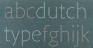
It’s hard to get a handle on Dutch Type, written by Jan Middendorp and published this year by 010 Publishers in Rotterdam, because there’s simply so much there. It’s a large book, more than 300 wide pages, and heavily illustrated on every spread. Its chapters are extensive; the one on Gerard Unger, for instance, would make a significant article by itself (indeed, I’ve written about him before), yet it’s just one of many individual parts that make up this careful survey. I want to use the word “thorough,” to reflect how much information and observation is worked into this book, but of course any of the individual subjects could have more said about them (and many have). Still, this is a remarkable overview.

Part of the subtle cover of “Dutch Type.”
Jan Middendorp has been writing about type and design for quite some time; he used to design and edit Druk magazine for FontShop Benelux, and he combines a facility with words and a hands-on sense of design. He is also a book designer, although he chose (very sensibly) to leave the design of Dutch Type to someone else—in this case, Bart de Haas and Peter Verheul. Middendorp approaches most of the chapters as a journalist, quoting the participants and telling their story; at the same time, he provides the analytical eye that sees the whole story at once, in its chronological depth and its cultural breadth. The Netherlands is a small country, but in the creation of type, its influence is extremely wide.
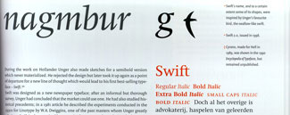
Detail of a page from the chapter on Gerard Unger’s type designs.
Then, But Mostly Now
Dutch Type leads off with a very good historical introduction, “Early type design and printing in the Low Countries,” and it goes on with chapters on the well-known and lesser-known typographers and type designers of the early 20th century, and the foundries that they designed for. But the focus is largely contemporary; the bulk of the book is about Dutch type designers who are working today, including many who were once the hot young newcomers and are now established and recognized. To divide up this wide field, Middendorp groups his modern subjects under a number of thematic titles: “Painters and penmen,” “A typographic counterculture,” and “Printing types for a changing technology,” for example.
A surprising number of contemporary Dutch type designers came out of the same school, the Royal Academy of Fine Arts in the Hague, and this is recognized by grouping them in a hefty section of their own. The introduction to that section on the Hague is called “Gerrit Noordzij’s school of letters,” because it was the teaching of Noordzij, over 30 years, that gave so many diverse students a common vocabulary and a common grounding in the nature of the letter.
When the technology and the marketplace opened up in the early 1980s and type design emerged as a plausible career choice, Noordzij’s graduates were ready to step onto the stage. Just consider the list of respected names, all of them designers who studied under Gerrit Noordzij: Lida Lopes Cardoso, Rudy VanderLans, Petr van Blokland, Albert-Jan Pool, Frank E. Blokland, Jelle Bosma, Peter Matthias Noordzij, Luc(as) de Groot, Just van Rossum, Erik van Blokland, Peter Verheul. This is not all of them, of course, just the most widely known. These designers have not always worked together, or in the same styles, but even when they’ve been competitors they share a common training. The extensive discussion and illustration of their work in this book make it easy to see the connections.
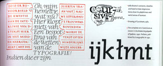
A few examples of the work of Jelle Bosma, one of many Dutch type designers who studied at the Royal Academy in the Hague.
Another art school has had an influence through its students, though the Arnhem Art Academy never had the concentrated focus on type design that the Royal Academy did. Yet three of the best-known modern Dutch type designers all graduated from Arnhem in the early 1980s: Fred Smeijers, Martin Majoor, and Evert Bloemsma. Their work, too, is grouped together in the book and given plenty of room.
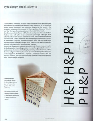
The Arnhem Art Academy turned out a number of other well-known Dutch type designers.
Pages to Jerseys
The last few chapters of the book show some of the more recent arrivals on the Dutch type-design scene, including a younger generation from the Hague and a number of unclassifiable individuals and approaches. One of the last pages shows, for instance, designs by Sander Neijnens for the most legible numerals for the numbers worn by soccer players on their jerseys—a highly specialized but useful kind of environmental typography.
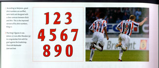
Even the numerals on the backs of sports jerseys need type design.
The design of Dutch Type not only gives a spacious and flexible way of showing the work, but makes its own contribution to the development of Dutch type: the typeface used, Peter Verheul’s Versa, was “honed and expanded until it was perfect for the book,” according to Middendorp. (He adds: “To me, this collaboration has been proof of how important type can be for the success of a work of graphic design.”) Although Versa is a serif typeface, it doesn’t look like it; the roman has “an unusual, asymmetric, speedboat-shaped serif which in small point sizes makes Versa almost look like an incise or glyphic—a hard-to-define but very legible hybrid.”
Some very beautiful type designs have been created in the “incised” form, but never anything as happily readable in extended text as Versa. The Versa family was expanded in the course of developing this book—to include, for instance, the condensed sans serif version used in the captions—and it’s available from Fred Smeijers and Rudy Geeraerts’s recently formed foundry OurType.
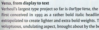
Peter Verheul’s typeface Versa is used throughout the book.
No Theories, Please, We’re Dutch
In keeping with the practicality that’s usually considered a trait of the Dutch, Middendorp doesn’t try to come up with a theory about why Dutch type designers have been so prolific and have affected the typographic world so emphatically. In his introduction, he does say, “For a community of designers driven by pragmatism, individualism and perfectionism, type design seems a natural specialization.” And he points out that a large number of Dutch type designers have felt that “new technologies need new letterforms,” not just retreads of the old designs. But “why”? There is no real answer to that. There is also no doubt that Dutch type design is one of the most vibrant areas of typographic design in the world today.
This article was last modified on February 18, 2022
This article was first published on November 8, 2004
Commenting is easier and faster when you're logged in!

Recommended for you
dot-font: OK to Typeset
dot-font was a collection of short articles written by editor and typographer Jo...

dot-font: The Foibles of Font Substitution
dot-font was a collection of short articles written by editor and typographer Jo...
dot-font: A New Slant on “Italic”
dot-font was a collection of short articles written by editor and typographer Jo...