


dot-font was a collection of short articles written by editor and typographer John D. Barry (the former editor and publisher of the typographic journal U&lc) for CreativePro. If you’d like to read more from this series, click here.
Eventually, John gathered a selection of these articles into two books, dot-font: Talking About Design and dot-font: Talking About Fonts, which are available free to download here. You can find more from John at his website, https://johndberry.com.
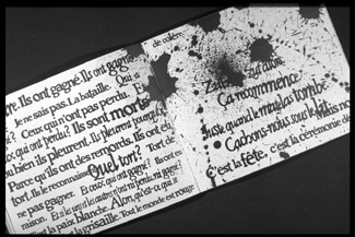
The French graphic designer Massin is best known in this country for his ground-breaking typographic and visual treatment of the Eugene Ionesco play “The Bald Soprano” (“La Cantatrice Chauve”), first published in France by Gallimard in 1964. Massin’s interpretation of Ionesco’s absurdist play was ground-breaking: Using a playful collage of posterized black-and-white photographs of the actors in silhouette, surrounded by sprays and cascades of type in varying sizes and styles (without benefit of cartoonish effects like word balloons), he created a juxtaposition of type and image in book form that became a classic of expressive typography. The stark images from “The Bald Soprano” are instantly recognizable—both the characters and their jumbled words.

The severe shapes of the characters in “The Bald Soprano” turn the blank page into a stage.
But Massin has done a great deal more than just this one notable book. The exhibition “Massin in Continuo: A Dictionary,” which originated at Cooper Union in New York and has toured to Los Angeles, Boston, Baltimore, and Montreal, explores Massin’s long career as a book designer, typographer, art director, writer, photographer, and music aficionado. An abridged “dictionary” will open in San Francisco on July 11, at the San Francisco Center for the Book, and will run through September 26. The abridgment was necessary, says SFCB artistic director Steve Woodall, because of the Center’s limited exhibit space, but it presents an opportunity to focus on “what is arguably Massin’s most interesting work: his early projects with Club du Meilleur Livre and his influential typographic experiments of the 1960s.”
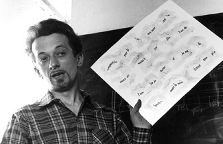
Type comes alive (‘Délire à Deux,’ 1966).
Education of a Renaissance Man
Massin started early. At the age of seven, he was producing small books that he would both write and lay out, signing them, “Robert Massin, Author, Editor, Publisher, Typographer, and Photographer.” As a child, he absorbed all the graphic images and letterforms to be found in his grandmother’s grocery shop: logos, packaging, signs, posters, and enamel advertising plaques. He was a voracious consumer of vernacular culture.
Even earlier, when he was only four, his father (a stone engraver) gave him a hammer and chisel and asked him to engrave his name in soft stone—even though the young Massin did not yet know how to write the alphabet. “This remains in my imagination a founding moment of my interest in letters and all graphic things,” he says, in an interview conducted by the exhibition’s curator, Laetitia Wolff, and published in “Design Issues” (MIT Press). The exposure to letters as images in their own right as well as carriers of meaning set the stage for Massin’s lifelong career of graphic experimentation.
Designing Books
He began designing books in 1949 for the Club du Meilleur Livre, one of the major book clubs that flourished in France after the Second World War, in a time when there was no functioning network of bookstores across the country. For several years, the book clubs were the principle means of publishing and distributing literature in France, and the designers and art directors had a free hand in presenting their texts.
Massin credits his mentor Pierre Faucheux with inspiring his own approach to the books. “Faucheux had been one of the first designer/typographers to emphasize the importance of dynamic typography and documentary iconography on covers, at a time when illustration had not yet been replaced by photography. For my first covers, I was asking myself, ‘What would Pierre Faucheux think?'” Massin describes himself and the fellow (sometimes competing) book-club art directors as “graphic acrobats.”
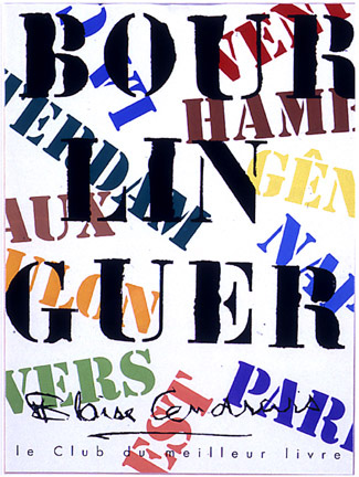
Type used expressively for the cover of ‘Bourlinguer,’ by Blaise Cendrars (Club du Meilleur Livre, 1953).
From an early date, Massin was influenced not only by the traditions of book design but by the innovations of film: Saul Bass’s title sequences for the movies of Alfred Hitchcock, and Tex Avery’s animated cartoons. “I have spoken often,” he says, “about the cinematic quality of book design, revealing its narrative structure while constantly changing scale and rhythm, and alternating focal planes and perspective. Between the endpapers and the first signature, it was like creating a little flip-book within the book. It was quite common to have these elaborate introductory pages in the Clubs’ books.”
Massin finds inspiration in popular culture, and as a book designer, he puts these influences to work in interpreting the text. In the words of curator Wolff, “While an innovator in typography, he has shown respect for classic, romantic, and popular art, integrating graphic elements of other epochs to match the content and context of a book he is designing.” For Blaise Cendrars’s “L’Or” (“Gold,” Club du Meilleur Livre, 1954), for example, Massin cut out letters from an 1848 American poster and used them to match the visual style of the California Gold Rush.
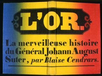
Cover (back, front, and spine) of “L’Or” by Blaise Cendrars, designed for the Club du Meilleur Livre in 1954.
Book Series
For the publisher Gallimard, whom he worked for as an art director for 20 years, Massin created the “Folio” line of popular literary paperbacks in 1972. He had to design 300 layouts in less than six months to launch the new line. Since the bright white Kromekote paper stock had recently been introduced by Champion Paper, he gave all the books a recognizable identity with bright white backgrounds, and used a consistent typeface, Baskerville Old Style, juxtaposed against unique illustrations.
It was an uphill battle to convince the sales force that the pocket books they were selling were meant to be kept, not just read once and thrown away. They were a long-term success. The Folio paperbacks can still be easily found in any French bookstore, although today their cover images are more likely to be stock photos than the original illustrations that Massin commissioned from notable illustrators such as Folon, Ronald Searle, and Roland Topor. (Massin still has a few of the original drawings framed on his walls.)
All the World’s a Page
Massin went to 20 different performances of “La Cantatrice Chauve” at the Théâtre de la Huchette in Paris. He even recorded the play so he could catch the inflections, intonations, and pauses of the actors as they spoke, and then transformed them into an interplay of photographs and type. Ionesco’s play deals with breaking down clichés and thoughtless truisms into absurd caricature; it has been described as an anti-play. Massin’s treatment on the page reflected that disjointedness and conveyed it graphically. He gave each character a different typeface, varying the size, angle, and placement to convey the nuances of the spoken dialogue.

Each character speaks in his or her own typeface.
“Massin’s version,” says Wolff, “created with the blessings of Ionesco, sought to capture the dynamism of the theatre within the static confines of the book.” Massin himself says that he “introduced the notion of stage time and space to the printed page.”
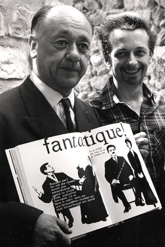
Eugene Ionesco (left) and Massin hold the original French edition of “La Cantatrice Chauve.”
Still Bending Expectations
Massin has designed and art-directed many other books and lines of books over the years, as well as writing several. His own books have included “Letter & Image” (“La Lettre et L’Image,” Gallimard, 1970), a comprehensive study of the interaction of letters and images through human history, and a theoretical treatise on page layout, “La Mise en Page” (Hoëbeke, 1991), which he both wrote and designed.
The techniques he uses to create his expressive kind of typography have changed with changing technology; today he works with digital publishing tools like Photoshop and Illustrator. “The Bald Soprano” had to be created in painstaking physical paste-ups on boards; he didn’t even have the advantage of phototype, which was not in common use yet in the early 1960s. One technique he used in order to freely change the shapes of letters, in the days before computer type, was to have them printed on condoms, which he then pinned down in stretched and distorted form and photographed.
Massin once used condoms as a flexible surface on which to print letters so he could distort their shapes.
As Laetitia Wolff concludes in her introduction of Massin and his work, “This free-spirited and compulsive creator is the unsung hero of an immense graphic heritage. Make way for Massin.”

This article was last modified on July 18, 2023
This article was first published on June 30, 2003
Commenting is easier and faster when you're logged in!

Recommended for you
dot-font: “It’s [Still] Alive!”
dot-font was a collection of short articles written by editor and typographer Jo...

dot-font: Typography, Architecture, and Inscriptions
dot-font was a collection of short articles written by editor and typographer Jo...

dot-font: Free Fonts for All?
dot-font was a collection of short articles written by editor and typographer Jo...