

dot-font was a collection of short articles written by editor and typographer John D. Barry (the former editor and publisher of the typographic journal U&lc) for CreativePro. If you’d like to read more from this series, click here.
Eventually, John gathered a selection of these articles into two books, dot-font: Talking About Design and dot-font: Talking About Fonts, which are available free to download here. You can find more from John at his website, https://johndberry.com.
There’s a strong myth in the typographic world that sans serif type is inherently “neutral,” or at least more neutral than any typeface with serifs. But where does this notion come from? And if it’s true, then how can we differentiate among sans serif type designs with similar characteristics and similar details?
Stripped Down to Essentials
Sans serif types got popularized in the 19th century, in the heyday of the Industrial Revolution, and so they, along with some other newly popular type styles, came to embody the modern machine age. Among the modernists of the early 20th century, who were reacting against Victorian excesses and wanted to get rid of “needless” decoration in art, architecture, and even language, serifs were seen as old-fashioned, dismissed along with the curlicues of Victorian exuberance. Just as the newly streamlined machines of the modern world were stripped of their decorative details, the typefaces favored by modernist graphic designers were stripped-down, serif-less, simplified and uniform wherever possible. From the slightly awkward shapes of sans serif jobbing types like Akzidenz Grotesk to the geometry-inspired circles of Futura, these were seen as somehow more “functional” than the serif typefaces that were being so actively revived and renewed by Stanley Morison and others, at exactly the same time.
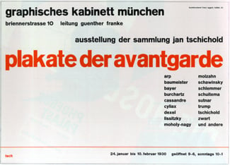
From an all-sans-serif poster design by Jan Tschichold, 1930
In the 1950s, this idea was taken even further, when Deberny & Peignot issued Adrian Frutiger’s Univers (the first rational family of typeface widths and weights) and Mergenthaler Linotype released Helvetica (regularized by Max Miedinger from the funky ordinariness of Akzidenz Grotesk). A host of other sans serif typefaces were designed, following or occasionally creating the new fashion, but it was Univers and Helvetica that embodied the sans serif ethic of the period. (And I use “ethic” deliberately, rather than just say “aesthetic”; for many moralists in the modern movement, this was seen as a matter of right and wrong. Take a look at some of the arguments in the Swiss graphic design magazines in the late ’40s and early ’50s.)
Various styles of Univers arranged in one line (from ‘Type Sign Symbol’)
Big in Business
Although the cool, sans serif style suffered a setback in the swirling ’60s, and underwent deconstruction in the ’80s, it has stuck with us as a symbol of modernism. Helvetica won the typeface laurels, achieving such ubiquity that it became the “default” sans serif typeface, even before the introduction of desktop computers and the enshrinement of Helvetica as one of the core fonts installed in every PostScript printer. (One unfortunate consequence is that we’re surrounded today with hard-to-distinguish numerals, in a world where we have to read numbers accurately all the time. The numerals in Helvetica, like many of its letters, are drawn with shapes that are deliberately similar; this may give the strings of big numbers on a building or of small ones on a business card a pleasingly smooth appearance, but it makes the different numerals hard to tell apart. Quick, on that photocopy of a faxed letterhead: can you tell whether that’s an eight or a three in the 8pt telephone number?)
Helvetica’s hard-to-tell-apart numerals
In the business world especially, sans serif has come to be seen as the ultimate in authority. To project an image of reliability, efficiency, and overall competence, large companies usually stick with a sans for their visual identity; the larger or more ambitious companies commission their own typefaces, for their own exclusive use, giving themselves a distinctive typographic identity and giving the luckier type designers a lucrative line of work. But even without the proprietary faces, most of the type you see in corporate design work, and in corporate advertising, is sans.
The significant development in sans serif type that began in the ’80s and flowered in the ’90s was the explosion of “humanist” sans serif designs. Unlike the grotesques and the geometrics, these letters were based on the shapes of Renaissance text types, and often had a basis in the study of humanist calligraphy. Yet they maintained the uniform stroke width that’s so essential to the idea of sans serifs as somehow representing the underlying “skeletal” forms of letters. The first sans based entirely on a humanist model was Hans Eduard Meyer’s Syntax (1968); the boom was really kicked off in the ’80s with Lucida Sans, created by Charles Bigelow and Kris Holmes for the low-resolution output of early laser printers. Since the early ’90s, inspired especially by the calligraphic teaching of type design in the Netherlands, humanist sans serifs have turned into a major category of type.
Neutral?
The more calligraphic sans serif type designs, especially those with italics based on the chancery italic written hand, can be elegant but have too much character to be called truly “neutral.” We see Helvetica as neutral because of its ubiquity, though in fact the shapes of its letters have a certain quirkiness. (This quirkiness, which was only partly smoothed away when Helvetica was adapted from its jobbing-grotesque precursors, has been picked up on and emphasized in some alternate typefaces based on the same models—most notably in FontShop’s FF Bau.) Univers is at first glance similar in form to Helvetica, but more consistently constructed and more “rational”-looking. The typeface “Frutiger” takes the same consistency and softens it with humanist letterforms, though without a true italic (except in the much more recent update Frutiger Next, redrawn and released by Linotype in 2000); Frutiger has more visual style than Univers, but it’s still a pretty neutral, functional-looking typeface: a subtle blend of utility and style.
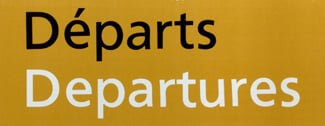
The typeface Frutiger, originally designed for signage at Charles de Gaulle Airport, outside Paris
The Frutiger typeface has inspired a host of imitators over the years, and this in turn has touched off a debate: is each of these similar typefaces nothing but a copy and a rip-off, or is this rationalized-humanist form a whole area of type design that’s worthy of exploration? When Adobe had Robert Slimbach and Carol Twombly collaborate on the design of Myriad, it was to be an open, deliberately neutral sans serif with a vaguely humanist form. How could it not resemble Frutiger in general feel, even if not in specific details? (Inside Adobe, Myriad was at first jokingly referred to as “Generica”; Slimbach and Twombly were assigned to work on it together because that way they might smooth off each other’s most notable characteristics, ending up with a face that didn’t reflect any one designer’s style.)
More recently, Microsoft’s new corporate typeface Segoe has been dismissed in some quarters as a Frutiger rip-off, but aside from knowing that the designers didn’t approach it in that way, I wonder why resemblance has to imply imitation. If the effect you’re after is a “neutral”-looking sans serif face, based on the proportions and shapes of old-style text typefaces but using stroke weights that don’t vary to any noticeable degree, you’re bound to end up with something along the lines that Adrian Frutiger first explored fifty years ago. Look, for instance, at Michael Abbink’s FF Kievit, a multi-weight type family that at first glance isn’t that easily distinguishable from a number of other neutral, vaguely humanist sans serifs. But it’s carefully designed, and the precise feel of its neutralness is what makes it appropriate, or inappropriate, for a particular use in a particular typesetting job.
It’s how the letters work together, and the details that give them their particular feel—whether lively or staid—that make a typeface what it is. From a type-user’s standpoint (other than avoiding genuine rip-offs or pirated fonts), the important question is whether the differences impart a sufficiently distinct character to make those typefaces appropriate for different purposes. (And for different media, in some cases.) If you find, for instance, that some design jobs cry out for Frutiger and others for Kievit, while Myriad seems perfect for a certain project and a signage job may suggest FF Transit, then you’ll need to have all of these typefaces in your typographic library. There’s a reason why people keep designing new typefaces, and it’s because we always seem to need something just slightly different, to convey that particular nuance and get precisely the effect we want.
This article was last modified on February 16, 2022
This article was first published on February 7, 2005
Commenting is easier and faster when you're logged in!

Recommended for you

dot-font: Kerning Chads
dot-font was a collection of short articles written by editor and typographer Jo...
dot-font: Finding Fonts
dot-font was a collection of short articles written by editor and typographer Jo...
dot-font: The Last Word on Book Design
dot-font was a collection of short articles written by editor and typographer Jo...