


dot-font was a collection of short articles written by editor and typographer John D. Barry (the former editor and publisher of the typographic journal U&lc) for CreativePro. If you’d like to read more from this series, click here.
Eventually, John gathered a selection of these articles into two books, dot-font: Talking About Design and dot-font: Talking About Fonts, which are available free to download here. You can find more from John at his website, https://johndberry.com.
Newspaper design is a funny business. It affects everyone—at least everyone who reads a daily paper, or who even glances at the headlines while strolling past a newspaper-vending box. But most people are only familiar with the look of their own local paper, and maybe one or two others; even frequent-flyers don’t necessarily read a variety of papers as they travel. The contents of each newspaper changes from day to day, yet the overall arrangement and the paper’s visual feel rarely change at all—just enough so you can tell one day’s paper from the next. The subject of newspapers is the “news”—a ferment of constant change—so the design of newspapers imposes a structure on that daily hodgepodge and lays it all out for the reader.
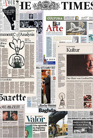
A collage of pages and elements from many different contemporary newspapers.
Almost unnoticed in all the cries of doom for the printed newspaper in an age dominated by television and the Internet is the way so many papers have spruced themselves up, sharpened their focus, and adopted much more sophisticated visual palettes than they ever had before. There’s an astonishing amount of very good design being practiced on a daily basis in cities all around the globe—design with a shelf life of a single day, but that creates a vivid and interactive engagement with the reader in that brief time.
It’s Typography All the Way Down
At the heart of all this is typography. Even the most pictorial tabloid is still basically a collection of words, and how those words are arranged on the page is what typography is all about. New printing technology has made it possible, in the last decade or two, to print much more precisely on newsprint, and it has led to an efflorescence of typefaces designed especially for newspapers. These take the form of both headline faces and body-text faces, as well as in-between and beyond-the-range examples such as caption and subhead faces, or agate faces made for setting stock quotes.
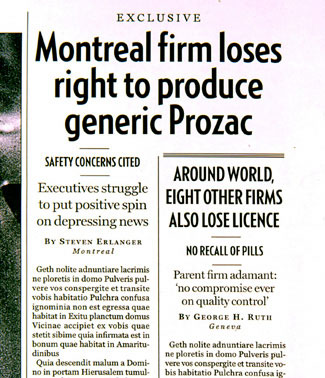
Detail of a sample layout from Lucie Lacava’s design for the Canadian “National Post.”
The requirements of newspaper typefaces are rigid. First of all, they have to hold up under extremely poor printing conditions; even the latest improvements in printing technology for newsprint haven’t changed that fundamental fact. Cheap paper, fast presses, quick turnaround. Then they have to fit a lot of information into as little space as possible—but without looking cramped. This is why condensed headline faces are so popular in newspapers, and why newspaper text faces, whether they look it or not, are always designed to fit the maximum number of characters into each line of those narrow, justified columns.
Then there is aesthetics. Serif headlines or sans; bold or light; centered or flush left? A text face with a chunky texture, or one with a smooth feel? How about contrasting faces for boxed items and alternate kinds of stories or for charts and pulled-out elements? These all contribute to the look of the paper, and that look is what readers respond to, unconsciously, as much as the paper’s editorial position or its reporters’ verbal skills.
Just try changing something about the appearance of a daily paper and watching the readers’ response come in, if you don’t believe that readers notice design. They may not notice it on a conscious level, but subliminally they’re responding to it all the time. And they don’t like it to change.
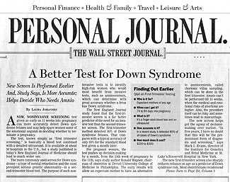
The new Personal Journal section of the “Wall Street Journal,” which was recently redesigned by Mario Garcia.
The Designer Makes House Calls
Much of the new design (and re-design) in newspapers these days is done by a fairly small number of specialists who take on projects all around the world. Roger Black, Mario Garcia, Lucie Lacava, Simon Esterson, Ally Palmer—these and a few others have established reputations in the newspaper business for giving each paper a distinctive look while bringing a depth and breadth of experience to each new job.
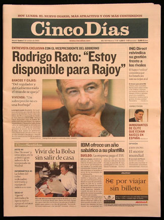
Front page of the Spanish business daily “Cinco Dias,” designed by Ally Palmer and Terry Watson.
They may work together on one project and compete on the next. And since they are brought in for a specific project and then go on to another, their role is a little like that of the Lone Ranger: riding into town, righting wrongs, and riding out again. But the design has to work over time; it’s not a static solution but a blueprint for an ongoing process, and ultimately the design will be implemented and maintained by the newspaper’s own staff. As Lucie Lacava has pointed out, “You have to think of the people who are going to be working day in and day out with the look and style that you’ve given it. And often, the layout people are not designers. You have to make sure it’s easy for those people to work with.”
Now Read the Book
The subject of newspaper design hasn’t been addressed seriously in a book in quite some time—certainly not since the current round of technological and economic changes hit the industry. There have been how-to books, such as the venerable “Newspaper Design Today” by Allen Hutt (published originally in 1960), and there are the annual awards showcases published by the Society for News Design, but when I first started asking around about recent books on newspaper design, the consensus seemed to be that a new one was needed.
So, at the suggestion of publisher Mark Batty, I put together a book: a collection of design profiles of individual papers around the world and articles on specific aspects of the process of designing newspapers.
That book, “Contemporary Newspaper Design,” with the somewhat long-winded subtitle, “Shaping the news in the digital age: typography & image on modern newsprint,” and a foreword by Roger Black, has just come off the presses. It tells—and shows—the story of particular redesign projects, told wherever possible in the words of the people who actually did the work. While I never intended this book to be comprehensive or definitive, it certainly covers a wide area: newspapers from the United States, Canada, Latin America, and Europe, and visual styles ranging from broadsheets to tabloids, from sports papers to business journals, from the brash and loud to the austere.
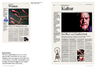
A two-page spread from “Contemporary Newspaper Design,” showing Science and Culture pages from the new Sunday edition of the Swiss paper “Neue Zurcher Zeitung,” designed by Simon Esterson.
Naturally, as both the editor and the designer of this book, I’m the last person you should trust as an objective observer. But in my unabashedly partisan way, I suggest that you check it out. Simon Esterson’s survey article (originally published in “Eye” magazine) and Roger Black’s lively account of the ins and outs of redesigning the “Los Angeles Times” would be worth the candle all by themselves.
The subject is large. Next column, I’ll take a look at some of the typefaces that have been designed specifically for newspaper text.
This article was last modified on February 18, 2022
This article was first published on March 29, 2004
Commenting is easier and faster when you're logged in!

Recommended for you

dot-font: Afrikan Alphabets
dot-font was a collection of short articles written by editor and typographer Jo...

dot-font: Not Your Father’s Sans Serif
dot-font was a collection of short articles written by editor and typographer Jo...
Mark Batty Publisher Announces the “dot-font” Series of Books
Mark Batty Publisher proudly commences the dot-font series, about design in the...