

dot-font was a collection of short articles written by editor and typographer John D. Barry (the former editor and publisher of the typographic journal U&lc) for CreativePro. If you’d like to read more from this series, click here.
Eventually, John gathered a selection of these articles into two books, dot-font: Talking About Design and dot-font: Talking About Fonts, which are available free to download here. You can find more from John at his website, https://johndberry.com.
Linotype has just issued a new version of Optima, designed by Hermann Zapf and Linotype’s typographic director, Akira Kobayashi, and built from the ground up for digital typesetting. Most of the changes to this much-loved typeface are subtle; some are startling.
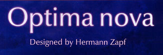
Figure 1: Optima nova, new from Linotype.
Optima was originally designed by Zapf more than 50 years ago; he made drawings of the face in 1952, though it wasn’t released until 1958. It was cut in metal by the punchcutter August Rosenberger at the Stempel type foundry in Germany, and also turned into Linotype matrices for hot-metal typesetting. The new typeface was a departure from most type designs before it, since the letters had no serifs yet they were based on the classic forms of roman letters, and their serif-less strokes swelled slightly toward each end. This subtle curve to the “straight” strokes gave Optima a monumental elegance at large sizes, and made it work surprisingly well as a text face.
Figure 1: A comparison of the original metal version of Optima (top) with the new Optima nova (bottom).
Optima has been adapted many times to photo and digital technologies, and it still remains a very popular typeface, but none of these translations has quite captured the beauty and the plain practicality of the original metal type. Trying to use Optima for text, in the age of digital typesetting, has been an exercise in wishful thinking—wishing that the digital version of the face were not quite so sparkly and light. At display sizes, some of the digital versions worked fine; but in text, none really did. If you’ve ever seen Hermann Zapf’s little book “About Alphabets,” which is typeset in the original metal version of Optima, you can see how agreeable Optima can be for text; but this is an effect I’ve tried and failed many times to reproduce using digital versions.
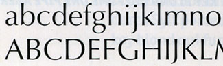
Figure 3: A sample of the current digital version of Optima (this is the Adobe font, licensed from Linotype).
Old & Improved
Optima nova is part of Linotype’s program of revisiting their best-selling typefaces and updating them for current technology. It’s a debatable idea—should older typefaces be “updated,” or should we leave them alone and design new faces for new uses? This question is a little like the perennial debate over “reviving” typefaces from centuries past, although in this case the typefaces are much more recent. In any case, Linotype’s program has produced some interesting, and potentially useful, innovations.
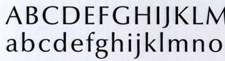
Figure 4: A sample of the new Optima nova.
Akira Kobayashi, a fine type designer in his own right, worked directly with Hermann Zapf in doing the new version of Optima. At the recent ATypI conference in Vancouver, Kobayashi described their process—Zapf sitting next to him, sketching out ideas, as Kobayashi worked with the outlines on the screen. It was with evident pride and pleasure that Kobayashi told us how after a certain point, Zapf stopped sketching and simply made verbal suggestions: “Make this one better.” Collaboration at its best.
The new Optima (for some reason Linotype likes to lowercase the word “nova”) is much like the old, but beefed up a bit. Its thin strokes are a little thicker, which makes it work better in text. In fact, its “color” on the page comes much closer to that of the original metal version than any of the earlier photo/digital versions did.
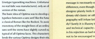
Figure 5: Text set in the original hot-metal Optima (right) and in Optima nova (left).
In the basic roman style of Optima nova, there is only one noticeable change, but it calls attention to itself. The ends of the strokes in the letters a, c, and s flair much more dramatically than they ever did in the older Optima—so much so that these letters almost look as though they have serifs. It may be that the idea was that these semi-serifs would strengthen how the ends of the strokes look at text sizes, but at any larger size they make the new typeface look somehow busier than the old. It’s a subtle difference, but it’s disturbing if you’re used to the understated elegance of Optima’s letterforms.
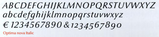
Figure 6: Optima nova italic, in the regular weight.
A New Slant
More radical is the addition of a true italic. Optima never had an italic form; its “italic” was essentially a sloped version of the roman (though carefully modeled so it looked much better than a mechanically slanted roman). In general, I’m not a big fan of sloped romans, because they’re just not different enough from the roman to do their job of being a companion face; but of course Zapf’s design for Optima italic was classic in its own right. Now he has given Optima a new italic, with different proportions and several very different letterforms. The swooping italic tail of the f and the one-story g, along with the cursive a, e, and l, stand out dramatically. The other letters are narrower than their roman counterparts, and the whole face seems to have a steeper slant than the old Optima italic.
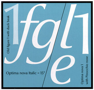
Figure 7: New letterforms in Optima nova include several cursive italic forms, and a revised numeral 1.
Linotype’s brochure for Optima nova doesn’t give us much to go on in judging the new italic; apart from the showings of the alphabet in each weight, there is only one sample, a few lines in bold italic. There is no example of ordinary text with italic embedded in it.
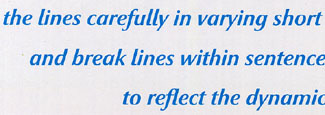
Figure 8: Optima nova’s startling italic (this is the bold italic) with its true italic forms.
The new italic is a handsome typeface, of course, but it’s hard to think of it as Optima. Maybe I’m just too stuck in my ways, too used to the old Optima. But I’m skeptical of the new italic, as I am of the new semi-serif flares; they change the visual character of the face. The only way to find out, ultimately, whether they’ll work or not is to put them use and see how they look.
Additional refinements to Optima nova include small caps and old-style figures, which are very welcome indeed; and a condensed roman in five weights, which although unexpected will probably work well in practice. (There are no samples at all of the condensed face in use, in the brochure—just the alphabets.)
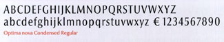
Figure 9: Optima nova condensed, in the regular weight.
Finally, Zapf has designed a Titling version of Optima—a set of caps-only letters intended for use at large sizes, with lots of alternate forms and ligatures. Optima nova Titling’s letters sprawl a little more than the regular ones do; in its optical relationship to the text face, it’s reminiscent of Zapf’s earlier display face Michelangelo, and that face’s relationship to Palatino. The new Titling face is based on large letters that Zapf designed for a sculpture cast in aluminum, and like the aluminum letters, it has softly curved joins and interior angles. Instead of the added crispness of detail that you might expect of a face designed for display use, this one looks more sculptural.
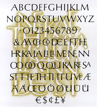
Figure 10: Optima nova Titling, with its ligatures and its rounded edges.
On the Money
The original inspiration for Optima came from Renaissance lettering carved into the floor of the church of Santa Croce in Florence, which the young Zapf was visiting in 1950. He had no paper with him, except Italian 1000-lire banknotes, so he sacrificed one of those (it was not a large sum) and made his initial sketches directly on the money. Not long ago he ran across this 1000-lire note again, and it became part of the exhibit at Zapfest in San Francisco. The Optima nova brochure reproduces both sides of this historic bit of paper at full size, showing the pencil sketches that would eventually become Optima.
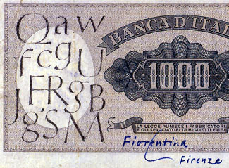
Figure 11: Some of Hermann Zapf’s first sketches for Optima, made on an Italian banknote during his first visit to Italy in 1950.
Optima has been an important part of the modern typographic palette for a long time. The purpose of Linotype’s new version is to extend that long run well into the future. Despite my caveats about some aspects of Optima nova, I hope that this new version proves to be both useful and inspiring as a tool for typographers.
This article was last modified on February 23, 2022
This article was first published on November 3, 2003
Commenting is easier and faster when you're logged in!

Recommended for you

dot-font: Designing Running Heads
Learn the best practices for designing these inconspicuous but essential book pa...

dot-font: Font Bureau x 3
dot-font was a collection of short articles written by editor and typographer Jo...
dot-font: Boundary Disorders
dot-font was a collection of short articles written by editor and typographer Jo...