

dot-font was a collection of short articles written by editor and typographer John D. Barry (the former editor and publisher of the typographic journal U&lc) for CreativePro. If you’d like to read more from this series, click here.
Eventually, John gathered a selection of these articles into two books, dot-font: Talking About Design and dot-font: Talking About Fonts, which are available free to download here. You can find more from John at his website, https://johndberry.com.
Portuguese type designer Mário Feliciano has a flair for big display and small text. The typefaces shown in his recent “Feliciano Type Foundry: Specimen of Types” range from big, blocky display faces that recall the Constructivist designs of the 1920s to carefully crafted serif and sans-serif faces that give style and readability to running text. It’s a remarkable variety for someone who has been practicing type design for less than a decade.
Surf’s Up
“I started my career as a graphic designer,” says Feliciano, “back in ’93, as designer assistant in the leading Portuguese surf magazine, ‘Surf Portugal.’ Since then I’ve been involved in its design, and many of my typefaces were developed to be used in it.” He also had a rock band in the 1990s, and because of his connection to surf culture and rock music, “it’s natural to me to have a more ‘funky’ and relaxed approach to type design.”
If that were all Feliciano did, the typefaces he calls “B-sides” (see Figure 1) would make an interesting addition to the number of aggressively unsubtle headline faces available for magazine design, but it wouldn’t be particularly remarkable.
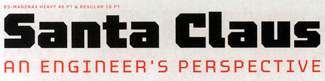
Figure 1: BS Mandrax, the most extensive of Mário Feliciano’s funky “B-sides” type designs.
“Then,” says Feliciano, “there is the other side of my work—the more serious one.”
Sans For Text
Feliciano designed FTF Stella as a text face for “Surf Portugal,” which had always used sans serif faces for text and resisted any change to a serif style. “I tried once to change to a seriffed face,” he explains, “but we had very bad reactions from the readers, so I decided to create this sans with some characteristics of seriffed text faces.” (See Figure 2.)

Figure 2: FTF Stella is a text face designed for readers who don’t like serifs but respond unconsciously to humanist letterforms.
What he created was a very clean, simple-looking sans serif that feels classical and reads comfortably in long text. It has a true italic, narrower and with italic letterforms, rather than the slanted roman that’s common to many sans serifs. “I can’t tell you any particular inspiration—the proportions are somehow based on my ‘image’ of roman type, much based on my study of [historical] Spanish types. I would say that W.A. Dwiggins’s Metro or Fred Smeijers’s Quadraat Sans might have played a role in here—but if you compare the typefaces, they are very different [see Figure 3]. I’m still missing some complementary versions (e.g., display or black) to make it more versatile.”

Figure 3: Stella’s forms recall some of the other popular humanist sans serifs, but don’t duplicate any of them.
The Morgan Project
Feliciano’s largest type family so far is what he calls “The Morgan Project,” an extensive set of sans serif faces that cover both the biggest, boldest display and a stylishly techno form of text. The names suggest their uses: FTF Morgan Big is a family of fat all-caps display faces with sharp corners on the interiors of the letters and rounded rectangular forms on the outside; FTF Morgan Poster takes this idea and blows it up even further, condensing the letters a bit for poster use; and the remarkable FTF Morgan Tower takes an even more condensed form and then stretches it into three different heights with the same optical weight (see Figure 4).
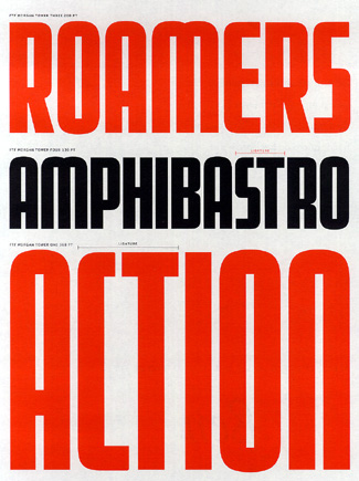
Figure 4: As a display face, FTF Morgan features strong, simple forms and a variety of weights and designs.
In contrast, or perhaps complement, to the big display forms there’s the other half of the Morgan family: FTF Morgan Sans, a subtler, squarish sans serif text face with regular and condensed widths in two weights, and italics for the regular. Morgan Sans probably wouldn’t work in really long passages of text, but in short text blocks it’s very effective, and at small display sizes its crispness and the curved notches and rounded flaring of its construction—a sort of softened industrial look with a hint of the LCD screen—give it a very contemporary look. (It reminds me a bit of Sybille Hagmann’s Emigre face Cholla but without the “blurred” effect of Cholla. And when you look closely at the letterforms, they aren’t that much alike.)
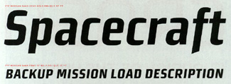
Figure 5: The text complement of FTF Morgan holds its own at both small sizes and small-display sizes.
“Morgan is influenced by science fiction comics from the ’50s,” according to Feliciano. He started with the caps-only display type, and expanded it to all the versions shown in the specimen book—with more on their way. The design came from his desire to “mix some quite opposite concepts,” he says. “The type is not calligraphic, but it is not completely mechanical either. And the variations, character sets, etc., show some respect for the typographic tradition. The ‘italics’ are deliberately called obliques, since they are a sloped version of the upright, optically corrected and with a change in the design of the lowercase f. People who like to have a design that looks ‘up to date’ can use Morgan and still be able to make a nice typographic job” (see Figure 6).

Figure 6: FTF Morgan Sans has small but significant differences between the roman and the italic designs.
He adds: “It’s becoming quite successful commercially.” (FTF fonts are sold through myfonts.com.)
Spanish Sources
The subtlety evident in Feliciano’s sans serif designs shows itself to good effect in FTF Rongel, the first of several serif type families based on his studies of historical Spanish types. Rongel was a Spanish punchcutter in the second half of the 18th century, whose work is displayed, along with that of several other type designers, in a type specimen published in Madrid in 1799. Though Feliciano is from Portugal, he responds strongly to the style of these distinctive Spanish types. One of the most noticeable details of his Rongel revival is the sharp point of the bowl of the lowercase a (see Figure 7).

Figure 7: FTF Rongel’s sharp-bowled a is a distinctive feature of this old-style serif face.
Like Morgan, Rongel possesses a crispness that seems to suggest higher contrast than it actually has; the roman has a little of the sparkle that’s so characteristic of Matthew Carter’s ITC Galliard, and the hint of square internal corners in the counters gives the italic a complementary sharpness (see Figure 8).

Figure 8: The italic of FTF Rongel looks sharp at small sizes.
Well Displayed Lines
Not insignificantly, in this specimen book, Mário Feliciano shows off his type designs very well. The juxtaposition of large, bold display sizes and variously shaped blocks of text provide enough variety of use to judge how effective they would be on the page. All the variations are labeled clearly but unobtrusively; I particularly like the way he indicates ligatures and alternate characters. He prepared this catalog for last year’s ATypI conference in Rome, and he plans to have a new one, with more typefaces, ready for this year’s conference in Vancouver.
This article was last modified on March 2, 2022
This article was first published on June 2, 2003
Commenting is easier and faster when you're logged in!

Recommended for you

dot-font: It's All Good in Denmark
dot-font was a collection of short articles written by editor and typographer Jo...

dot-font: Hauling Freight
dot-font was a collection of short articles written by editor and typographer Jo...

dot-font: Designing Running Heads
Learn the best practices for designing these inconspicuous but essential book pa...