

dot-font was a collection of short articles written by editor and typographer John D. Barry (the former editor and publisher of the typographic journal U&lc) for CreativePro. If you’d like to read more from this series, click here.
Eventually, John gathered a selection of these articles into two books, dot-font: Talking About Design and dot-font: Talking About Fonts, which are available free to download here. You can find more from John at his website, https://johndberry.com.
Sabon has been one of the most useful text typefaces ever since its introduction in 1967. It is frequently used in books, because it’s classic in form but sturdy and practical in execution. It reads well. Now Linotype Library, as part of its program of refining the digital forms of older typefaces and issuing updated versions, has commissioned Jean François Porchez to create a new Sabon: Sabon Next. How do the two compare?
Three in One
Sabon has an unusual history. It was commissioned by a consortium of the German printing industry, who wanted a new text typeface that would work equally well on both Linotype and Monotype machines (the two dominant hot-metal typesetting systems) and as handset type (to be issued by the Stempel foundry). The new typeface was to look for its roots and inspiration to the 16th-century types of the French typecutter Claude Garamond, but to be a practical modern-day text face. They asked Jan Tschichold to design it.
Tschichold was a superb typographer. A one-time radical modernist who fled from Nazi Germany to Switzerland, he eventually turned his practice 180 degrees and became an outspoken advocate of classical typography. He was certainly one of the finest book designers of the 20th century—not just of “beautiful books” for connoisseurs but also of mass-market paperbacks like those published by Penguin (he redesigned the whole line and set new standards for it after the Second World War). Tschichold designed very few typefaces, but Sabon was his masterwork; it has become a modern classic.
Hemmed In
The constraints that Tschichold had to work within, in designing Sabon, didn’t bother him (it was “no effort at all,” he claimed, to make it work with three different systems), but they certainly influenced the shape of the type. First of all, he had to fit all of the letters into the Monotype machine’s 18-unit width system; every letter had to be an even number of units wide. That wasn’t too hard. For handset foundry type, he had to take into account the “German standard baseline,” which was based on the proportions of blackletter fonts and left very little space for descenders. Tschichold managed to turn the short descenders into a virtue, so that they looked natural and compact.
The most awkward restrictions came from the Linotype.
On a Linotype machine, the roman and italic were generally “duplexed”—that is, contained on the same matrix—which meant that they had to be the same width. But italic is traditionally narrower than the roman it accompanies. The Linotype also can’t kern, which is why the lowercase italic f in some Linotype faces seems to be awkwardly straightening up and tucking its extenders in, to avoid overlapping the letters on either side. Tschichold finessed the latter problem by creating an italic f with a straight tail, rather than the long curving tail that was common (see Figure 1). And in designing his italic for Sabon, he made an open, readable italic that didn’t look as though it had been stretched to fit.
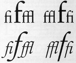
Figure 1: Traditional long f forms (left) and the compact f forms used in the original design of Sabon.
He actually got to create a narrower italic for the display sizes, since the Monotype and Linotype versions were designed for setting text at 12 point and under; larger sizes would be set by hand, using the Stempel foundry type. As Jean François Porchez puts it, “The second version of Sabon was designed by Tschichold for Stempel metal handsetting, for sizes of 14 pt and over, and it seems closer to a pure interpretation of Garamond without all the constraints described above (see Figure 2). Sadly, when Linotype and Monotype adapted the design to their photocomposition systems, they did not follow the Stempel version.” In phototype and later digital versions of Sabon, some of the features that Tschichold created to meet the technical requirements and to work at text sizes can look a little clunky when blown up large. The unusually round lowercase italic o is one that sticks out.
Figure 2: From left to right: outline of Sabon Next Display by Jean François Porchez; Tschichold original drawing for his Sabon; Stempel artwork for the handset version of Sabon; outline of the previous digital version of Sabon; Stempel artwork for the Linotype/Monotype version of Sabon (which was the basis for the previous digital version).
Old & Improved
When Porchez set out to reinterpret Sabon, he wanted to do it without the compromises that Tschichold had had to make. He wanted to go back to the original typefaces that Tschichold had used as his models, and make something that was faithful both to the typeface that Tschichold designed and to the original. In doing this, he discovered another source. Tschichold had always said that he took his inspiration from the 1592 Egenolff-Berner type specimen sheet, which shows several sizes of Garamond’s roman paired with Robert Granjon’s italics; Porchez is convinced that Tschichold was also looking at another specimen, showing the roman types cut by Guillaume II Le Bé, whose father had bought most of Garamond’s punches and matrices after he died. So Porchez looked back to both specimens as he worked on his new digital version.
The new typeface, Sabon Next, is in some ways more a revival of Garamond (and Le Bé) than of Sabon—if such a fine distinction can be made. It’s interesting to compare Sabon Next with Adobe Garamond, Robert Slimbach’s ambitious revival for which he researched Garamond’s original punches in the Plantin-Moretus Museum in Antwerp. The two digital typefaces are different interpretations of the same sources. It’s especially easy to see the resemblance in the italics, but even the romans have a similar color.
Sabon Next has an advantage over Adobe Garamond, however: Sabon Next includes an extra version of the roman and italic that have been beefed up a bit for use at small sizes. (Curiously, Linotype calls these Regular and the finer version Display, even though they recommend using the Display version for sizes of 11 point and larger. Usually “display” refers to non-text sizes—at least 18 point. I would probably use Regular for any serious text work, and not switch to Display until 14 point or larger.) Sabon Next also includes something that the old Sabon never did: a complete range of heavier weights. Tschichold did design a bold (though no bold italic), but Porchez has added not only a bold (with italic) but a demi, an extra bold, and a black as well (see Figure 3 and 4).
Figure 3: The Linotype specimen booklet for Sabon Next shows the subtle differences between the Display and Regular versions, intended for different sizes of text.
Figure 4: A comparison of the previous digital version of Sabon italic (top) and the new italic of Sabon Next (bottom).
Sabon Next has some notable differences from Tschichold’s Sabon in the details. In the original Sabon, for instance, the cap-height (lining) zero is an ellipse with thicker sides and thinner top and bottom; the old-style (lowercase) zero is a perfect circle, with no modulation at all to its stroke. That perfect circle is used in many old-style typefaces, and it has a long history, but it has always disturbed me. Yes, it makes it impossible to mistake the zero for an o, but it doesn’t fit with the modulated strokes of the other numerals.
For Sabon Next, Porchez has chosen to echo the unusual arrangement used in Stempel Garamond (widely regarded as the most faithful revival of Garamond’s types, at least until recently): a zero with the thickness at the top and bottom rather than the sides. He uses this in both the cap-height zero and the lowercase zero. As in Stempel Garamond, it stands out—but it looks odd. I’m not sure where this style came from; there are no Arabic numerals at all on the Egenolff-Berner specimen sheet.
The lowercase roman a and s are narrower in Sabon Next; Porchez felt strongly that the unusually wide a and s in Sabon were a mistake, occasioned by the limitations of the Monotype and Linotype systems. This may be the case, but in use those wide a‘s and s‘s give Sabon part of its character—part of what makes it something more than just another Garamond revival. Certainly the narrower a and s give a different look and feel to a line of text in Sabon Next—as do the roman f with a longer top curve, the italic f with its curling tail, and, on a subtler level, the italic p with a normal serif on the bottom of the descender, rather than the righthand-only serif that Tschichold used (again to avoid kerning problems). (Some of these forms have been preserved as alternates in the new fonts.)
The accents—acute, grave, and circumflex—are much taller and more vertical than in Sabon; these follow Garamond’s originals closely, and certainly look well in French.
On the Shoulders of Giants
On the whole, Sabon Next is more elegant than Sabon, though it doesn’t seem to have quite the robustness that characterizes the Tschichold version.
A new version of a typeface is always a new typeface, no matter how closely it hews to the original design. As such, it should be judged on its own terms. Sabon Next is clearly a useful addition to our typographic repertoire. Producing it was a major undertaking, and each of the myriad decisions about the exact form of a letter or the angle of a curve was made deliberately—just as those decisions were made almost 40 years ago by Jan Tschichold, working within the constraints of the technology of his time. I’m looking forward to getting my hands on the new Sabon Next and giving it a practical workout; as a book designer, I’ve used Sabon many times, and I’m curious to see whether Sabon Next seems a good replacement—or something different and new, with its own style and its own uses (see Figure 5).
Figure 5: The very first use of the new Sabon Next was in a commemorative booklet about the Prix Charles Peignot, designed by Jean François Porchez and published by ATypI for its 2002 conference.
After completing the project, Jean François Porchez said, “I like to imagine what Jan Tschichold, and by extension Claude Garamond and Guillaume Le Bé, would think about this revival—I dream that they would probably follow similar design decisions faced with today’s less limited technical possibilities. Sabon Next was a really passionate project for me, and a real pleasure to stand on the shoulders of such giants. I hope that Sabon will now be appreciated not only because it is a Tschichold design—free from any criticism of how Linotype/Monotype limitations restricted Tschichold’s first ideas—but also for the real quality of a good text face which has been renourished by the two sides of its roots.”
This article was last modified on March 2, 2022
This article was first published on March 10, 2003
Commenting is easier and faster when you're logged in!

Recommended for you

dot-font: Font Bureau’s Ample Scope for Typography
dot-font was a collection of short articles written by editor and typographer Jo...

dot-font: Big Pages, Flamboyant Typography
dot-font was a collection of short articles written by editor and typographer Jo...

dot-font: The “X” Appeal of James Montalbano
dot-font was a collection of short articles written by editor and typographer Jo...