

dot-font was a collection of short articles written by editor and typographer John D. Barry (the former editor and publisher of the typographic journal U&lc) for CreativePro. If you’d like to read more from this series, click here.
Eventually, John gathered a selection of these articles into two books, dot-font: Talking About Design and dot-font: Talking About Fonts, which are available free to download here. You can find more from John at his website, https://johndberry.com.
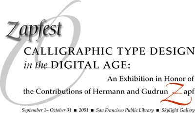
Zapfest got off to a roaring start last weekend, with a well-attended opening to the exhibition on Saturday and a packed presentation by Hermann and Gudrun Zapf on Sunday, both at the main branch of the San Francisco Public Library. Zapfest banners flew on light poles outside the library, which is directly across the huge Civic Center plaza from the domed, ornately gilded City Hall, and Sunday, September 2, 2001, was officially declared Hermann & Gudrun Zapf Day in San Francisco, by proclamation of Mayor Willie Brown. (His Willieness, as he’s known to locals both affectionately and otherwise, did not attend or open the festivities himself. We all know that proclamations of official “days” are usually noticed only by those immediately affected, but for those of us familiar with this particular area of abstruse craft and knowledge, there could be no official honor more well deserved.)
Zapfest runs through the end of October at the San Francisco Public Library.
The official title of Zapfest is “Calligraphic Type Design in the Digital Age: An Exhibition in Honor of the Contributions of Hermann and Gudrun Zapf.” The heart of the exhibit is the work on display—calligraphy, typefaces, and working drawings that bridge the gap between the two—but a series of lectures will complement and punctuate the exhibit throughout its two-month run.
Typefaces at an Exhibition
The exhibition is a large one, on display until the end of October in the Skylight Gallery on the top floor of the main library. In addition to several cases each showing the work of both Hermann Zapf and Gudrun Zapf von Hesse, there are fourteen more cases, each displaying the work of another calligraphic type designer. Several of the other designers, as well as the Zapfs, were there for the opening reception on Saturday.
The exhibit features the work of both Hermann Zapf and Gudrun Zapf von Hesse.
Preparations for the opening were going on right up to the last minute. Linnea Lundquist was the spearhead and coordinator of the whole affair, and Susie Taylor of the library’s Rare Book department did a masterful and creative job of presenting the work itself in its many glass-topped cases. Hermann Zapf had sent detailed sketches of how his and Gudrun’s cases should be laid out (leaving very little space for labels inside the cases to identify the items), and Susie had made similar layouts for the other cases; in the end, though, as Susie said, you have to do it by eye. She used brackets and supports to raise certain items a little bit or tilt them slightly to give the displays a three-dimensionality they would otherwise lack, and she carefully arranged the cases themselves according to the dominant colors and the style of typefaces displayed within them. The effect was dynamic and elegant, and even during the crowded reception there were plenty of people peering happily at the work on display.
The reception itself, with catered munchies in the gallery and wine on the sunlit patio outside, brought visitors from Texas, New York, Seattle, and Los Angeles, among those I knew or discovered myself.
Gudrun’s Work
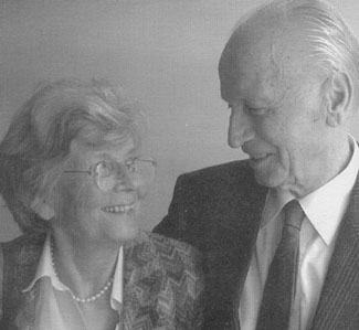
On Sunday afternoon, in the library’s downstairs auditorium, first Gudrun and then Hermann made presentations of their life’s work. Some of the work (though by no means all) can be seen in the exhibit upstairs, or in the library’s excellent collection of Zapfiana.
Gudrun Zapf von Hesse is less well known than her prolific husband Hermann, but she was already a calligrapher and book binder when they met at an exhibit in the late 1930s. (As Hermann later put it, he “married the competition.”) Her first typeface, Diotima, was commissioned by D. Stempel AG, the type foundry that employed Hermann.
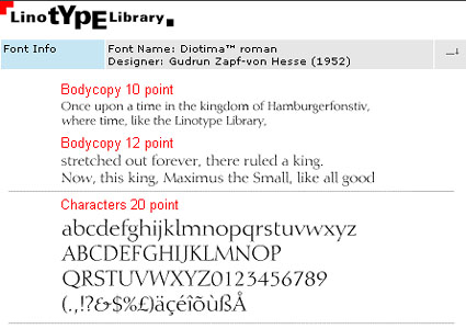
Gudrun Zapf von Hesse created her first typeface, Diotima, in 1952.
Gudrun’s slide presentation showed exquisite examples of her book bindings, often in leather with gold-foil stamping, many times using types she had developed specifically for the purpose. She also showed many samples of her gorgeous calligraphy. Smoke proofs of Diotima (a quick way of proofing the work of cutting metal type punches) gave way to such unusual images as two magazine ads for Opel automobiles from the 1980s, using the fine-boned Diotima as the typeface for the headlines.
Among her other notable typefaces, the Nofret family (1986) was originally going to be called Diotima Book. The resemblance in the lighter weights in obvious; the italics are especially similar, but Nofret’s roman is narrower than Diotima’s extremely spacious characters—more of a text face. Gudrun expanded Nofret in the direction of very heavy weights, too, which take on a massive sparkle found in very few bold typefaces.
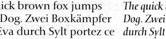
Nofret resembles Diotima, especially in the lighter weights.
Her examples of type and calligraphy in use were sometimes breathtaking. Even as a slide projected onto a slightly over-lit screen, her setting of the preamble of the United Nations charter, blind stamped into dampened paper, was beautiful. The watercolors she showed from more recent years melded the forms of letters with the interplay of blocks of color. A page from a booklet from 1955 that I’d like to study in more detail, showing interleaved lines of black, swash-filled civilité lettering and roman, showed her mastery of contrast.
Gudrun doesn’t speak English as fluently as Hermann, and she perhaps didn’t give us as much detailed commentary as she might have if she’d been speaking her native language, but the audience was delighted to see the work and hear from its source. Both Gudrun and Hermann are quiet, soft-spoken, and reserved, without flamboyance or pretension. Their work speaks for them. If Hermann has come to cast a very long shadow, through his prominence in the world of type, Gudrun shows no signs of letting her own shadow be lost in his; and this exhibition and her talk may remind us what a talented artist and craftswoman she is and what a body of work she has created. I wouldn’t be surprised to see this event inspire a number of graphic designers to put Gudrun’s typefaces to use more often in the coming years.
The Other Half
Next week I’ll turn to Hermann Zapf’s part of the opening presentation, which focused on the upcoming CD-ROM retrospective of his work.
Zapfest continues this weekend with a talk by master printer Jack Stauffacher along with Sumner Stone on Saturday (my column “Type Tradition in a Digital Age” has more background on Sumner); and on Sunday with an event at Mills College honoring women in printing and type design, at which Gudrun Zapf will be an honored guest.
This article was last modified on March 23, 2022
This article was first published on September 7, 2001
Commenting is easier and faster when you're logged in!

Recommended for you

dot-font: Industrial-Standard Typefaces
dot-font was a collection of short articles written by editor and typographer Jo...

dot-font: Typeface With Flourishes
dot-font was a collection of short articles written by editor and typographer Jo...

dot-font: Type Design Today
dot-font was a collection of short articles written by editor and typographer Jo...