

dot-font was a collection of short articles written by editor and typographer John D. Barry (the former editor and publisher of the typographic journal U&lc) for CreativePro. If you’d like to read more from this series, click here.
Eventually, John gathered a selection of these articles into two books, dot-font: Talking About Design and dot-font: Talking About Fonts, which are available free to download here. You can find more from John at his website, https://johndberry.com.
Newspaper typefaces have it tough. There is almost no other category of type—except possibly the type designed for telephone books—that has to meet such an exacting list of requirements. As I mentioned in my previous column, a newspaper text face has to be compact, legible, and sturdy; it has to look contemporary and up-to-the-minute, yet still seem comfortable and familiar to the paper’s readers; and it has to stand up to high-speed industrial printing on poor paper under varying conditions.
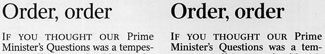
Despite these daunting conditions, there have been a number of successful newspaper typefaces produced in the last hundred years, and there’s been a flurry of new designs just recently, responding to changes in printing technology. Everyone knows about Times New Roman, which was designed as a fresh new typeface for “The Times” of London in the early 1930s. Times is everywhere in the modern world, but oddly enough it’s not used that often in daily newspapers. It’s popular with small-scale weekly or monthly publications, but even “The Times” itself has used different text faces (which it has commissioned) for many decades.
Linotype machines were the typesetting method of choice for newspapers through most of the 20th century, and Mergenthaler Linotype was famously responsible for a number of new typefaces in the ’30s and ’40s, which it called its “legibility faces,” that were developed expressly for the newspaper market. Some of those faces are still used, in digital form, but the change to offset printing and first photo then digital typesetting required new forms of type that were adapted to the new technology. A number of type foundries and individual type designers have tackled this problem; the most systematic program that I’m aware of, or at least the most extensive, is the one that Font Bureau calls (echoing the Linotype hot-metal typefaces) its “Readability Series.”
Finely Graded Fonts
Since newspapers first became widespread in the 19th century, which was dominated by what got dubbed “modern” typefaces (vertical stress, high contrast, rounded terminals, and a general feeling of roundness), many of today’s news faces hark back to that familiar look. One of the best is Matthew Carter’s Miller, which is based on the spirit of the Scotch Roman look that was popular in the 19th-century United States; Carter didn’t derive Miller from a particular historical typeface, but he captured the feel of those sparkly yet workmanlike letters in digital form. Miller is used today in magazines (it’s the text face of Newsweek), and Carter did an adaptation of it for use in the British daily “The Guardian.”
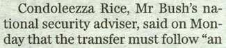
Matthew Carter’s typeface Miller, as used in “The Guardian” for text.
That adaptation, under the name Miller Daily, is marketed by Font Bureau in four different “grades,” each very slightly darker than the last, to compensate for variations in printing conditions; different grades of the typeface can be used on different kinds of paper or on different presses, so that the printed result comes out looking the same. (Each grade has the full complement of weights—in this case bold and regular, with their italics; the whole range of weights simply looks denser or lighter depending on which grade you choose.)
Font Bureau took this even farther with Bureau Roman, a slightly condensed oldstyle news face based on Morris Fuller Benton’s Century Oldstyle, but without the prickliness that today’s versions of Century Oldstyle suffer from. Bureau Roman comes in five closely spaced grades, giving even more flexibility than Miller. David Berlow, along with Cyrus Highsmith, developed Bureau Roman originally for the “Washington Post.”
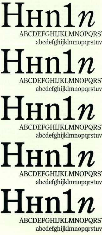
The five different “grades” of Bureau Roman, designed by David Berlow along with Cyrus Highsmith.
Perhaps the most ambitious newspaper type family that Font Bureau has done is the Poynter series, which was created under the sponsorship of the Poynter Institute (an institution devoted to studying and improving the newspaper and the news). Tobias Frere-Jones designed Poynter Oldstyle Text as an all-purpose newspaper face; for inspiration he reached back far beyond the origins of newspapers to the 16th-century Dutch punchcutter Hendrik van den Keere, whom Font Bureau describes as the “wellspring of our oldstyle tradition.” (Poynter Oldstyle is also a “graded” typeface; it comes in four grades.) As a sans-serif companion to this, Frere-Jones drew on Morris Fuller Benton’s drawings for ATF Franklin Gothic and created Poynter Gothic Text, which is designed to work well in subheads and ancillary material alongside Poynter Oldstyle. Poynter Gothic is not graded, but interestingly enough the third part of the Poynter family is: Poynter Agate, a robust sans serif developed by David Berlow for use at very small point sizes, in stock listings or classified ads.
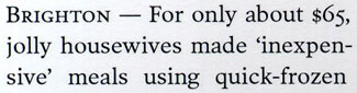
A type sample of Poynter Oldstyle Text, designed by Tobias Frere-Jones for Font Bureau.
Gulliver & Swift
In Europe, quite a few newspapers have used typefaces designed by Gerard Unger for their text (and for their headlines). Though it wasn’t specifically designed as a newspaper face, Swift is used by several papers, including the one that lands on Unger’s own breakfast table in the Netherlands. Perhaps inspired by this, Unger devoted a good deal of energy to the problem of making a successful, versatile newspaper typeface, and he developed the specialized type family he calls Gulliver. It’s compact, large on the body, and surprisingly elegant for a news face. Unger markets Gulliver to large newspapers as a complete system.
Gerard Unger’s Gulliver
As I couldn’t resist pointing out in “Contemporary Newspaper Design,” Gulliver serves as an almost textbook proof that how a typeface is used counts for more than what the typeface looks like. In the sober, elegant “Stuttgarter Zeitung,” where it is given room to breathe, Gulliver exudes an air of calm and order; in the flashy “USA Today,” where it is squashed and stretched and pumped up and jammed together, Gulliver appears frenetic and overwrought. Both papers use the same typeface; the difference is all in the treatment.
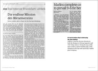
A comparison, from ‘Contemporary Newspaper Design,’ of how differently Gulliver is used in the “Stuttgarter Zeitung” and “USA Today.”
The Times & Le Monde
I mentioned that the “Times” had gone through several proprietary typefaces in its history. The most recent is Times Classic, which was designed as a complete type family, with text and display versions in several weights, by Dave Farey and Richard Dawson. Since I’ve written at length about the Times Classic project in “Contemporary Newspaper Design,” I won’t dwell on it here, but I do want to mention Farey and Dawson’s description of their typeface as a “Contemporary Roman”—a category of British newspaper text faces that they contrast with the more rounded Ionics such as Nimrod or Miller.
A type sample of Times Classic regular and semibold, designed by Dave Farey and Richard Dawson.
Sometimes a major newspaper commissions a new text face; much more rarely, a type designer approaches a paper with a new design. That’s what Jean-François Porchez did with “Le Monde” a few years ago, when the Paris daily was undergoing a re-design, and they took him up on it. While “Le Monde” has gone through another re-design since then, it still uses Porchez’s type family for its text. This newspaper face, Le Monde Journal (to distinguish it from other members of the extended family, Le Monde Livre, Le Monde Sans, and Le Monde Courrier), achieves some of the stylistic and practical feats of Times Roman but in a contemporary manner; it looks less dated and clunky than many newspaper faces.
Text from “Le Monde,” set in Jean-François Porchez’s typeface Le Monde Journal.
Beyond Text
This doesn’t exhaust the typefaces currently being used in major newspapers around the world, but it might give some hint of the range and the style of what’s being done today. I haven’t even touched on the variety of headline faces; in newspapers, as in every area of publishing, the possibilities of display typography are endless.
We’re putting together a mini-track of programming about newspaper design and type for this year’s ATypI conference, in Prague at the end of September. Come and check it out.
This article was last modified on February 18, 2022
This article was first published on April 12, 2004
Commenting is easier and faster when you're logged in!

Recommended for you

dot-font: The Next Sabon
dot-font was a collection of short articles written by editor and typographer Jo...
dot-font: Type Goes Global
dot-font was a collection of short articles written by editor and typographer Jo...
dot-font: Where Type Designs Come From
dot-font was a collection of short articles written by editor and typographer Jo...