


dot-font was a collection of short articles written by editor and typographer John D. Barry (the former editor and publisher of the typographic journal U&lc) for CreativePro. If you’d like to read more from this series, click here.
Eventually, John gathered a selection of these articles into two books, dot-font: Talking About Design and dot-font: Talking About Fonts, which are available free to download here. You can find more from John at his website, https://johndberry.com.
An unusual collaboration has just come to fruition in San Francisco. It’s the work of a master printer, Jack Stauffacher, and a fine photographer, Dennis Letbetter—inspired by an 18th-century book by the Neapolitan philosopher Giambattista Vico, and focused on the stuff and substance of typography.

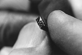
Close-up of a piece of wooden type and part of an 18th-century edition of Vico’s “Scienza Nuova.”
I’ve written about Jack Stauffacher before, including a column about his use of huge wooden type to create letterpress prints that are intended as art rather than typography. For this new project, inspired by the artfully philosophical prose of Vico, Stauffacher has created a new series of prints, which incorporate not only the huge wooden letter-shapes but also small lines of text, phrases extracted from Vico’s “Scienza Nuova” (“New Science”) and hand-set in text type: little words among the giants. These limited-edition prints make up one of the two portfolios of the Vico project.

One of the new prints created by Jack Stauffacher using huge wooden type in abstract ways.
The other portfolio is photographic. Dennis Letbetter, who has collaborated with Stauffacher before, took a series of macro-photographs, those extreme close-ups that capture the finest details of small objects and make them seem huge and out of scale. The subjects of Letbetter’s photos were the objects of printing: individual pieces of metal type, by themselves and composed into lines and blocks of text; letterpress ink and the patterns it makes; and details of the printing and construction of the original editions of Vico’s book itself. These photographs zoom in on the physical reality of print and type in a way that few other images have.
Dennis Letbetter’s close-up photograph of a piece of 7-point type held by Jack Stauffacher.
Connecting the Arts
The results of this collaboration were first on view at an opening at the Bonnafont Gallery in San Francisco last month, which celebrated the connections and interconnections of art, craft, philosophy, and a great variety of people.

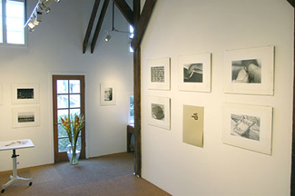
Prints by Stauffacher and Letbetter on display at the Bonnafont Gallery in San Francisco.
Prints hung on the walls, and in a couple of clear-topped display cases were artifacts of Vico and of printing: the hand-tied block of 7-point type, for instance, that features in one of Letbetter’s photos, and a copy of the miniature third edition of Vico’s work, which used type of this infinitesimal size on pages that would fit into a small pocket. (Stauffacher had set this block of type himself just to find out what it would feel like to set such tiny type and imagine what might have been involved in setting an entire book in it by hand.)
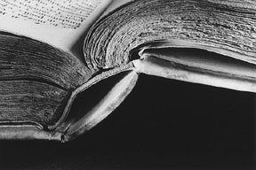
Binding of an original edition of Vico’s book, photographed in extreme close-up by Dennis Letbetter.
Enthusiasm
In a short public presentation during the opening, Stauffacher spoke about the importance of Giambattista Vico (saying that he wasn’t going to explain anything about Vico’s thinking: “You’ll just have to go read the book yourselves!”) and the oblique way in which it had inspired both him and Letbetter in their respective work. Then he had Pino Trogu, an Italian graphic designer who lives in San Francisco, to read aloud the passage in Italian from Vico’s original text that Jack had used as a sample; and he asked me, since I had come in from out of town, to read the English translation. (We both had to incorporate a few phrases of Latin, too.) The real meat of the evening was probably Jack’s informal expositions in front of a few attentive people in the midst of the party. There is nothing like Jack Stauffacher on a roll, explaining the craft of something he loves.

Jack Stauffacher explaining the tactile pleasures of creating art out of huge wooden type. (Photo: Larry Will)
He had had a chance to do this in front of a much bigger audience a couple of months before, when he was one of the featured speakers at the AIGA’s annual conference, in Vancouver. (Yes, Vancouver hosted two major design conferences within a month of each other: the ATypI conference in September, and the AIGA one in October.) He showed some of the prints that would make up the Vico portfolio, along with the literary books that have made him respected as a printer. His animated explanations captivated the young designers crowding around him.
Jack Stauffacher and young designers at the AIGA national conference in Vancouver. (Photo: Larry Will)
Up Close and Material
Some of Letbetter’s intensely focused black-and-white photos have the quality of 19th-century photography; one view of a single line of composed metal type, shot from the side from only inches away, looks like it might be an early photo of the chimneypots of Paris. When you realize what it really is, it changes your perspective on type and typography, quite literally.
Stauffacher’s subtle bending of the crafts of inking and printing to get specific visual effects, and his arrangement of the gigantic letters and parts of letters, create abstract images that aren’t just shape and color but physical, tactile interactions of the materials of paper, ink, and type.
This sort of artistic creation is far from the practical exigencies of job printing, or the deadlines and pressures of commercial typography, but it is a unique joining of several pragmatic crafts and the highest aspirations of human thinking.
This article was last modified on February 23, 2022
This article was first published on December 15, 2003
Commenting is easier and faster when you're logged in!

Recommended for you
dot-font: Is It Type, Or Is It Art?
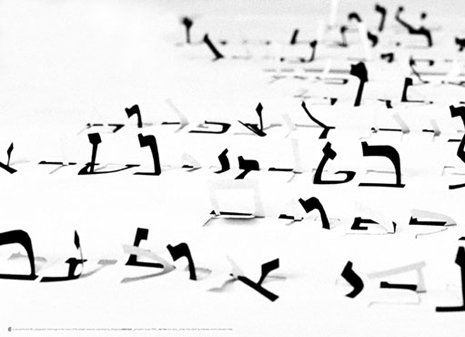
Photos by Idan Gil dot-font was a collection of short articles written by editor...
dot-font: Expressive Typography
Learn about the practice of using the physical shapes of letters to create new m...

dot-font: The Type Show Goes On
dot-font was a collection of short articles written by editor and typographer Jo...