


dot-font was a collection of short articles written by editor and typographer John D. Barry (the former editor and publisher of the typographic journal U&lc) for CreativePro. If you’d like to read more from this series, click here.
Eventually, John gathered a selection of these articles into two books, dot-font: Talking About Design and dot-font: Talking About Fonts, which are available free to download here. You can find more from John at his website, https://johndberry.com.
Photographing type in the world around us is a popular pastime. Graphic designers, especially, all seem to have caches of snapshots of interesting lettering they’ve spotted in their neighborhoods or on their travels. But for French photographer Isabelle Rozenbaum this is a serious art form. She was already a master of observing the typography around her, but with her new PhotoAlto CD-ROM “Moving typography” she moves to a new level.
Layered Movement
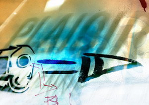
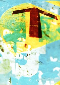
Rozenbaum has an eye for detail and texture in urban settings. The 84 images on this disc all seem to derive from cities, both European and American. Although most of them incorporate words, they’re not just shots of signage or graffiti. For one thing, there’s an intense feeling of motion in almost all of them—sometimes real motion, such as lettering on a train or other object that’s moving by, and sometimes an illusion of movement, created through the juxtaposition of several layered, partly transparent images that go in and out of focus.
It’s hard, sometimes, to be sure whether you’re looking at one image physically reflected onto another, or a computer collage of several manipulated photographs.
Nets of Words
Rozenbaum’s compositions are more than just “layered images,” but it’s not always clear what to call them. They’re colorful and evocative. And they use, as their most basic ingredient, letters and other visual symbols.
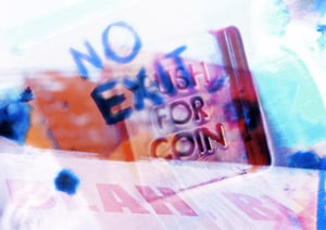
The words that show up in these pictures are sometimes the ones you might expect: “SEX,” “CAUTION,” “NO EXIT.”
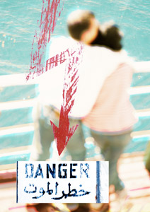
Other times, they take you by surprise: “AME” (French for “soul”) or a bilingual “DANGER” sign in English (or French—it’s the same word) and Arabic.
A favorite that crops up in several photos is “PUSH FOR COIN,” from that little door to the coin slot on a public pay phone. Sometimes we see single letters, or numerals, all by themselves. One shot shows a hand-scrawled warning sign, on what looks like a subway window: “CAREFUL / OLD LADIES CROSSING.”
Quite a few photos include the beginning of an Internet address: “www” or https:// running out of the frame. It’s clear that the mixed-up layering of word fragments and pure images is a photographer’s response to the confusing input we all experience in this world that’s simultaneously digital and physical.

Type, Food, and Backgrounds
Isabelle Rozenbaum began her photographic career by shooting still-life and food photography, which required an intense study of lighting, in the studio and outdoors. She has made a name for herself with culinary photos that have appeared in books, magazines, and CD-ROMs, but it’s her passion for typography and for textures that led her to what we see in “Moving typography.” Earlier CDs she did for PhotoAlto (which she helped to found) featured deeply textured and evocative images of lettering in various urban contexts—including one whole disc called “Urban typography,” which ranges from the varied letter styles and clock faces on a shuttered clock shop to close-ups of a few letters incised in stone. Others include individual letters and symbols, with variations of focus, lighting, and color that prefigure the collages of the new CD; she also did a non-typographic CD called “Backgrounds & Colors,” and another with co-founder Frederic Cirou called “Backgrounds & Textures.”
But “Moving typography” is a departure. It’s something new. And the images are compositions in every sense.
Using Art
I have to wonder how people will use these images. After all, PhotoAlto is a company that sells royalty-free stock photography. The idea is that designers will buy the CDs and incorporate the photos into their own work—ads, brochures, book covers, whatever—rather than just admire them. In some ways, the simplest image is the easiest to use, as just one visual element among many. And these are not simple. But then, I’m not a big user of stock photography.
PhotoAlto bills itself as “the world’s most beautiful digital photo library.” I’m sure the people at other stock houses would argue the point, but there’s no doubt that PhotoAlto’s extensive catalog offers some amazing images. Each CD features the work of just one photographer (or two working together, such as Rozenbaum and Cirou), so each one has a guiding intelligence behind it.
This article was last modified on April 7, 2022
This article was first published on August 10, 2000
Commenting is easier and faster when you're logged in!

Recommended for you

dot-font: Sparkle, Sparkle, Little Type
dot-font was a collection of short articles written by editor and typographer Jo...

dot-font: The Type Show Goes On
dot-font was a collection of short articles written by editor and typographer Jo...
dot-font: Typographic High in SF
dot-font was a collection of short articles written by editor and typographer Jo...