


dot-font was a collection of short articles written by editor and typographer John D. Barry (the former editor and publisher of the typographic journal U&lc) for CreativePro. If you’d like to read more from this series, click here.
Eventually, John gathered a selection of these articles into two books, dot-font: Talking About Design and dot-font: Talking About Fonts, which are available free to download here. You can find more from John at his website, https://johndberry.com.
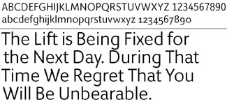
Type designer James Montalbano may make the sexiest x in the world. When he was showing me printed samples of his new type family Giacomo, my eye zeroed in on the big x in the display setting. “Wow!” I said with a laugh. “That’s quite an x!” (“Glad you noticed,” said James.)
Swaying to the Music
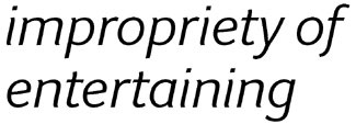
OK, when I say sexiest, I’m succumbing to the usual sloppy usage of calling everything from cars to concepts “sexy.” I’m also being influenced by the choice of words in Montalbano’s type samples. To show his typeface in various display sizes, he used quotations from that widely circulated list of broken-English signs and notices with unintended double-entendres. The large-scale sample of Giacomo uses this sentence: “Because of the impropriety of entertaining guests of the opposite sex in the bedroom, it is suggested that the lobby be used for this purpose.” The x, of course, appears at the end of the word sex.

But really, the italic version of the Giacomo x is unusually sinuous, with angles and curves that you wouldn’t expect. It’s especially obvious in the bolder weights. (Giacomo comes in five weights, from Light to Black, each with both roman and italic fonts.)

At large display sizes, the x draws attention to itself, as do a few of the other letters: the t, the n, and even the i. At text sizes, however, these curves disappear—at least to the naked eye—and the effect is simply to add a slightly cursive feel to the italic of what is, essentially, a plain sans-serif typeface.
The roman weights of Giacomo possess no such undulating rhythm; they are upright and cleanly-limbed, what you might call plainspoken. Their character comes from subtle modulations of the stroke width, slightly squarish curves, occasionally slanted stroke ends, and a certain very restrained playfulness in the lowercase g and a.

Restrained Flair
Giacomo exhibits the virtues of James Montalbano as a type designer. He draws typefaces for text and signage that follow the basic principles of letter formation for legibility; he develops them across a wide range of weights, widths, and styles; and he endows them with a painterly playfulness in the tiniest details.
He has designed pure display faces, such as ITC Freddo, the wide, fat, friendly, bulbous Art-Deco-ish typeface inspired by a 1930s manual for sign letterers. (Before the wide-spread use of desktop publishing software, most signs were hand-lettered. In many places, for practical as well as esthetic reasons, they still are. But if there are still manuals for the practitioners, they are much less vivid and rich than the ones from the 1920s and 1930s.)
Montalbano is a long-time fan of these manuals for sign painting and showcard lettering; I have seen him engage in a spirited bidding war during an ATypI auction when a particularly choice example came up for sale. His playfully elegant display typeface ITC Nora (like Freddo available in only one weight and style) was another product of his fascination with 1930s signage: one of what he called the “informal, wacky scripts.” These are typefaces that are perfect for display use in small quantities—for a word, a phrase, a title.
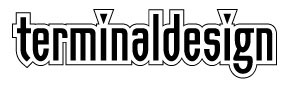
Montalbano’s restraint shows up in ITC Orbon, a four-weight family (with no italic) which he claims is a sort of stripped-down, postmodern extrapolation of blackletter. Orbon is also, of course, a display face, though at large enough size it’s surprisingly legible in long lines. Its simplicity, its quirky shield-shaped counters, and its narrow width give it its character—as do the distinctive wedge-shaped dots on the lowercase i and j. Montalbano uses Orbon, or a version of it, in the logo of his own design studio, Terminal Design.
Utility Ahead
But it’s in sans-serif type families for use in text that Montalbano excels. Not only does Giacomo promise to be useful in any number of situations that call for clarity suffused with wiggle, but his earlier type family ClearviewOne—conceived for absolute legibility in highway signage—reads astonishingly well as a text face. (He uses it in his design of “Letterspace,” the occasional newsletter of the Type Directors Club, of which Montalbano has been a longtime board member and of which he has just been elected president.) ClearviewOne uses the same humanist-inspired letterforms that make a text type familiar and readable, translating it into a starkly functional signage form but also expanding it into a widely useful family of type.
(I mentioned ClearviewOne in an earlier “dot-font” column, about typefaces derived from or inspired by highway signs. Recently, in doing a quick Web search in connection with this column, I happened upon one of the most unusual sites on highway signage I’d ever seen. Obviously, highway signs drive some people crazy. Take a big pinch of salt with you when you check out this site on a project called Euroface.)
A Wealth of Type
James Montalbano is one of those unsung type designers, quietly designing very usable typefaces without making a big splash. Like most independent type designers these days, he makes his living largely from commissioned work (for clients such as “GQ” and “Vanity Fair”), not from selling his fonts to the public. But his ITC display faces are of course available as part of the ITC typeface library, and you can get ClearviewOne and Giacomo directly from Terminal Design. The time spent developing a fully integrated family of usable typefaces is never fully repaid, but in today’s buyer’s market, the fruits of that labor are readily available.
This article was last modified on March 10, 2022
This article was first published on June 10, 2002
Commenting is easier and faster when you're logged in!

Recommended for you

dot-font: Optima nova—New Take on Timeless Face
dot-font was a collection of short articles written by editor and typographer Jo...
dot-font: Acrobatics—Putting the Story on the Screen
dot-font was a collection of short articles written by editor and typographer Jo...
dot-font: Type You Can Use Again and Again
dot-font was a collection of short articles written by editor and typographer Jo...