

dot-font was a collection of short articles written by editor and typographer John D. Barry (the former editor and publisher of the typographic journal U&lc) for CreativePro. If you’d like to read more from this series, click here.
Eventually, John gathered a selection of these articles into two books, dot-font: Talking About Design and dot-font: Talking About Fonts, which are available free to download here. You can find more from John at his website, https://johndberry.com.
Extra typographic characters, the elements that make fine typography possible in digital typesetting, used to be unavailable in a standard font. If they existed for an individual typeface, they were packed into a second, supplementary font known as an “expert set.” The expert set was a separate font, and you had to pay for it separately, but it was typically a fraction of the cost of the primary font.
Although I’m writing in the past tense, you can still buy plenty of text fonts with supplementary expert sets, not to mention all those residing on many of our machines (including mine). But since the advent of OpenType fonts, which can hold tens of thousands of characters in a single font (instead of the 256 of a single-byte PostScript or TrueType font), it’s no longer necessary to segregate the expert characters in a different font (Figure 1).
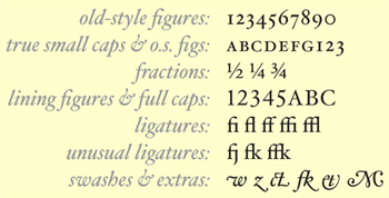
Figure 1. These typographic refinements can often be found in an expert set or an OpenType Pro font.
Not all OpenType fonts contain extra characters—they may be nothing more than the character set of an older PostScript or TrueType font repackaged in OpenType format—but the possibility is always there, and a lot of digital type foundries have taken advantage of it. Some foundries sell fonts, labelled “Pro,” that include a host of typographic refinements and extra characters (though technically, the “Pro” designation, which began with Adobe, doesn’t refer to expert characters but to multilingual capabilities). With an OpenType font that contains thousands of extra and alternate glyphs, the question becomes how the software can access them, and how you can put them to use.
So there you have the two problems of using expert characters. In a PostScript font, how do you use that supplementary font and its character set when you’re putting together a publication or designing an ad; and in an OpenType Pro font, how do you get at all the extra goodies?
Using an Expert Set
A typical expert set might contain small caps, oldstyle figures, and a full set of f-ligatures (fi, fl, ff, ffi, ffl) to supplement a basic font that uses only modern (cap-height) figures and (at least in the Macintosh character set) the fi and fl ligatures. (The default Windows character set doesn’t even include those two common ligatures.) I have typeset many books using this set of supplementary characters. Other expert sets may include fractions, alternate characters, extra ligatures, and typographic ornaments. Some have been called “SCOSF” fonts, for “small caps and old-style figures.”
If you know what you need, it’s not hard to locate a particular character in any font (Figures 2 and 3). You look for it in a utility like Key Caps or in an internal tool like InDesign’s glyph palette. (Or you simply copy it from another document that uses the glyph you need. This is an often-overlooked and very simple way of extending your typographic reach.)

Figure 2. You can select the characters you want to change… (Click on the image to see a larger version.)
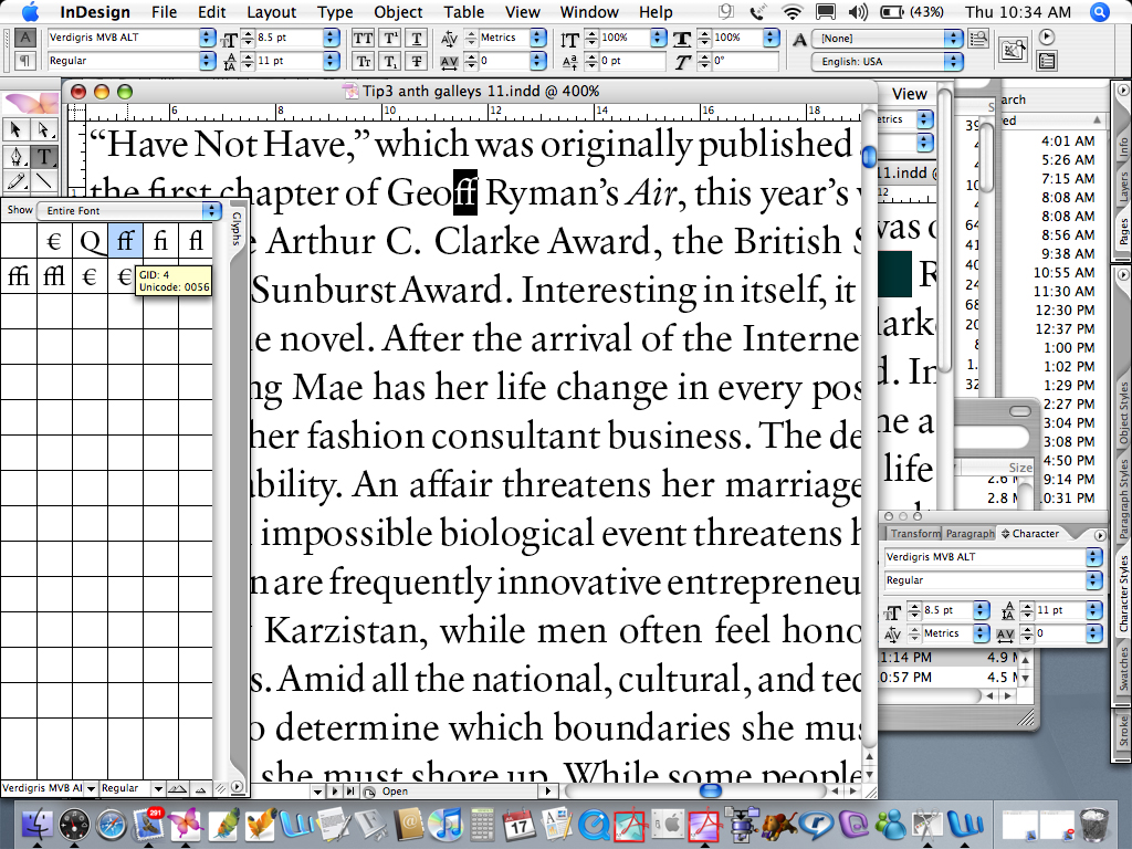
Figure 3. …and replace them with the proper ligature from the expert font. Click on the image to see a larger version.
But how do you use things like oldstyle figures and ligatures consistently and efficiently in a production typesetting environment, when you’re churning out long documents?
With PostScript fonts and expert sets, it’s a matter of good old search-and-replace (Figures 4 and 5). You have to search your document for the letter combination f+i, for instance, and replace it with the ligature fi. But there a few pitfalls. You don’t want to include a name like Fitzgerald in your search, ending up with a lowercase “fitzgerald” that starts with a ligature. And since, as far as your software is concerned, that “fi” ligature is a unique glyph—not a combination of “f” and “i” at all, no matter what it may look like, but a particular character at a particular position in a separate font—once you’ve replaced all the f+i combinations with fi, your next search won’t find that combination when you’re looking for f+f+i. So you have to apply a certain logic to constructing a search-and-replace sequence.

Figure 4. Search for the combination of letters you want to replace… (Click on the image to see a larger version.)

Figure 5. …and replace them with the ligature. Click on the image to see a larger version.
Search-and-Replace Logic
First, make sure your search is case-sensitive; you only want it to affect lowercase letters. Next, make sure that you have not checked a box telling it to look only for whole words; by definition, none of these ligatures is a complete word in itself (at least in English).
Start with the largest combination: either f+f+i or f+f+l. Search for that combination in your regular text font, and replace it with the ffi or ffl ligatures in the expert font. (Usually the f-ligatures follow a set pattern: They’re in the position, in the expert font, of capital V W X Y Z. So if you type a capital-Z into the “replace” field while you’re searching, and specify the expert font, what you’ll see on the page will look like ffl.) I usually do the first couple of replacements manually, just to be sure I have the right character and haven’t forgotten something; then I click “Replace all.”
After replacing ffi and ffl, you can search for f+f without fear of missing it. Then, after you’ve dealt with all the three-letter combinations, search for f+i and f+l (first one, then the other, though the order here doesn’t matter). That’s all there is to it.
To change all the lining figures to oldstyle figures, you have to do ten separate searches, one for each digit. Yes, it’s tedious, but it’s straightforward. Search first for the numeral 1 and replace it with the figure 1 from the expert font, and keep going until you’ve gotten through 9. (Don’t forget zero.) If you’re dealing with money, and the expert font has a differently designed dollar sign, you might want to search for “$” too. Same with any other currency symbol.
Depending on the font, you may have to do all of this again for the italic or bold, after finishing with the roman. Or you may get them all at once, if the font recognizes “italic” and “bold” as linked styles (and you left those styles unspecified). Just follow through logically and check your results.
Changing an acronym or a few words ALL IN CAPITAL LETTERS to small caps is a two-part process, using expert sets. It doesn’t matter which order you do them in, but you have to do both. First, select the text. Then, change the font to the expert set or SCOSF font. But in most of these fonts, the small-caps characters are in the lowercase positions on the keyboard; the uppercase characters are ordinary full caps (In some expert fonts, the full caps are missing entirely.). So you have to take this second step: change the case of the selected text (Figures 6 and 7). Or, of course, you could always simply retype the word, if that’s quicker.

Figure 6. Even after you apply a small-caps character style that switches the font to an expert font… (Click on the image to see a larger version.)

Figure 7. …you have to change the uppercase caps to lowercase to make them small caps. Click on the image to see a larger version.
OpenType Typography
OpenType fonts are much more sophisticated pieces of software, and they make your life much easier. At least they do if you’re using an application that knows how to exploit the capabilities of the full OpenType character set. InDesign has been doing this for some time; QuarkXPress is finally catching up. I’ll use InDesign for my examples, since that’s what I’m most accustomed to.
OpenType fonts have a number of different attributes that can be programmed into them; it’s up to the font designer to decide which ones to use. There are, for instance, potentially several different levels of alternate characters; the font designer decides which alternate glyphs to include in the basic set, which belong in a more elaborate set (for fancier effects), and which should only appear when you’re using the most decorative set. Normal typographic refinements, such as standard ligatures, fall into the first category. (An oddity of some Adobe Originals Pro fonts is that there’s a T+h ligature included in the “basic” set. If you really hate it, you can search for T+h and then turn off ligatures for that letter combination.)
In InDesign, look at the Character palette. There’s a little circled arrow in the upper-right corner, which displays a flyout menu when you click it. On that menu, you’ll see choices such as “Superscript” and “Underline”. At the top of the list is an entry labeled “OpenType,” which opens up a submenu with nothing but the possible OpenType typographic features. That’s where you’ll choose the OpenType features you want.
To use old-style figures consistently, select the text you want to apply them to (maybe the entire text of your document), then choose “Proportional Oldstyle Figures” from that flyout submenu. Some OpenType text typefaces have old-style figures defined as the default style for numerals; in those cases, if you want lining (modern) figures—in a line of all-caps, for instance—you simply select the text and choose “Proportional Lining Figures.”
A few OpenType Pro fonts even include non-proportional versions of old-style figures; that is, old-style in form but uniform in width. These are handy for annual reports or any document with columns of figures that need to align with each other, where you’d still like the elegance and readability of old-style figures. (Old-style figures are more readable, just as lowercase letters are more readable than all-caps. Always use old-style figures in text, if they’re available and appropriately designed.)
If the font includes numerals designed specifically to serve as the numerators and denominators in fractions, you can use the OpenType submenu’s “Fractions” command to turn an awkward faked construction like “1/2” into a true fraction.
One of the pleasures of OpenType’s typographic features is that you can apply true small caps to an acronym in one step (Figure 8). The OpenType “All Small Caps” feature automatically makes every letter selected a small cap, whether it began life as lowercase or uppercase. There’s no need to go through the text and change all-caps to lowercase letters before making them small caps.

Figure 8. In an OpenType font with advanced typographic features, use the All Small Caps command to change selected text to small caps in one step. Click on the image to see a larger version.
You can build this capability into a character style, give it a keyboard shortcut, and have it at your fingertips during production typesetting (Figure 9). I regularly use a “small caps” character style, which I can then apply just by selecting text and clicking in the Character Styles palette (or using a keyboard shortcut that I’ve created). If an acronym appears frequently in your document, simply use the Find/Change dialog box to search for that acronym and apply the small-caps style to it.

Figure 9. Using the OpenType All Small Caps feature in a character style automates the whole process. Click on the image to see a larger version.
Automating Quality
By enabling the typographical enhancements in an OpenType Pro font, you can add a layer of typographic quality to your text without having to jump through hoops every time you want to do it. Reserve the more baroque and decorative things, such as swash capitals, for special occasions, when fanciness is appropriate and not just a distraction (Figure 10).

Figure 10. Use the extra flourishes and exotic swashes in some fonts only with caution. Click on the image to see a larger version.
But the basic level—full ligature support, old-style figures, true small caps—ought to be the default for text typography in almost any situation. With OpenType’s typographic features, and applications that support them, they can be.
This article was last modified on February 16, 2022
This article was first published on October 23, 2006
Commenting is easier and faster when you're logged in!

Recommended for you

dot-font Book Free to Download
Back in 2007, longtime CreativePro.com author John D. Berry gathered a selection...
dot-font: Revival Meetings of Mind
dot-font was a collection of short articles written by editor and typographer Jo...

dot-font: The Type Show Goes On
dot-font was a collection of short articles written by editor and typographer Jo...