To Double-Space or Not to Double-Space…

37

It’s the debate that refuses to die: Do you set one word space or two after a period? In all my years of writing about type, it’s still the question I hear most often, and a search of the web will find threads galore on the subject. I’m going to try to put an end to the argument here.

Origins

Traditional wisdom on the subject asserts that using two word spaces after sentences is left over from the days of the typewriter. This is only partially true. It’s a fact that people who first learned typing on a typewriter were indeed taught that you should always use two spaces after a sentence-ending period. Habits are hard to break. More on that later.

But the use of double spaces (or other exaggerated spacing) after a period is a typographic convention with roots that far predate the typewriter. The first commercially available typewriters—the only ones that could arguably have been influential enough to change typographic habits—didn’t appear until the 1860s. The first patents for related gizmos appeared about 50 years earlier.

I am not a type historian, nor am I an antiquarian book collector, so the oldest printed book I own dates only to 1819. That book, though—a Dutch theological bibliography—uses em spaces (which are more or less equivalent to two word spaces) after periods. The oldest type sample I have on hand is a replica of an American short story set in Williamsburg, Virginia, in 1774. It also uses ems after sentences.

Reproduction text from 1774 of A Pretty Story, showing large spaces between sentences

Apart from the funny s glyphs used to set this letterpress page, the thing that catches the eye most are the holes created by the big spaces between sentences. Disruptive by modern standards, they were all the rage when this was originally set, back in 1774. The face is Caslon.

The first printing of the U.S. Declaration of Independence also uses em spacing. The practice in those days was hardly universal, though, and many contemporaneous anglophone volumes—John Baskerville’s 1763 Bible, for example—show the spacing that we now regard as the norm; that is, a single word space between sentences.

Type sample catalogue showing text set in several different fonts, with double spaces between sentences

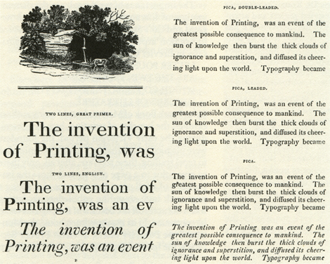
This American type sample catalogue shows that in 1808 using the equivalent of double word spaces between sentences was the style of the day.

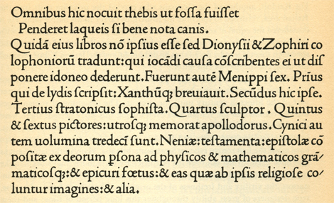
The earliest printed example of exaggerated inter-sentence spacing that I could find is a hoary one indeed. Below is a sample from “De Aetna,” by Pietro Bembo (who gave his name to the typeface used in it) and printed by Aldus Manutius (né Teobaldo Manucci) in Venice in 1495.

Latin text with large spaces between sentences

The spacing used to justify these lines from Bembo’s 1495 work De Aetna is pretty irregular. But the spaces between sentences are much bigger than a single word space, and they carry the brunt of the work of filling out the lines.

Other contemporary printed works—including those by the above Signore Manucci—use “normal” spacing.

Latin text with single spaces between sentences

Twenty years before Manutius, the French printer Nicolas Jenson, also working in Venice, used a spacing scheme that looks quite contemporary, with single word spaces applied between sentences.

In the early days of handset type, having the flexibility to exaggerate the spaces between sentences must have been a boon to quickly setting justified type. And Aldus Manutius was famous as a thrifty, profit-conscious printer. He developed what we now call italics as a way to jam more type onto the page to save money on paper. I’m not prepared to aver that double spaces at the ends of sentences arose from crass commercial concerns, but I think it makes a quality rumor, and you can say you saw it here first.

English text with double spaces between sentences

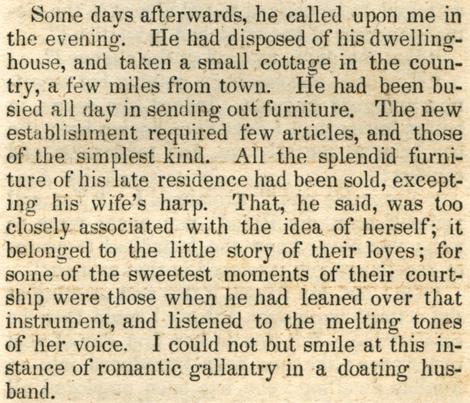
In this 1846 pocket volume for newlywed women, the sentences are as spaced out as the advice. It was printed in Philadelphia.

Styles in all things change, and for reasons that are unclear to me, the habit of double-spacing faded away. As best I can tell from books I’ve looked at, this happened first in continental Europe, followed by the United States.

Text from a novel with large spaces between sentences

As late as 1941, the practice of using double spaces to separate sentences was still alive in the U.S., as seen in this extract from a Damon Runyon work. Within the following few years, the practice became all but extinct in commercial publishing on American shores.

The English seem to have been the last to join the crowd, with the use of big inter-sentence spaces there continuing at least into the mid-1950s.

Text from a novel with large spaces between sentences

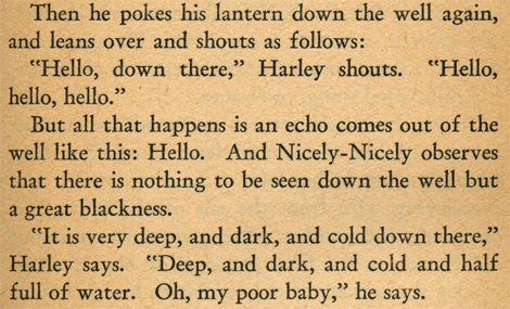
There are surely later survivors of the tradition, but this 1956 edition of the gripping “Airtight Alibi,” printed in London, was the latest I could find that maintained the double-spacing convention.

The Typewriter Connection

On a typewriter, using two word spaces after a period makes sense and is, in fact, typographically the right thing to do. That’s because typewriters use monospaced typefaces, in which every character has the same width. This allows the typewriter to have a simple mechanism for advancing the page as you type, with the carriage (or the typing mechanism) moving a fixed amount after each keystroke, regardless of which character is set: Capitals, lowercase characters, punctuation marks, spaces, everything gets the same escapement (which is the word for that machine movement).

Characters in monospaced typefaces look weird, forced by mechanical necessity onto a Procrustean bed. Some—like the M—look pinched, while others are grossly expanded—such as the i or l. Side bearings for narrow characters, such as punctuation marks, have to be puffed up. The overall effect of such type is very airy and open and its spacing is poorly modulated.

Monospaced fonts with lines showing even spacing between characters

The mechanism for moving the carriage of a typewriter obliged every character to take up the same amount of space on the line, as shown in these monospaced faces. Punctuation—whose shapes can’t be adapted—fares particularly badly. From top to bottom are Courier, Letter Gothic, and Prestige.

So for the same reason that double-spacing typewritten lines is the norm, for monospaced fonts, using two word spaces after periods is too. It’s a question of balancing the white space bound up in each character with the spaces around them. In addition, a single word space simply lacks the visual impact to cue the reader that a sentence has ended. The punctuation mark alone, in short, isn’t enough to punctuate the texture of the type flow.

However, when using proportional typefaces, everything is different. Each character can be designed with its familiar historical proportions and has its own unique width. The texture and color of each line of type is much more even. In these faces, the word space is part of the team, proportioned to work individually, creating a spacing break between sentences that’s neither jarring nor too wimpy.

So there’s no need, except when using monospaced faces, to double the word space after sentences. In fact, good type color and balanced spacing argue against it. But clearly, from a historical perspective, there’s no reason that such doubling should be banned, either. The problem with doing so these days is that it looks like a mistake. We’re not used to seeing these white holes peppering the page, so the wider spaces look inappropriately large.

Interestingly, by the 1960s, electronic phototypesetting systems went as far as ignoring consecutive word spaces altogether when they appeared in text. If the system found consecutive word spaces, it regarded that as a mistake and collapsed them into a single space. For the generation of typesetters who grew up during this regime, this no-nonsense interdiction may be part of the source of the notion that double spaces are not just a bad idea but are in fact verboten.

The Cocktail-Party Summary

Here are the salient points to remember, which you can wheel out against the next type pedant you find yourself stuck beside at a design conference:

  • Doubling the word space after a sentence-ending period does not come from the use of typewriters. It was an existing practice that found practical application there.
  • If you’re using a typewriter, keep on doubling that space.
  • If you’re using a monospaced typeface, do the same, and for the same reasons.
  • Modern spacing aesthetics aside, the main reason not to use two word spaces (or an em space) between sentences is that people will think you’re doing it out of ignorance. It will be perceived as a mistake. You may know better, but you’ll have a hard time convincing everyone else.
James Felici has worked in the publishing industry for over 30 years. He is the former managing editor of Publish magazine, and written for PC World, Macworld, and The Seybold Report. A renowned type expert, he is the author of The Complete Manual of Typography.
  • Anonymous says:

    I was apprenticed as a compositor in London in 1950. I was told by an old-timer that wide spacing was used by comps on ‘piece-rate’ to fill the page faster – so increasing the payment.
    By the time I finished my apprenticeship close setting was the fashion. The standard word spacing was a mid space (1/4 of an em).

  • Anonymous says:

    Thank you James for this insightful article. Robert Bringhurst, “The Elements of Typographic Style” (pg 28), [snip] “Your typing as well as your typesetting will benefit from unlearning this quaint Victorian habit.” My studies also support single spacing when it comes to readability. The moves in sacatic (sp?) jumps with readbility impaired by rivers and blotch spaces at sentence stops.

    I also find it interesting that The Chicago Manual for Style (the Bible for typewriter students for years) has changed its antiquated typewriter doctrine to typographical. But armed with all this typographic wisdom there are those (typewriter gurus) who state emphatically that us typographers are totally wrong and 2 spaces is RULE. They also set comma’s outside quotes &c.

    BTW, I designed, hand-cut & hand-digitized typefaces in late 70s for the old Rockwell Metro Typesetters aka MGD Systems development. Very tedious esp applying all the side bearings optically! I also designed fonts at Zipatone cutting rubylith masters. “Chic” was my only DTL claim to fame. Adobe offered it for a while in early 90s then 86d it.

    Thanks again,
    Gerald Moscato

    Moscato Design
    https://moscatodesign.blogspot.com/

  • HawaiiBill says:

    James Felici–and CreativePro–have done a great service in this examination of one or two spaces after a period. Typesetting has been of major interest to me both professionally and as “art” for most of my 74 years. It deserves all the attention it can get in our world.

    The column sent me to my 14th Edition Chicago Manual of Style. Though familiar with that valuable book and after lots of looking in the index and such, I could find nothing there about the one or two spaces question. Odd. The sections on manuscript style seem also silent or, better, opaque.

    Many years in journalism lead me to think that a single space was preferable for the same reason some other rules exist in news style, to save space in the usually short lines of newspaper columns. The Associated Press and United Press International books of style were the usual authority in most publications. The Chicago Manual of Style–as I have been assured–is the most used reference in printing houses that offer everything from flyers to academic books and all in between.

    Mr. Felici departs from that in only one style issue I could find. Chicago says there are no spaces before and after a one-em dash–or two hyphens to indicate that mark–for a parenthetical element. That advice is under Chicago’s exploration of the Dash beginning at 5.105.

    Seeing such a wealth of research, beautifully illustrated, must have made many CreativePro readers very happy today. A good way to start our new week and many thanks for that!

  • Anonymous says:

    What a great post, Thanks. As a designer two spaces is wrong for everything I do, but this made me rethink things when using a monospace typeface, I probably won’t do it still, but I will think about it when I don’t. :)

  • Anonymous says:

    Odd that this should come up at this time. It’s been many years since I worried over double spaces at the end of sentences. I used to have a script in Quark, and before that Aldus Pagemaker that automatically stripped out double spaces. I had forgotten about the issue until this week. I am guiding two different organizations in development of their blog sites and in fact was stripping double spaces from some posts when this newsletter arrived.

    Many years ago, I had lost my cushy job as a designer and was trying to make a go at freelance work. A friend got me an in with a major not-for-profit organization that needed an emergency rework. I staid up all night and long into the next day working on the piece. I had to take the proofs to some woman’s house and sit with her yapping dogs while she studied the proofs.

    “What happened to the space?” she cried out.

    “What space?” I asked.

    “The space between the sentences. Where did it go?”

    Apparently I was tired and not my most gracious and tactful self when I educated her on proper typesetting. As I recall, I was sharing valuable information about how to make professional looking presentation. Something that any secretary that had to get type ready for a publication would want to know. This was not how it was perceived.

    My friend called me the next.

    “How could you talk to the president of the organization that way?”

    I offered to waive my fee in an effort to make amends and gain future work. In the end, I didn’t get paid, I didn’t get anymore work, and someone went back and restored all of the precious double spaces after each sentence.

    Double spaces still bring up painful memories.

  • Anonymous says:

    The examples you show of early typesetting are all justified alignment. To save time they used the sentence breaks to justify many of the lines vs. tediously adding word or letter spacing. Inter word or inter letter spacing to create justified text happens automatically today with fine controls available to adjust the final result. Two spaces does make sense with monospace fonts just as it did with the typewriter. With most modern fonts a period, a space and a sentence cap are more than enough visual delineation between sentences. Double spaces only take up more space than necessary, take more time to type and create gaps and rivers that interrupt the natural flow of the eye when reading (not to mention it’s ugly). As we no longer generally use typewriters or even monospaced fonts routinely, they should teach keyboard skills sans the extra unneeded space. Nevertheless, I’ll still run search and replace on all the text I receive just to make sure.

  • Anonymous says:

    You mention double spacing or em spacing, but you fail to mention using en spacing at the end of a sentence. Some feel that an en gives the visual pause without the large space gap of an em or a double space.

  • Anonymous says:

    I always use double spaces at the end of a sentence, and I wish everyone did. To me, the reason is obvious. The sentence breaks are easier to see, and it improves the readability of a document. This is especially true for people with aging eyes or marginal vision, for whom a tiny period is almost invisible.

  • Anonymous says:

    The TEX typesetting invented by Prof. Donald Knuth in the 1980s and used widely for typesetting scientific and mathematical texts allows the space after punctuation to be precisely controlled. By default it inserts more space after the end of sentences.
    Paul Howson, Queensland, Australia

  • Anonymous says:

    Still a hot-button issue! I had no idea that coming down on the wrong side of it could threaten your livelihood.
    First and foremost I confess to making a terrible typo in this column. The word space found in most text faces is equal to half an EN space, not half an em. The widths of characters in most digital fonts are expressed in thousandths of an em, and word spaces typically measure 250/1000 em. They may be somewhat narrower in faces with narrower characters, and wider in faces with wider characters.
    That said, the width of word spaces has also varied over time. In the past, word spaces that were one third of an em wide have also been commonly used. The point of this column, though, hinged not on the thickness of the spaceband itself but on the relationship between the width of a word space and that of a sentence period space. The norm for that relationship has become one to one, with the same size space used in both places.
    Clearly, not everyone agrees that today’s norm deserves its status, and there was a time not too long ago when their views held sway. Moreover, technically speaking, there is no penalty to pay for using two word spaces after a sentence period: Today’s word processors and page layout programs will not allow those spaces to be divided at a line ending, which would cause the turn line to start with a word space.
    Ultimately, it’s a question of typographic style, not typographic dogma. But when you defy the norm, you risk looking, well, abnormal.

  • Anonymous says:

    It’s not clear to me that using two space characters after a period character looks better for a monospaced font than for a proportional font. In a monospaced font, the space glyph is the same width as the period glyph, both of which have lots of white space. The period plus single space combination results in a lot of white space between sentences. In a propotional font, both glyphs are quite narrow, leading to less visible white space.

    When lines are set flush left, ragged right (which minimizes letterspacing variations caused by justification algorithms), it may be possible that some proportional fonts look better with two spaces, or one em space after the period than with just a single space(though I don’t know of any examples).

  • Anonymous says:

    The history is entertaining. The answer, however, is indisputable. If you are ever to send a document to a reputable publishing house, there is no argument. CMS states (not to mention AP, APA, and MLA styles, not quoted here):

    “6.11 Space between sentences

    In typeset matter, one space, not two (in other words, a regular word space), follows any mark of punctuation that ends a sentence, whether a period, a colon, a question mark, an exclamation point, or closing quotation marks.”

    Designers should not be concerning themselves with editing issues. That is the editor’s purview, not the designer’s. In fact, designers should never input text, performing only paste work from the editor’s approved document. In most professional establishments, if a designer attempted to take on editing responsibilites, they would be fired. Stick to what you know. Leave the editing to the professionals.

  • Anonymous says:

    Sorry, I should have clarified what those abbreviations meant (all referring to industry standards): CMS=Chicago Manual of Style; AP=Associated Press (journalism); APA=American Psychological Association (for psychological and behavioral health publishing); and MLA=Modern Language Association.

    The Chicago Manual of Style is actually quite flexible, but the issue of spaces is very clear and affords no wriggle room (and yes, to whomever made reference to the CMS being silent on the issue is the 14th edition, it is very clear in that edition as well. One must know how to use the CMS to find the relevant information. Simply saying it doesn’t speak about it because you can’t find it is irresponsible at best).

  • Anonymous says:

    I’ll note only that the entire preceding article uses a single space throughout, except where it references a double-spaced example.
    In my 25 years of professional typography, both manual and digital, a single space has been the convention, and double spaces are meticulously and thoroughly removed from text documents that contain them when styling type.
    Even in the days of galleys and paste-up, good copy editors and proofreaders (sadly, a vanishing breed) steadfastly marked up the second space of a sentence-ending double space with the familiar red squiggle we know and love as “delete”.

    James, thanks for the informative look into the stylistic evolution of the printed word…

    Yours truly,

    TM

  • Anonymous says:

    Just wanted to say I thought this was a great bit of info to read. I too believed the origins of the double-space came from the typewriter and always do a find and replace for them. Now I know when not to.

  • HawaiiBill says:

    That looked like James Felici taking another whack at it in the “CMS makes it simple and clear” comment.

    In there, he made it simple and clear that he is using the 15th Edition of the Chicago Manual of Style and his quote applies solely to typeset copy. We remain without the authority that CMS has and deserves on monotype that might still roll from some ink-stained wretch’s old Royal or–perhaps–the printer spitting out good Courier.

    He is very clearly off base, however, when he says that type is solely the editor’s responsibility. As long as I’ve been in the business the designer of either books or less substantial matter such as advertising calls the shot on font to be used, justified or ragged-right and other matters. A designer might have very strong feelings about a type block that includes a sponsor’s slogan or logo, for example, and that would be indicated in the copy. These days, increasingly, the designer not only decides how the work will look in its finished state but might also set the type and finish the page for printing with, for example, inDesign. Do it myself, as a matter of fact. As a professional editor, by the way, the designer in me is not offended by changes the current CMS suggests but would be unhappy with some of the older CMS settings such as wide spacing between sentences where they occur in the original 1906 Manual of Style. Things change.

  • Anonymous says:

    Typography in a design sense is one thing. There is a difference between manipulating type and manipulating text. Spacing as defined by editing and writing style falls within the editor’s purview, and involves manipulating actual text. Style falls within the designer’s purview, and involves the appearance of the type on the page. Blurring the lines between these two is very risky business. Let’s put it this way: if you need to use story editor to change something, you probably shouldn’t be doing it.

  • Anonymous says:

    Very interesting article. I recently was discussing this very subject with my non-graphic designer husband. He is currently taking classes in a MBA program, where his professor was teaching them some best practices for business page layout. The professor recommends using 2 spaces after a period in business writing becuase it is more formal and the “norm” in the business arena.

    Ironically, this suggestion came from the professor who wrote their textbook, which was professionally typeset, and of course only used one space after the periods throughout the book.

    Thanks to your article, i guess I should now forgive my business-oriented clients for sending me emails and copywriting with the “ugly” extra space after their periods.

  • Anonymous says:

    The reason I was told that double spacing was discouraged because of saving memory/space that was used in early computer days, to memory comes the figure 32 bit/byte(?), not quite sure of that, but that was reserved for every letter used, so computer memory space saving being of the premium in the early days, the double space took up 64 bit/byte of memory, so to retrieve that memory space double spacing was discouraged, and that was the only reason.
    I hate to read a large block of text which runs on and on with no gaps for the eyes to rest for just a moment, and the double spacing does give a break for digesting what was said in the previous matter, before reading on to digest the following text, whilst non-double spacing just encourages you to read on and on and on whether you fully understood or took in what you was reading fully, there is not a ‘rest spot’ for you to think of what you had just read. My opinion of course for over 50 years of typesetting, I bet you stopped briefly at the double spaced places to become more aware of the written text. One can talk of ‘rivers’ of text, one can also talk of boredom of blocked text, with no character. Errol Owen

  • Anonymous says:

    Well I guess you could not tell where my double-spaced parts were as they were taken/stripped/stolen away without my permission.

  • Anonymous says:

    Feel free to visit https://en.wikipedia.org/wiki/Sentence_spacing, where I have placed the results of a bit more research on the subject. Hawaiibill, by the way, the CMoS quote above came from section six. If you look in section two of the 15th edition, (page 61), you can see a section as follows, that applies to more than “typeset matter.”

    Keyboarding: General Instructions
    61 – A single character space, not two spaces, should be left after periods at the ends of sentences (both in manuscript and in final, published form) and after colons.

    Anyway, I won’t get into more details. I like this Website more than most of the other 70+ I have visited on the subject while researching. I hope the info on Wikipedia is also helpful for those interested.

    Plinko

  • Anonymous says:

    I work on the writing/copyediting side, and have had occasion to discuss the one-space-or-two issue with clients. If I see the double space, I bring it up right at the start of the project and get the input of the designer and any key players. That avoids nasty situations like the one recounted above (ouch!) Once a decision has been made for or against, my job is to check for consistency. In the end, spacing is a design call.

    This is the best article on the issue that I’ve found to date. I love the historical examples. Many thanks!

  • darcyryan says:

    Using single spacing not only looks better (in digital design), it also saves on space and paper (taking less to say the same thing). AND it saves on the number of keystrokes needed. I’m happy I’m no longer on a typewriter. ” )

  • Anonymous says:

    The second picture shows that double space doesn’t look all that weird with enlarged line height.

  • Anonymous says:

    While I would agree with monospacing for type-set material, in my work-environment of technical written and architectural CAD work many office still prefer dbl-spacing sentence-ending periods to differentiate them from the many abbreviated-term periods, “dot” outline-markers and decimal-placeholders used. Just as we typically abuse the “comma rules” all the time to preserve clarity of intent over typography and grammar rules.

  • Anonymous says:

    Bookmarked will be visting regularly. Really like your stuff mate.

  • Anonymous says:

    “Double Space or Not? [ ]Well I guess you could not tell where my double-spaced parts were as they were taken/stripped/stolen away without my permission.”

    There. _…restored to what the author intended!

    The worst aspect of the situation with sentence spacing is the automatic (and mostly irreversible) stripping away of elements of prose that authors clearly want included. _I am looking at you, html, and anyone trying to force his or her opinion on others.

  • Anonymous says:

    It’s interesting that you think additional space was used as a cost-saving method. I argue the opposite – that transitioning to word spacing between sentences was cost-saving. Additional sentence spacing requires the typesetter to understand the context in order to know which periods are at the end of a sentence and which are used in some other fashion (like an abbreviation or a number).

    In my opinion, the mass-production needs of the 20th century eliminated additional space. Using word spacing for sentences can be done correctly at high speed without paying any attention to the content.

    I observed this myself when I was participating in early HTML design. Nobody wanted to bother with additional sentence spacing. Only now that HTML has grown and includes fine-grained layout control (largely through CSS) are they seriously considering a tag to mark sentence structure.

    Here’s the article I’ve written on the topic:
    https://www.tomsarazac.com/tom/opinions/space-after-periods.html

    tom

  • Anonymous says:

    Your argument in favor of double spaces in typewriter text is fallacious, as it does not provide a rationale for making a special case for sentence spaces as opposed to other spaces.

  • Roger Sewall says:

    I was taught double-spacing in school during the 1960s, and remember having homework returned to me for not doing so. It was drilled into our heads throughout our school years. After joining the Air Force in 1970, this practice was reinforced in a 1972 class called Effective Writing. In fact, the Tongue and Quill (the rule book for Air Force writing) “favors two spaces after the end of a sentence”. While the military has its own writing style and rules to follow, it’s just interesting to find out after all these years later that nobody I have talked to had been informed that the rule has changed.

  • Philip Frey says:

    Thank you for your very interesting read. I am not sure what to do about spacing in this comment, since the entry field is monospaced, but I suspect it will not be when posted. I’m going to go ahead and continue to use double spacing after my sentences. I’m used to it, any program that wants to “correct” it is free to do so. And if people are worried about that kind of thing and not what I’m writing, they aren’t really worth my time.
    There are no rules, only guidelines.

  • Anonymous says:

    I double space my text messages. If you double space your web content by using   no one could ever possibly believe that it was not done very delibrately.

  • Steve Leeper says:

    After almost 45 years of typesetting, I gave up trying to teach good typography to folks. I had formal training at a graphic arts college and many years of real-world experience. But the masses who hurriedly type copy on I-Pads, etc., tell me to not “sweat the small things” and their message/article is much more important than proper typography. I just couldn’t fight anymore :(

  • M Tiro says:

    To avoid ambiguity, those who discuss this topic ought to say something like “double-spacing between sentences” instead of just “double-spacing,” which can also refer to placing an extra line between lines of text. Even better would be to distinguish between “word-spacing” and “line-spacing.”

  • You assert that single spacing between sentences aids readability and say your studies support this assertion. Can you provide a citation for such studies?

  • Christian Z. says:

    My understanding is that… ideally… intersentence spaces would be a little bit wider than spacing between words, but not quite so much as twice as much, maybe like 1.2 times or 1.4 times. Whether or not double-spacing between sentences was invented for typewriters it was still taught to me that it was used on typewriters because typewriters couldn’t do something like a 1.2x spacing, so that we were left with no choice but to do two full spaces to really point out the beginning of a new sentence in a paragraph. When computers and word processing became more prevalent I learned that the computers were supposed to know when to make a space 1.2x wider than normal, but that wisdom didn’t seem to catch on too much at all with the masses who couldn’t admit anything more into their learning beyond, “Two spaces after every period!!”
    ***************************
    “their message/article is much more important than proper typography” Steve, I wish they knew that proper typography would help convey their message properly. Little things do matter and can confuse or clarify.

  • Bob MacFarland says:

    Enjoyed this! I worked in, and eventually managed, a small, high-quality, typesetting house not far outside of NYC. We used MCS 8400s among other things. We laughed at the first example of “desktop publishing” type that we saw. Little did we know it was the virtual death knell of typesetting.

    Kudos for using “procrustean bed”; it deserves much more widespread use!

  • >