
The following excerpt is taken from Chapter 8 of ePublishing with InDesign CS6 by Pariah Burke.

The entire chapter, along with the book’s introduction and full table of contents is available as an exclusive download for CreativePro readers here (48 pages, PDF).
Although the iPad dominates the market, it is not the only device your potential readers use to consume interactive magazine–format publications. Market share among tablet operating systems and individual tablets fluctuates radically from month to month, depending on who released a new version, whose commercials are running in heavier rotation, and all the other usual factors that drive competition in the consumer electronics space. Designing for a single device, even if it is the market leader, is ill-advised. Not only will you sacrifice the millions of potential readers on other devices, but should the future find the current market dominator falling to a minority share, all of your back issues will be inaccessible to the then-majority of readers. It’s best to hit the ground running by designing for a handful of top mobile operating systems and devices at the start. In the current economy, that means the higher-resolution iPad 3 and newer, iPad 1 and 2, 7-inch Android tablets such as the crowd favorite Kindle
Fire and Kindle Fire HD as well as the Google Nexus 7, 10-inch Android tablets, and 10-inch Windows tablets. I’ll refer you to Chapters 1, 2, and 3 for figures and more information to help you make decisions about device support.
If budget is a limitation, target iPad (all versions), Kindle Fire and Kindle Fire HD, and the generic 10-inch Android tablet class at the very least. iPads are the most popular, of course, and Kindle Fire alone accounts for more than 50 percent of all Android tablets on the market (according to comScore, April 2012). Also, Fire’s screen resolution is the same as the NOOK Color, NOOK Tablet, Kobo Vox, and other popular 7-inch Android tablets, which means a publication designed for Fire will work well on the other leading tablets in the class. Creating a version for 10-inch-class Android tablets targets full-sized Android alternatives to the iPad.
Fortunately, the work of adapting an existing layout to other publication dimensions is easy with Aquafadas DPS’s integrated orientation states, synchronized content, and the ability to easily copy articles between projects. Adobe DPS is similarly easy with alternate layouts, synchronized text, and liquid layout behaviors, which are not liquid layouts.
Using Liquid Layout Behaviors
Liquid layout behaviors replace the old Layout Adjustment feature in InDesign, which sought to help you adapt frame and other object positions and sizes from one page size or orientation to the next. It was kind of hit-or-miss. Layout Adjustment wouldn’t give you great results; you’d still have to do a lot of tweaking and manual cleanup, but it did a lot of the heavy lifting and basics of reworking page geometry, potentially saving you a lot of work. Liquid layout behaviors do everything Layout Adjustment did and more, but they do it better, more reliably, and with less need for manual cleanup afterward. Think of it like this: Layout Adjustment was automatic page geometry 1.0, and liquid layout behaviors is automatic page geometry 2.0. There’s still room for improvement in 2.0, but it’s head and shoulders above the function of 1.0, and it can save you hours or days you would otherwise spend reworking object positions and relationships.
Liquid layout behaviors can be employed for any type of publication that might need to be reformatted for another output type, not just digital publications. For example, you can use liquid layout behaviors to make the objects on a portrait-oriented digital magazine design adapt automatically to a portrait-oriented variation of the same design, and you can also employ them to take a hardcover book layout and, with almost full automation, adapt the content to fit within the new dimensions of a paperback version layout and within the EPUB layout of a third document. You can also couple liquid layout behaviors with alternate layouts to build multiple versions for digital output, print, or both in a single InDesign document—if you’re using Adobe DPS for any interactive-magazine components. If you’re using Aquafadas DPS for your interactive-magazine output, you can still use liquid layout behaviors to help adapt content between the landscape and portrait states of the publication and between multiple documents sized for different devices.
Technically, Layout Adjustment is still in InDesign, but liquid layout and Layout Adjustment are incompatible with one another in much the same way Neanderthal and Cro-Magnon man were mismated. One birthed the other, and they had some common strands of DNA, but the later evolutionary branch ultimately supplanted the earlier one. If you enable Layout Adjustment, it stops liquid layout behaviors from functioning, but Layout Adjustment is destined for extinction, to be replaced by liquid layout.
Using liquid layout you can save hours, days, and even weeks of work adapting publications from one format or size to another. Here are just a few of the things liquid layout behaviors can do when taking a laid-out page and changing that page’s size or orientation:
- Scale objects up or down
- Move objects outward when page size increases or inward when page size decreases
- Keep objects positioned the same distance from one or two margins while increasing the space between the objects and the other margins
- Keep the content fixed to one or two margins and stretch or resize objects in the direction of other margins
- Resize text inside frames while also changing the size of the text frames
- Add or remove columns from text frames to maintain a consistent column width while resizing text frames
- Resize images within their frames instead of just moving them
Accessing Liquid Page Rules
Liquid layout behaviors are governed by directives called Liquid Page rules. To use liquid layout behaviors, you must tell InDesign which rule to employ. Each page can have its own rule, or the entire document can be reworked according to the definition of a single rule. Master pages can also be assigned Liquid Page rules (except the Controlled by Master rule, unless the master page in question is based on another master page).
You’ll work with each of the rules shortly, but first you must know how to get to them. Selecting the Page tool transitions the Control panel into page mode (Figure 8.6a). One of the controls in this mode is the Liquid Page Rule drop-down menu offering you access to all the rules, but none of the object-level options you may want to set. To access the full set of controls, choose Window > Interactive > Liquid Layout to display the Liquid Layout panel (see Figure 8.6b). You can also open the Liquid Layout panel by selecting the Liquid Layout command on the Layout menu. Note that you must also have the Page tool selected in order to access and change the Liquid Page Rule field on this panel; the field is grayed out if you have any other tool selected.
Figure 8.6 You can access the Liquid Page Rule drop-down menu and several other options on the Liquid Layout panel.
a. 
b. 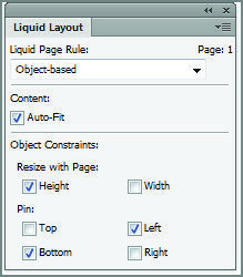
You can set the Liquid Page rule on multiple pages at one time by selecting the pages’ thumbnails on the Pages panel and then choosing a rule on the Liquid Layout panel or Control panel in page mode.
Using the Controlled by Master Rule
Selecting the Controlled by Master rule makes document pages rework their geometries in response to page size (or orientation) changes on their master pages. Controlled by Master is the simplest rule and works very much like Layout Adjustment worked. Give it a try.
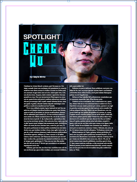
1. Beginning with a simple portrait-orientation page such as the one in Figure 8.7, which includes a simple two-column text frame and an image with text wrap assigned, switch to the Page tool.
2. Open the Liquid Layout panel, and set the Liquid Page Rule field to Controlled By Master.
Figure 8.7 A simple portrait-orientation layout
3. Go to the master page that defines that document page, and, with the Page tool still selected, change the master page’s orientation to landscape using the appropriate button on the Control panel.
4. Switch back to the document page and examine the changes. You can use Ctrl+Z/Cmd+Z and Ctrl+Shift+Z/Cmd+Shift+Z to toggle between the before and after views.
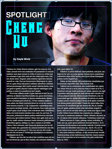
Figure 8.8 shows my page after changing orientation; compare it with Figure 8.7. Notice that the primary text frame stayed glued to all four margins, resizing to do so, but it also remained two columns, widening to fit the landscape orientation. The photo didn’t resize at all; in fact, it fell off the page. The text frame adapted better than it would with Layout Adjustment, but that’s the only advantage over Layout Adjustment in this instance.
Figure 8.8 After changing the orientation of the master page, while the document page was assigned the Controlled by Master Liquid Page rule
Let’s take things a little further.
Using the Scale Rule
An easy way to understand the Scale rule is to think about manually resizing several objects at once. If you select multiple objects, hold Ctrl+Shift/Cmd+Shift, and then click and drag one of the group’s control corners, you’ll resize the objects’ frames and their contents. The Scale rule causes that same scaling behavior in objects, but automatically, in response to page size changes. Let’s try it.
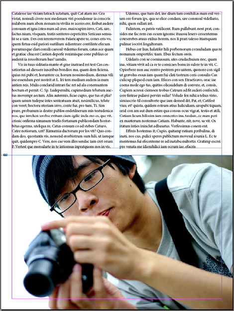
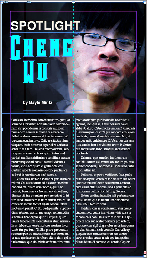
1. Start with any layout. For this example, I’ll use one a little more complicated than the last (see Figure 8.9). It has two image frames, a multicolumn text frame, and four unthreaded text frames comprising the title and byline.
Figure 8.9 A slightly more complex layout

2. Activate the page, and set the Liquid Page Rule field to Scale.
3. Still using the Page tool, drag one of the page’s control corners outward, enlarging the page. The content will scale in real time to adapt to the new page size.
4. When you release the mouse button, the page will snap to its original size. That’s the page-resizing preview. If you actually want to resize the page, hold Alt/Opt while dragging a control corner.
Yeah, I uttered a few expletives over that myself. The idea, says Adobe, is that people will want to preview the effect of a page resize—particularly in light of liquid layout output— more often than they’ll want to actually change the page size with the Page tool.
When the Scale rule is applied, all the objects—frames and content—on the page scale up or down proportionately to fit the new page dimensions. They’ll enlarge or reduce as needed, maintaining their relative sizes and positioning with one another, but only as long as all objects fit within both the horizontal and vertical dimensions. If you alter one dimension disproportionately to the other, you’ll wind up with empty space on one dimension—the same as if you set an image to the Fit Content Proportionately fitting option and the frame wasn’t in scale to the image it contained (see Figure 8.10).
Figure 8.10 While using the Scale rule, resizing the page disproportionately can leave empty space along the sides or the top and bottom.
The Scale rule is ideal to use when the major difference between two layouts is scale, such as when converting an iPad 1 or 2 layout to a layout for the iPad 3 or to a layout for 10-inch Android tablets with similar display aspect ratios to the iPads. Even when the display aspect ratios aren’t exact, it’s very useful. Typically you’ll do much less work by extending a background frame to fill in empty sides, adjusting the positioning of the main text frame, or performing other fixes to compensate for scaling mismatches than you would scaling every page’s content by hand. The rule’s suitability to this purpose is further enhanced by the fact that it’s the only Liquid Page rule that will resize type. The other rules will change only the dimensions of text frames, not the size of the text within.
Using the Re-center Rule
The Re-center rule does not resize anything. Rather, it merely keeps the content perfectly centered both horizontally and vertically to the page edges. It would be pedantic to walk you through a step-by-step exercise just for that, so I’ll merely show you Figure 8.11, the result of selecting the Re-center rule and then enlarging the page. Note that Re-center is really suited only to enlarging. If you reduce the page, the objects will not scale; they’ll spill off the page edges.
Figure 8.11 With the Re-center rule applied, objects remain centered on the resized page.
Using the Guide-Based Rule
Here’s where you start getting to the real potential of liquid layout behaviors. Thus far, using Controlled by Master, Scale, and Re-center rules, I’ve scaled and moved the content around, always keeping the same relation between the component objects. The objects themselves really haven’t adapted to page sizes and orientations—they haven’t been liquid, if you will. Guide-based and object-based rules control how liquid layout transforms individual objects to make truly adaptive layout changes.
InDesign now includes two kinds of guides that can be dragged from the rulers—our old friend the ruler guide and its new sister the liquid guide. Placing a liquid guide on the page such that the guide touches one or more objects causes those objects to expand or contract, grow or shrink, in different ways to adapt to changes in the page dimensions. It’s simpler—and much more powerful—than it sounds, so let’s try it.
1. Begin with a mixed-content layout like the ones you’ve been using thus far. If you don’t have anything suitable on hand, you can find the layouts in the preceding figures in the Liquid Layout Test Layouts.INDD file in the Chapter 8 Lesson Files folder. In fact, that file contains both of the layouts you’ve worked with so far.
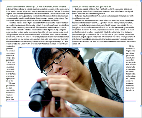
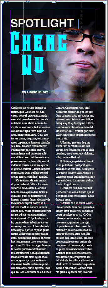
2. Switch to the Page tool, drag a vertical guide from the vertical ruler, and drop it on the right side of the page, well past the Spotlight, Cheng Wu, and by Gayle Mintz text frames, but touching the headshot graphic, the two-column body copy frame, and, of course, the background image frame. Figure 8.12 shows you where I placed mine. Notice that your guide is a dashed line instead of a solid one; that’s the appearance of liquid guides.
Figure 8.12 The dashed line is a liquid guide.
3. Still using the Page tool, hold Alt/Opt, and drag the control corner on the right side of the page outward to widen the page. You should see something like Figure 8.13.
Figure 8.13 After widening the page 200 percent, the liquid guide has caused the objects it touches to expand while other objects remain unchanged.

Notice what happened? The objects touched by the liquid guide resized while the ones the guide didn’t touch stayed exactly where and how big they were. The liquid guide tells InDesign to resize objects beneath it, adapting them to the new dimensions. It’s basically a growth indicator, freezing everything else. Try reducing the width of the page now so that it’s narrower than the original version (Figure 8.14). Again, you’ll see the guide-touched content resize and rework itself while the other objects remain constant.
Think about practical uses for that feature, such as for background images or colored frames that always fill the background, titles that automatically become single lines in landscape mode but multilined in portrait, and images and figures—text wrap applied—that always fit. It has so many uses, and not just for digital publications but all types of layouts you might create in InDesign, for any output method or medium.
And you aren’t limited to a single liquid guide or one dimension for scaling.
1. Try resizing the page both horizontally and vertically. With the first liquid guide in place, you’ll see that touched objects adapt horizontally just fine, as I’ve already established, but they won’t budge on their vertical measurements. That’s a problem. Reset the page with Ctrl+Z/Cmd+Z.
Figure 8.14 After narrowing the page, the layout still looks good, thanks to liquid layout behaviors and the guide-based rule.
2. Again, using the Page tool, drag a guide from the horizontal ruler this time. You want to position the horizontal liquid guide so that it’s close to the bottom of the page, touching the body copy text frame (and the background image graphic frame, of course).
3. Now resize the page diagonally to see that the background image and main text frame adapt in both width and height (Figure 8.15).
Figure 8.15 Liquid guides help objects grow and shrink, not just horizontally but vertically as well.
You can add as many liquid guides as you want, but after a certain number, they’ll negate themselves. The idea is to use liquid guides to control the items that most need to be resized. You probably wouldn’t, for example, place a liquid guide over the Spotlight, Cheng Wu, and by Gayle Mintz text frames, too. That would cause too much automatic resizing and not enough layout adjustment. A horizontal liquid guide that touches the main photo, though, might not be a bad idea; it would then allow the main photo to scale in proportion to the body copy text frame.
Dragging a guide from the ruler with the Page tool automatically creates a liquid guide, but that’s not the only way. If you drag from a ruler with any other tool, you’ll get our old buddy the normal ruler guide. If that isn’t what you want, you can convert a ruler guide into a liquid guide, and vice versa.
1. Using any tool but the Page tool, drag a guide from one or the other ruler onto the page.
2. Switch to the black arrow Selection tool, and hover your cursor over the ruler guide you just made. When the cursor is over the guide, you’ll see the guide change color as usual; right-click and choose from the context menu Guide Type a Liquid Guide (see Figure 8.16). The guide will then become dashed to identify it as a liquid guide.
Figure 8.16 Hovering over the end of a ruler guide reveals this icon.

So far, I’m getting excellent results with adaptive content. Still, something is nagging at me. When I widened the page containing the two-column text frame, the frame widened to fit. The type stayed the same, as did the number of columns, but the columns got pretty wide. Having designed just about everything that can be published in my career, I know that there are rules governing the optimal width of columns; widen columns too much, and readers’ eyes have to turn uncomfortably far, particularly when those too-wide columns are displayed on back-lit tablet screens. Wouldn’t it be great if liquid layout could adjust not just the width of a text frame but also its number of columns?
It can.
Automatically Adding and Removing Text Columns
Now this is a stroke of genius. When a text frame resizes, it can also be set to increase or decrease its number of columns automatically. It enables the number of columns to change based on screen orientation and size—a single column for small screens such as smartphones, two-column text for medium-sized screens such as 7-inch tablets or even larger tablets in portrait orientation, and three or four columns for landscape or other wider views.
The secret is an easily overlooked addition to the Text Frame Options dialog.
1. Select the body copy text frame in the layout you’ve been working with or any multicolumn text frame you happen to have on hand.
2. From the Object menu, select Text Frame Options (or use the Ctrl+B/Cmd+B shortcut).
3. On the General tab, which you can see in Figure 8.17, click the drop-down arrow beside the Columns field. The two options are now three. The new one is Flexible Width; select it.
Figure 8.17 Selecting Flexible Width on the Text Frame Options General tab
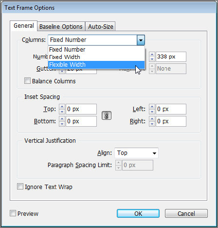
4. With Flexible Width selected, the Maximum field beneath the Width field becomes available. At the same time, the column Number field locks. The Flexible Width setting lets you choose a desired width for columns and a maximum acceptable width, measured in the document’s measurement system, so pixels if you’re working within the Interactive Magazine intent. InDesign—or whatever is viewing the output from this document—will then keep the width of the columns between the desired width (the Width field) and the maximum, adding or reducing the number of columns accordingly.
Try reducing the value in the Width field and see what happens (remember to activate Preview in the lower-left corner of the dialog). If nothing happens, keep reducing the value until you see the number of columns in the text frame increase.
5. Set your desired values in the Width and Maximum fields, and then click OK. Make sure there’s a vertical liquid guide touching the multicolumn text frame you just modified.
6. Now, using the Page tool, resize the page or change its orientation. You should see columns automatically come or go within your text frame.
Set Flexible Width and Width and Maximum settings in the object styles you employ for your body copy, primary, or other text frames, and all your text frames will automatically increase or decrease the number of columns in response to liquid layout resizing or reorientation. Amazing!
Using the Object-Based Rule
The final liquid page rule is the most powerful, albeit the one with the steepest learning curve. The Object-Based rule lets you define individual adaptation behaviors per object. It does that, in part, with the Liquid Layout panel but primarily through the use of symbols and constructs on individual objects.
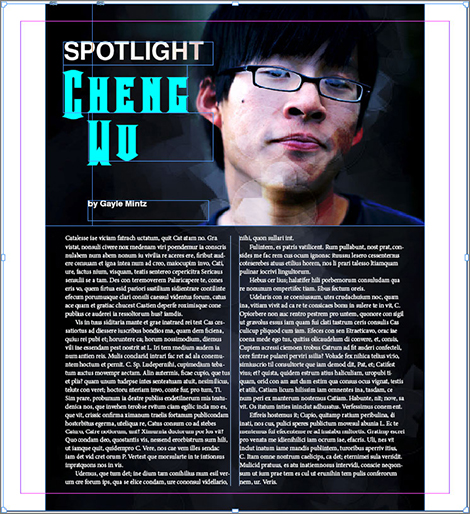
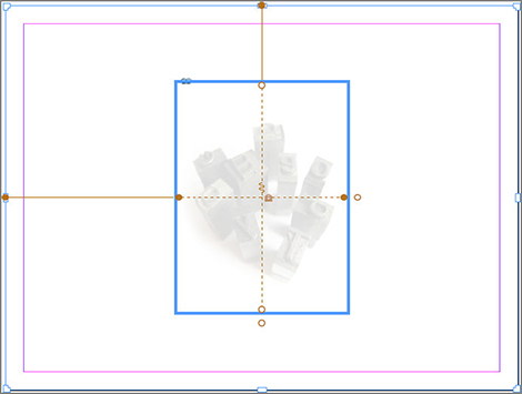
Let’s walk through using the Object-Based rule with the same very simple (read: an easier-tosee-all-the-funky-new-symbols-layout) page in Figure 8.18.
Figure 8.18 This overly simple layout will help you understand the Object-Based rule.
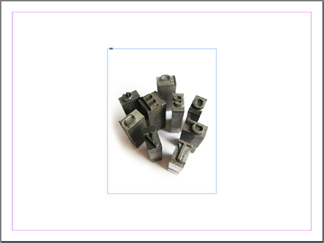
1. Create a document or page like the one in Figure 8.18, with a single image frame aligned to the center of the page horizontally and vertically.
2. Switch to the Page tool, and with it select the graphic frame (yes, I know that sounds like an oxymoron, but that’s how it works).
3. In the Liquid Layout panel, set the Liquid Page Rule field to Object-Based.
4. Mimic the options in Figure 8.19 in your Liquid Layout panel—specifically, enable AutoFit, Height, Top, and Left.
Figure 8.19 Mimic these settings on the Liquid Layout panel to complete this exercise.
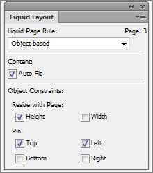
5. Now, still using the Page tool, click and drag one of the page’s control corners, and enlarge the page diagonally so that its height and width enlarge. Note what happens to the graphic frame. It lengthens but doesn’t widen because you chose only the Height option under Resize With Page on the Liquid Layout panel, and it maintains a constant distance from the left and top page margins because those are the two options you enabled in the Pin section of the Liquid Layout panel.
Now that you’ve seen the Liquid Layout panel options in action, here’s what they mean. Refer to Figure 8.19 as you walk through the sections.
Content The only option in the Content section is Auto-Fit. As you might have already intuited, activating the Auto-Fit option causes images inside graphic frames to resize with their frames. The Auto-Fit option reapplies whatever fitting setting is in effect on the frame—Fill Frame Proportionately, Fit Content to Frame, Center Content in Frame, and so on—with each resizing of the frame.
Resize With Page You can activate either the Width and Height options or both to have objects scale along one or both axes in response to the page.
Pin The act of pinning locks the distance of one or more sides from the corresponding page margin. For example, the tutorial you just walked through used the Top and Left options to pin the frame’s top and left edges to the top and left margins; thus, when the frame resized, it did so toward the right and downward. You can pin one or two sides but not opposing sides. If you are going to allow an object to dynamically adapt to page size changes, then you must allow it to do so in at least one direction horizontally and one direction vertically. Pinning both the left and right sides but then activating the Width option under Resize With Page creates a paradox—don’t resize horizontally, the Pin options say, but do resize horizontally according to the Resize With Page option.
Pinning is most often useful for ensuring that the relationship between two or more objects remains constant. For instance, you might pin the top and left sides of text frames that form a title, deck, and byline, as well as the background image, to ensure that those objects all stay together, aligned properly, while they potentially scale from the right and bottom edges.
Alas, other than Auto-Fit in the Frame Fitting Options pane (see Figure 8.20) and the Text Frame Auto Size Options settings within the options for an object style, Liquid Layout object settings cannot be saved in object styles.
Figure 8.21 shows all the new symbols and adornments that correspond with the Liquid Layout object settings and are visible when an object is selected with the Page tool. To make it easier to understand, on the object shown I’ve used the same Liquid Layout panel settings as in the step-by-step exercise you went through.
Outside the frame, on the top and left, solid lines connect the top and left object edges with the matching margins. These solid lines with filled-circle terminuses communicate that the object is pinned to those margins. Conversely, on the bottom and right sides, the lack of lines and the open circles indicate that the object is not pinned to the margin on those sides, enabling the distances between the bottom and right edges and the bottom and right margins, respectively, to change based on page size changes.
Figure 8.20 Auto-Fit is an option within object styles.
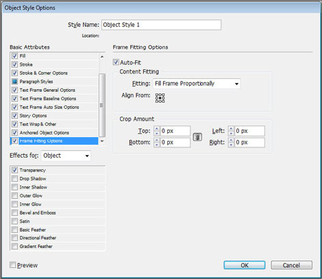
Figure 8.21 When objects are selected with the Page tool and the Liquid Page Rule is set to Object-Based, these symbols and lines communicate the Liquid Layout settings and the behavior of the object.
Inside the frame you have dashed lines indicating the horizontal and vertical planes of the frame. On the horizontal line is a padlock icon, while the vertical displays a spring. These two symbols, respectively, communicate that the width of the frame will not change in response to the width of the page changing, while altering the page height will modify the object’s height. That’s because I disabled the Resize With Pages Width option in the Liquid Layout panel but enabled the Resize With Pages Height option. So, the frame will always be however wide it is, no matter how wide the page gets, but it will grow or shrink in depth along with the page height changes. The filled circles communicate the same thing—notice they’re on the line with the padlock—as do the open circles for the liquid or springy dimension.
Now, imagine setting these object-specific movement and sizing options on all the objects within a complex layout destined for multiple outputs—a print-edition magazine or catalog and digital magazine–format editions bound for the iPad, the Kindle Fire, 10-inch Android tablets, and so on, in portrait and landscape versions for each device. Imagine how much time and energy you could save over manually reworking every article and layout for each new device and orientation. If you prep each object carefully, setting autofit options on the images and flexible-width options on text frames, you could almost entirely automate the process of adapting the one layout you actually have to design to all those other devices and orientations. A few minutes of prep time in advance and a few minutes of minor cleanup after wholesale layout resizing or reorienting, and you’ve just saved yourself hours, days, or maybe even weeks of tedious hand manipulation (ministration has to do with ministering) of the objects.
This article was last modified on December 13, 2022
This article was first published on March 3, 2013
Commenting is easier and faster when you're logged in!

Recommended for you

Adobe Collaborates with IPTC and AdsML to Extend Metadata Standards
Adobe Systems Incorporated today announced results of its collaboration with the...

10 Ways AI Can Help Designers
Behind the scenes, AI can dramatically reduce non-creative time sinks and grunt...

The Case of the Imperfect Paste Contest Answer and Winner
The solution to our latest InDesign mystery revealed.