Fill Live Text With Any Image in InDesign
Mike Rankin shares the trick for filling live text with any color, pattern, or photo on top of any background.

This article appears in Issue 62 of InDesign Magazine.
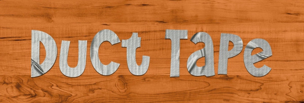
Consider the wonders of duct tape. Originally used by American soldiers in WWII, this magical stuff might be the most versatile material on earth. What else can remove lint from your shirt and patch a hole in a sinking boat? When the Apollo 13 astronauts had their famous “problem” in space, they fixed it with duct tape. Nowadays kids fashion everything from wallets to prom dresses from it. (Just don’t use it to seal ducts—ironically, that’s the one thing it can’t do well.) So in honor of this miracle material, I offer this InStep on how to fill live text with duct tape. And in fact, the technique is almost as versatile as real duct tape, since you can use it to fill live text with any image or texture on any background.
Place an image of duct tape (or whatever you want to fill your text with) into your InDesign document. I got this image from cgtextures.com, which has a large selection of free textures for personal and commercial use.
Create a frame that totally covers the image of the duct tape. You can fill it with anything you like: a solid color, an illustration, a photo, etc. It just has to completely hide the underlying image. In this example I’m using a wood grain photo, which also came from cgtextures.com.
It might seem weird to put the background image on top of the duct tape, but it’s the only way to make this effect work properly. Essentially, what we’re going to do is use a blend mode trick to punch a text-shaped hole through the background image so it looks like the letters are made of whatever’s underneath (in this case, duct tape).
Create a text frame with no stroke and no fill on top of the background image. Then add the text that you want to spell out in duct tape. Use a font that’s bold enough to show off the texture of the tape. You might also want to find a font with a hand-drawn appearance so the letter shapes look like they were cut out with scissors or a razor blade. I chose a free font called Wee Bairn from Typodermic.com. Fill the text with white.
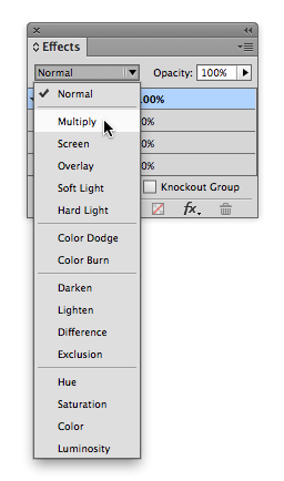
Select the text frame with the Selection tool. Open the Effects panel by choosing Window > Effects. With the Object level in the Effects panel targeted, choose Multiply from the blend mode menu.
The Multiply blend mode adds the darkness of the topmost object to what’s beneath it. Since the text frame had no darkness to add (no stroke or fill, and the text was filled with white), it completely disappears.
Select the text frame and the top image, and group them. Be sure not to include the duct tape image at the bottom of the stack.
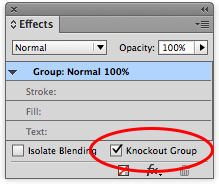
With the group selected, enable the Knockout Group setting in the Effects panel to reveal the duct tape image through the letter shapes.
If necessary, move or scale the image of the duct tape to get the best look.
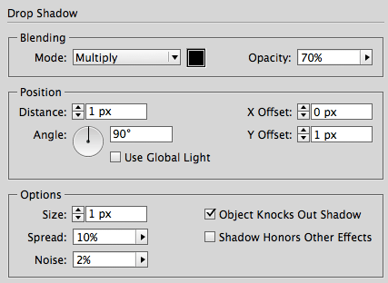
It’s not required, but a very small drop shadow applied to the text frame can lend a bit of realism. Select the text frame, and choose Drop Shadow from the fx menu in either the Control panel or the Effects panel. For a material that isn’t very thick (like duct tape), use a very small size and offset, usually just 1–2 pixels. Adjust the angle, opacity, spread, and noise to taste.
Edit the text as needed, change the font, images, etc. The effect will update automatically.
***
Mike Rankin is the Editor in Chief of CreativePro Magazine and the author of the LinkedIn Learning course InDesign FX.
This article was last modified on February 3, 2026
This article was first published on October 3, 2014
Commenting is easier and faster when you're logged in!
Recommended for you

CreativePro Tip of the Week: Using Resource Libraries in Illustrator
This CreativePro Tip of the Week for using resource libraries in Illustrator was...

Halloween Photoshop Techniques
Looking to whip up some quick Halloween fun in Photoshop? Over at the lynda...

How to Create a Burnt Paper Effect in Photoshop
Creating a burnt paper effect in Photoshop is much easier than you might think....


